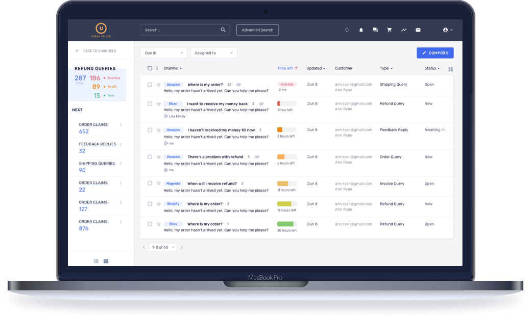
Rethinking a customer service and engagement platform for e-commerce
Innovative solution for online retailers to increase sales and customer engagement.
Challenge
Our client, Urban Seller, sought to redesign its online customer query platform to enhance usability and overall appeal. Urban Seller enlisted Windmill Smart Solutions to design an interface that eliminates all points of friction in the user experience, enables companies to manage their online reputation better, and increases sales. Our challenge was to define the app’s biggest pain points and then craft a solution that empowers agents to deliver and track their best performance.
Approach
We worked with Urban Seller to clarify key user workflows, use cases, and content types. From there, we performed a comprehensive UX audit to define pertinent design issues and determine the best solutions for each scenario. Once we had a full understanding of the existing pain points and Urban Seller’s long-term needs, we crafted and iterated multiple design concepts and prototypes before ultimately building and delivering developer-friendly guidelines.
Industry
E-commerce
Solution
Urban Seller provides a platform for online retailers to quickly and efficiently manage customer queries.
The platform enables sales professionals to resolve account suspensions, handle international communications using auto-translate features, monitor brand and company reputation online, and respond to customer reviews – all in a single workflow, eliminating the need for multiple accounts and passwords. The platform also allows for countdowns to be set for every selling platform to ensure that customers always receive responses in a timely manner.
Windmill Smart Solutions worked with Urban Seller to improve the overall user experience of this platform and establish more intuitive workflows that maximize the value of existing content.
UX design goals
Make it easier for agents to address, escalate, and resolve customer queries.
- Create a single view
- Make primary elements stand out
- Make it easy to access secondary elements when needed
- Rethink workflows to maximize efficiency
- Maximize the value of existing content
UI design goals
Design a clean, consistent interface in which primary and secondary information is easily distinguishable
- Remove visual clutter
- Add visual accents
- Establish a consistent UI across the platform
- Create a modern look and feel for the app
- Create visual data hierarchy

What did we do?
We conducted thorough research to understand the needs, motivations, and goals of online retailers who manage multiple profiles. Our questions included:
- What motivates people to have multiple selling accounts on different platforms?
- What are the key challenges around working with ongoing customer queries?
- What are the needs of the users of such a platform, i.e. sales professionals and other employees?
- What tools could help these professionals better manage customer queries?
Workflow and User Journey
Based on our research, we defined the most important features and designed an improved vision of the workflow, mapped existing user journeys, and converted key issues into opportunities to improve design.


Heuristic Evaluation and Usability Testing
We put special focus on integrating with existing solutions and infrastructure, performed usability testing, and made adjustments as needed according to strengths and weaknesses uncovered.
Designing a New Concept
With the information we collected about user personas, we developed a new way to manage emails, suitable for all selling platforms.

A unique platform to manage all accounts
Our advanced platform enables users to provide customer support like a pro.

Impact
We created a single, simple interface for managing multiple selling accounts to help retailers increase sales and improve company reputation. Upon our redesign of the Urban Seller platform, retailers are able to perform their daily tasks 5x faster and reply to 21% more emails per day.


