How workflow diagrams expose weaknesses in UX design
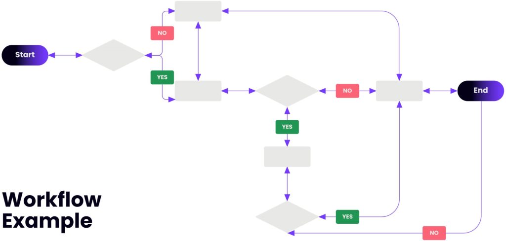
A workflow diagram (also known as a workflow) provides a graphical overview of a process. Using standardized symbols and shapes, the workflow shows, step-by-step, how a process is completed from start to finish. Designing a workflow involves first conducting a thorough workflow analysis, which can expose weaknesses.
A workflow analysis can help you define, standardize, and identify critical areas of your product. Workflow diagrams go by other names, including UML Activity Diagram, Flowchart, Taskflow, Process Map, and Process Chart.
In short, workflows are for:
- Showing how users travel through the system while performing a specific task.
- Describing a path that might not always be linear, but the one that branches.
Why use a workflow diagram?
Workflow is an integral part of UX design and is critical to a product’s ultimate success. We’re not talking about on-screen visual elements, but rather the path a user takes across various features towards their desired result. The user experience is strongly impacted not just by what’s on the screen at any given time, but also by how the current screen relates to past screens and future states. Product usability is much enhanced when you consider the totality of the user experience.
But there’s also a more business-oriented argument for improving workflow usability: Users can often overcome isolated usability problems, but a broken workflow is much harder for them to fix. Among the typical consequences of bad workflow design are:
- Undiscovered errors that occur when users don’t relate what happened on screen A with a (much-later) screen B;
- Abandonment, where users simply give up on something they don’t understand;
- Frustration, which arises when an awkward process takes much more time than it should. (Individual design elements can also delay users, but a poor workflow takes considerably longer to complete.)
Therefore workflow diagrams are useful when:
- You need to communicate complicated ideas to people who may not have been party to their creation.
- You need to understand which screens are required and how a user might experience them. Workflow diagrams take a holistic view on the flow. This is different when you single out some pieces of the flow.
- Usually we design only the happy path. Branching in the flow can highlight additional considerations in the design. Workflow helps to visualize what’s going on and thereby help to understand a process, and perhaps also find less-obvious features within the process.
Creating effective Workflow Diagrams
Effective diagramming of a workflow can facilitate a clear understanding of the boundaries of a product process. This allows the reader to see where and when the process flow can leave the process that is being documented.
Such diagrams can convey complex information or help elicit nuanced details when designing interfaces.
Diagramming these process flows can be an effective tool that a designer uses to shed light into the nuances of the flow that may not have been so evident.
Use common symbols and shapes
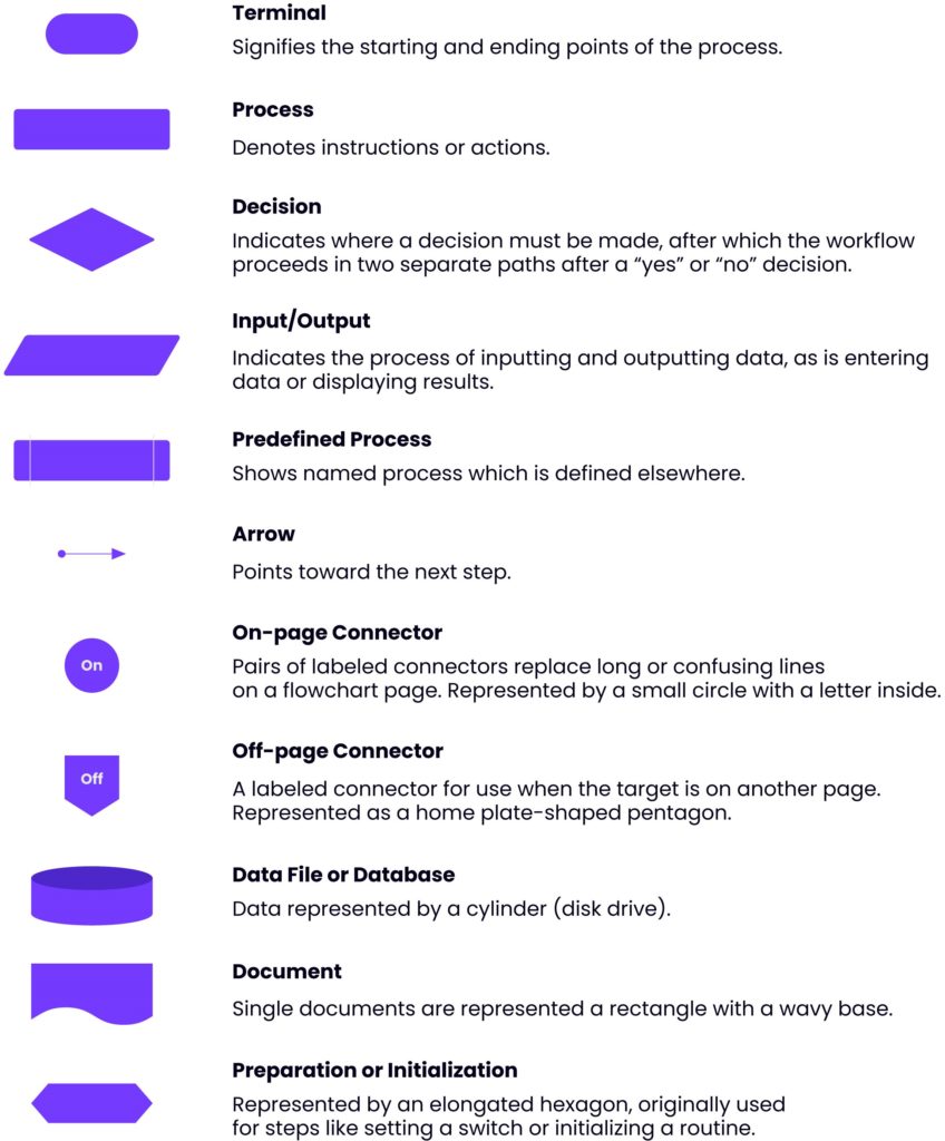
Workflows use specific shapes and symbols to represent steps and actions throughout the process. These symbols were approved by The International Organization for Standardization (ISO 5807) in 1985. Common symbols and shapes include:
Utilize numbering to direct your narrative
Generally, flowcharts read from top to bottom and left to right. But if your diagram is not sequentially drawn, numbering helps in the accurate consumption of information.
Keep everything on one page
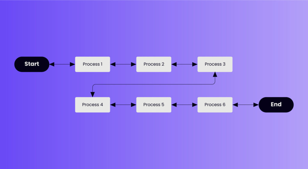
It is good practice to make sure that the workflow fits on a single page while keeping the text readable. When a diagram becomes too large to fit on a page, depending on the number of steps, you can also have your workflow left to right, then down to a subsequent line where it continues. It will look something like this:
Place return lines under the workflow diagram
Since we naturally read text from the top of the page down, it is logical that return lines should be placed under the workflow rather than above. If two return lines are needed, they shouldn’t overlap.
Workflows vs User Flows
Both workflows and user flows are deliverables that are generally useful within the interaction design phase. They are used to map out the structure, hierarchy, and relationships across content and features, so that people can fluidly navigate through the design to accomplish their desired goals.
But compared to user flows, workflows are appropriate when the task in question will be performed similarly by all users and who will also share a common entry point. For example, in an alarm clock mobile app, a task such as “set alarm time” is likely to be performed in the same way by all users.
A few “don’ts” in creating workflow diagrams
When creating a workflow diagram, there are some practices best avoided.
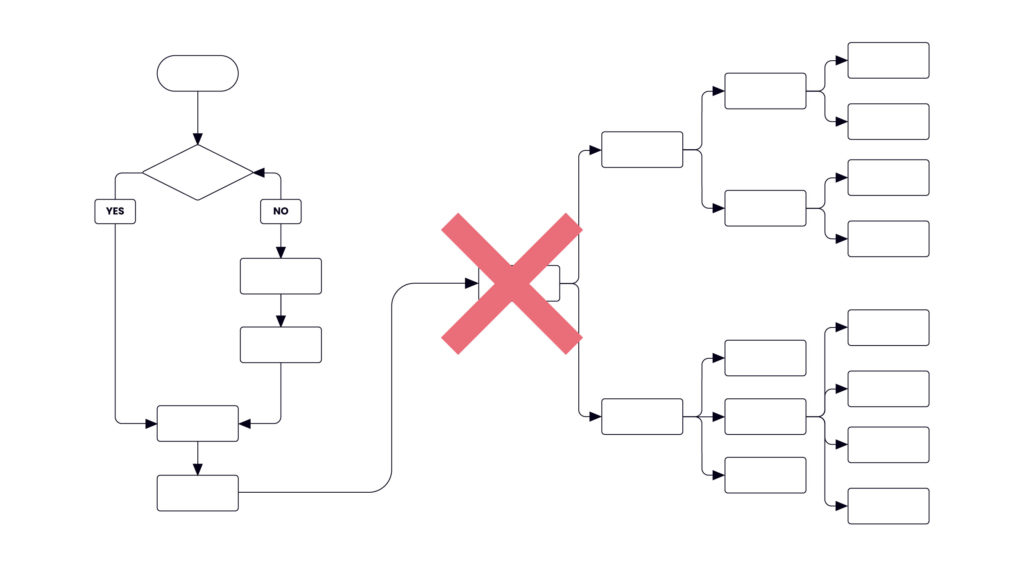
❌ Don’t make them look like user flows.
❌ Don’t depict the user persona as flow is similar to all users.
❌ Don’t put wireframes into the flow.
❌ Don’t put any pages into the flow at all. The workflow is more conceptual deliverable.
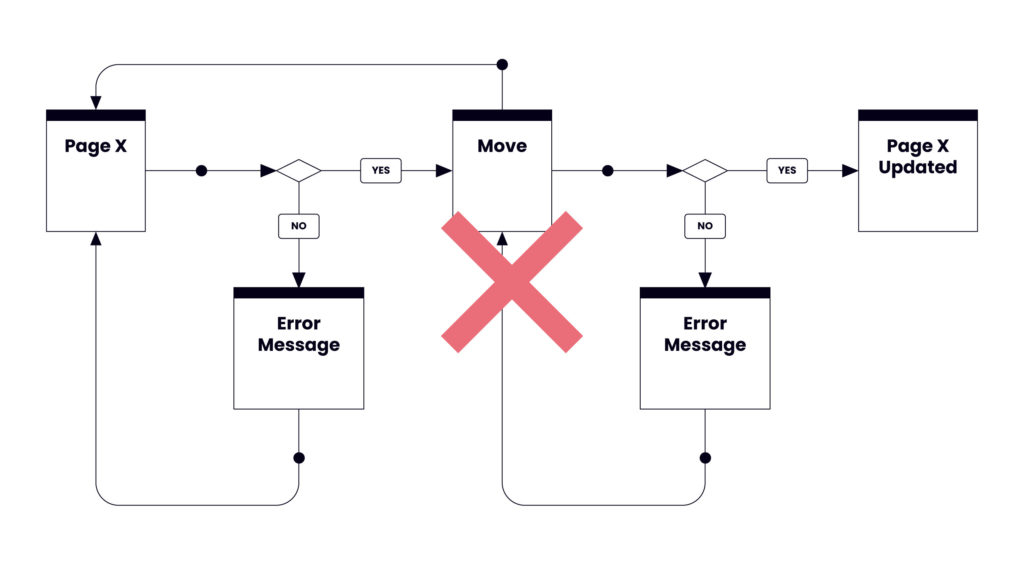
❌ Don’t loop the flow. Each flow has to have a start and an end.
❌ Don’t merge several flows together. The workflow is focused on completing one task.
Workflow Diagrams are one of the many tools Windmill uses as part of our digital product strategy services. With our help, you can accelerate your start-up’s growth strategy with confidence. Together we can rationalize objectives and create exciting web and mobile app concepts.


