UX & Design • Windmill

Customer experience has evolved into a pivotal differentiator in the dynamic business world. Crafting a robust customer experience strategy is no longer just a buzzworthy term; it’s a necessity in today’s digital landscape. This blog will guide you through the ten essential steps to create a stellar customer experience strategy.

From understanding the core principles to mastering the latest digital customer experience strategy techniques, we’ve got you covered. Let’s set out to enhance customer satisfaction, foster loyalty, and drive your organization’s success by implementing best practices for customer experience strategy.

10 Steps to Build a Customer Experience Strategy

Creating an outstanding customer experience is the outcome of a well-thought-out customer experience strategy and not just a mere coincidence. Here are ten essential measures to help you provide a solid groundwork for your company’s customer experience initiatives.

1. Understand Your Audience

Start by creating detailed customer personas that encapsulate various facets of your customer base. Consider demographics, such as age, location, and gender, as well as psychographics, which delve into their attitudes, values, and behaviors.

Consider elements like your audience’s preferred digital customer experience channels and communication styles as you dig into their digital interactions and preferences. Analyzing their online activity and feedback will give you priceless knowledge about what they anticipate from your company. This thorough understanding will serve as the cornerstone for developing a plan that connects with your audience and entices them to return for more.

2. Set Clear Objectives

Setting clear objectives within your customer experience strategy is the compass that guides your journey. It involves defining specific, measurable, and time-bound goals that align with your organization’s mission. Rather than a vague aim, you might want to establish a precise target that is achievable.

These goals act as quantifiable benchmarks that let you know how well you’re doing when measured using KPIs like Net Promoter Score (NPS) or Customer Satisfaction (CSAT). They must be practical, considering your capabilities and resource availability, and flexible enough to change with the quickly evolving business environment. Establishing specific goals can help you plot your course and ensure your customer experience strategy is an effort motivated by goals and outcomes.

3. Map Customer Journeys

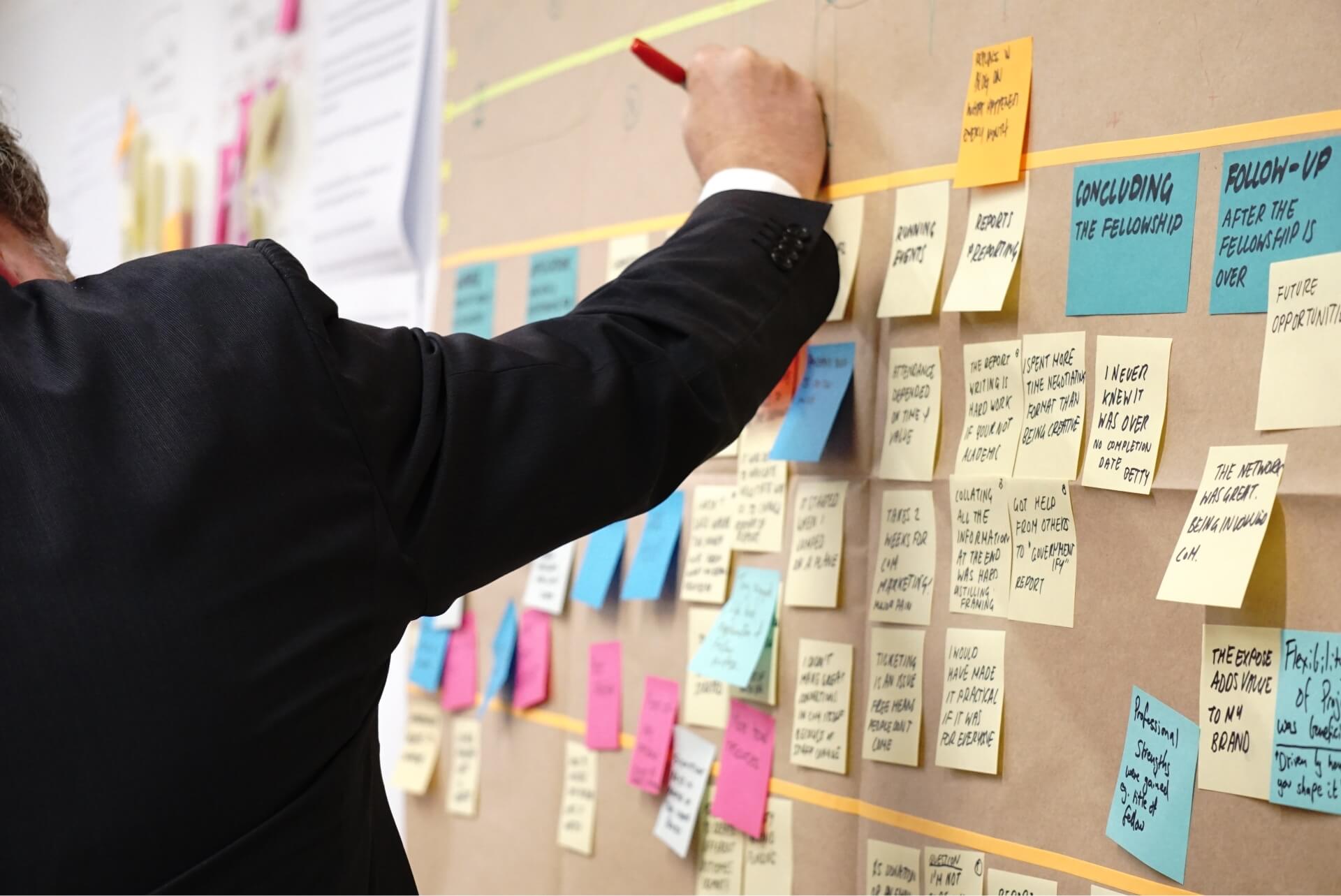
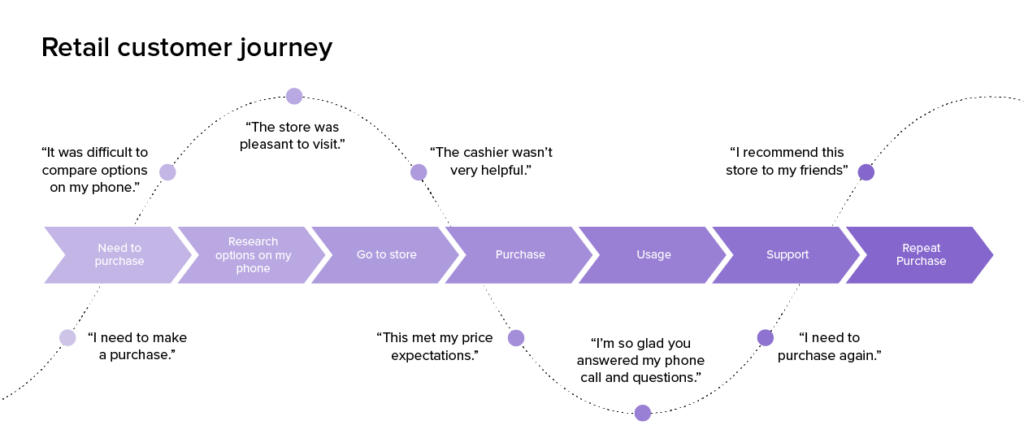
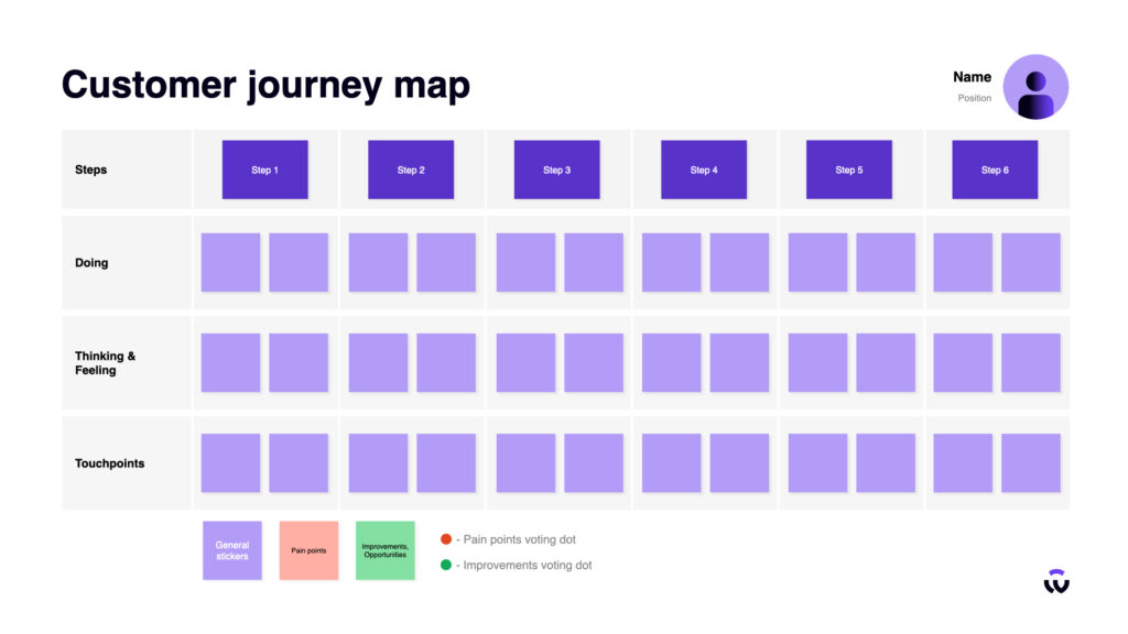
Mapping customer journeys refers to tracing the paths customers travel when interacting with your brand, from the first touchpoint to post-purchase. This method helps you understand the various stages of the customer experience by identifying critical times in their interactions with your company. Customers may interact with these journeys through a variety of channels and devices, making them complicated and non-linear.

You can visualize the complete client experience by mapping these travels, which is helpful for identifying pain points, delightful moments, and areas that can be improved. It gives you the ability to customize your tactics, content, and interactions to improve the whole customer experience and synchronize it with your goals.

4. Gather Customer Feedback

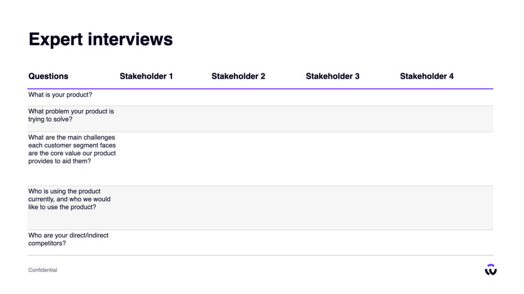
Use surveys, interviews, and feedback forms to get insightful information about the expectations and experiences of your customers. These interactions offer data that can be evaluated to identify certain problem areas and ones where your approach has to pay special attention. You may effectively gather and examine online reviews, social media mentions, and digital feedback using specialist customer experience management (CEM) solutions.

Such tools give you a thorough understanding of how your customers feel and behave across a range of digital touchpoints, empowering you to make informed decisions. You may ensure that your strategy is in line with your consumers’ expectations and levels of satisfaction by collecting and analyzing this feedback.

5. Leverage Technology

Digital solutions and customer experience management (CEM) platforms are at the forefront of effectively collecting and analyzing customer data. Tracking interactions, criticism, and performance across numerous digital touchpoints is made possible by these tools. The deployment of proactive digital customer experience management is made easier by technology. It makes it possible to give individualized and relevant digital interactions and content.

Utilizing technology, you may maintain a consolidated repository for customer data and interactions by seamlessly integrating customer relationship management (CRM) solutions. This unified data center is essential for personalizing interactions and ensuring that your customer experience plan corresponds with the audience’s digital preferences.

6. Employee Engagement

Employees who are actively involved in their work are more likely to be motivated, skilled, and committed to the objectives of your customer experience strategy. Programs for training employees that emphasize customer-centric procedures can be implemented by organizations. The significance of comprehending digital client behavior, preferences, and the precise objectives of the strategy should be emphasized.

Create a team to manage the digital customer experience or assign people to keep an eye on, react to, and enhance digital interactions. These teams can supply pertinent digital content by using customer relationship management (CRM) tools to stay up to date on customer needs. Through these systems, workers are encouraged to share their knowledge and expertise, promoting ongoing development.

7. Design Consistency

Design consistency is the maintenance of uniformity in the interactive and aesthetic components of your digital touchpoints across a variety of channels, which promotes reliability and trust in your brand. Establish branding standards for the use of digital assets such as color palettes, fonts, logos, and interface elements. To make sure their work is consistent with the brand identity, digital content providers and designers can use these standards as a guide.

Extend these rules across all digital platforms, like as websites, social media, mobile apps, and email marketing, to provide a consistent and comfortable user experience. The deployment of branding components and templates to ensure consistency is made easier by digital content management systems (CMS) and design tools.

8. Implement Improvements

In this process, strategic changes are made to improve the customer experience based on the knowledge and information gathered. Prioritizing problems and improvements in accordance with how they will affect the overall experience of customers is crucial. To ensure a quick and significant improvement in customer satisfaction, focus initially on high-impact pain issues.

Tracking the development of these improvements can be incredibly helpful when using digital customer experience management (CEM) solutions. As you update your digital content and touchpoints, they enable you to track changes in customer satisfaction, engagement, and other relevant key performance indicators (KPIs). Even after making adjustments, keep collecting feedback and data to assess their impact.

9. Measure and Analyze

In this step, you’ll utilize specific key performance indicators (KPIs) to measure the effect of your plan, like the Net Promoter Score (NPS) and customer satisfaction (CSAT). A quantified overview of consumer sentiment and the general health of your digital customer experiences is provided by routinely monitoring these KPIs. These indicators allow you to determine whether your initiatives and alterations have a positive impact on customer satisfaction and loyalty.

Customer feedback, digital interactions, and the performance of numerous digital touchpoints are all examined through analysis to identify trends, patterns, and areas that need more focus. Digital customer experience management (CEM) tools are essential for this step because they provide thorough dashboards and reporting capabilities that allow for performance monitoring and analysis.

10. Iterate and Innovate

Iteration entails going back and modifying your current strategies and approaches in light of the facts and insights you have gathered. To improve the digital customer experience, you go through a process of continuous improvement. On the other hand, innovation focuses on finding fresh and original approaches to advance your strategy. It entails keeping up with the most recent digital trends, technology, and customer experience management (CEM) best practices.

Advanced data analytics and digital customer experience management (CEM) solutions are essential in this stage. These tools enable you to measure the outcomes of your iterative and inventive efforts and pinpoint areas where innovation is required.

Final Thoughts

Understanding, engagement, and ongoing change are crucial to success. Your digital customer experience strategy is a live, breathing creation that thrives on input and changes to the ever-evolving digital dynamics, not a static plan.

You’ve laid a strong foundation for a strategy to promote customer pleasure, loyalty, and, eventually, the success of your company by putting these ten steps into practice. Keep in mind that just as the digital world never stops, neither should your dedication to providing top-notch experiences.

FAQs

  • What is a customer experience strategy, and why is it important for businesses?
    A customer experience strategy is an action plan created to foster successful, dependable, and significant interactions between a company and its clients. Businesses need it because it has a direct impact on customer satisfaction, brand loyalty, and business success. A carefully developed approach promotes long-lasting, valuable connections and aids in exceeding customer expectations.
  • How does a customer experience strategy contribute to the success of a company?
    A customer experience strategy contributes to a company’s success by enhancing customer satisfaction and loyalty. Satisfied customers are more likely to return, refer others, and make repeat purchases. This leads to increased revenue and a stronger market position, ultimately boosting the company’s success.
  • What are the key components of a customer experience strategy?
    Understanding the needs of customers, tracking customer journeys, getting feedback, utilizing technology, and implementing continuous improvement are important elements of a customer experience strategy.
  • Can you provide an overview of the 10 essential steps involved in building a customer experience strategy?
    Here’s an overview of the 10 essential steps for building a customer experience strategy:
    • Understand Your Audience
    • Set Clear Objectives
    • Map Customer Journeys
    • Gather Customer Feedback
    • Leverage Technology
    • Employee Engagement
    • Design Consistency
    • Implement Improvements
    • Measure and Analyze
    • Iterate and Innovate
  • How often should I revisit and update my Customer Experience Strategy?
    Review and adapt your customer experience strategy frequently to reflect changing market conditions, consumer preferences, and customer feedback. Aim for at least a yearly review, but be ready to alter it as necessary to maintain its efficacy.
  • How do I measure the success of my Customer Experience Strategy?
    Through key performance indicators (KPIs) like Net Promoter Score (NPS), Customer Satisfaction (CSAT), and Customer Retention Rates, you may assess the effectiveness of your Customer Experience Strategy.
  • What are some common challenges in implementing a Customer Experience Strategy?
    Aligning organizational culture, gathering and analyzing customer data efficiently, and ensuring consistent execution across every customer’s touchpoint are common obstacles to adopting a customer experience strategy.
  • What role does customer research play in shaping a successful customer experience strategy?
    A good customer experience strategy is shaped substantially by customer research. Insights into client wants, preferences, and pain areas are provided, influencing the creation of the strategy and ensuring that it is resonant with the intended audience, resulting in greater customer satisfaction and loyalty.
The ever-evolving digital landscape challenges businesses to stay ahead by delivering exceptional customer experiences. “Customer Experience” (CX) and “User Experience” (UX) are two terms that often come into play. While they may sound interchangeable, they represent distinct aspects of a product or service journey, each holding its significance.

Understanding the nuances between customer and user experience is crucial for industry professionals and anyone seeking to create impactful digital solutions. In this blog, we delve deep into the world of CX and UX, dissecting their differences and uncovering why grasping this disparity is essential for crafting digital experiences that truly resonate with your audience.

What is Customer Experience?

Customer Experience (CX) is a customer’s overall perception and interaction with a brand, product, or service throughout the customer journey. It encompasses every touchpoint and interaction a customer has with a company, from the initial awareness and research stage to the purchase process, post-purchase support, and ongoing engagement.

Customer experience is a cumulative result of multiple interactions and experiences. It includes digital and physical interactions, such as using a website or app, contacting customer support, receiving a product, or visiting a physical store. A positive customer experience results in customer satisfaction, loyalty, and advocacy, which are essential for long-term business success.

What is User Experience?

User Experience (UX) is an individual’s overall experience when interacting with a product, system, or service. It focuses on how users perceive, interact with, and feel about the product or service’s design, usability, and functionality. UX design aims to create products and experiences that are user-centered, intuitive, and enjoyable.

User experience focuses on understanding the user’s goals, motivations, and pain points to create a seamless and satisfying experience. A well-designed UX increases user satisfaction, lowers abandonment rates, and improves user retention.

Customer Experience vs User Experience: What’s the Difference?

Customer Experience (CX) and User Experience (UX) are both related but distinct concepts that focus on different aspects of interactions with a company’s products, services, or brand. Let us look at the breakdown of the key differences between customer experience and user experience.

Scope of Focus

Customer experience encompasses the entire end-to-end journey of a customer’s interactions with a company, including marketing, sales, customer support, and post-purchase experiences. It considers interactions both online and offline, spanning the entire customer journey.

User experience focuses on user interactions with a product, system, or service. It is primarily concerned with the design, usability, and functionality of that product or service.

Target Audience

Customer experience involves a broader range of audiences, such as stakeholders, customers, prospects, partners, and employees. It focuses on how various interactions impact overall brand perception and relationships.

User experience is more user-centric and primarily concerns the experience of individuals who directly engage with a product or service.

Context

Customer experience considers the overall context of a customer’s relationship with the company. It includes marketing communications, brand perception, and customer service interactions.

User experience focuses on the specific context of a user’s interaction with a particular product or service. This may include aspects such as ease of use, navigation, and satisfaction within that context.

Goals

The primary goal of customer experience is to build and maintain positive relationships with customers, driving customer loyalty, retention, and advocacy.

The primary goal of user experience is to optimize the usability and user satisfaction of a specific product or service, ultimately improving user adoption and engagement.

Metrics

Metrics for CX include Net Promoter Score (NPS), Customer Satisfaction (CSAT), Customer Effort Score (CES), and customer retention rates.

Metrics for UX include usability testing, task success rates, user satisfaction surveys, and user engagement metrics.

Why Does the Difference Matter?

Understanding and appreciating the difference between Customer Experience (CX) and User Experience (UX) is crucial for several reasons. It empowers organizations to allocate resources efficiently, tailor strategies, and create products and services that resonate with their audience.

Strategic Alignment

Recognizing customer experience vs. user experience helps organizations appropriately align their strategies and resources. CX strategies focus on overall customer satisfaction and loyalty, while UX strategies are more granular, concentrating on the design and usability of specific products or services. By knowing the difference, companies can develop targeted strategies for both areas.

Resource Allocation

Companies have limited resources, and knowing the difference between CX and UX enables them to allocate resources effectively. For example, if customer feedback indicates dissatisfaction with a website’s usability (UX), resources can be directed toward improving the website’s design and functionality. Conversely, if customer satisfaction is low across multiple touchpoints (CX), resources may need to be allocated to broader customer service or marketing efforts.

Specialized Expertise

CX and UX require different skill sets and expertise. CX involves marketing, customer service, and brand management, while UX involves design, usability, and user research. Recognizing the distinction allows organizations to hire and develop specialized talent in each area, ensuring customer experience and product usability receive the attention they deserve.

Improved Customer Understanding

Distinguishing CX vs. UX allows companies to understand their customers better. By examining the broader customer journey (CX), organizations can identify pain points, moments of delight, and areas where loyalty can be built. Simultaneously, analyzing the specific interactions and usability of products (UX) helps pinpoint where design improvements are needed.

Enhanced Problem Solving

Organizations can approach problem-solving more effectively when they grasp the difference between CX and UX. If a company faces a decline in customer retention (a CX issue), it can analyze the entire customer journey to identify contributing factors. If a specific product has low user adoption (a UX issue), they can focus on refining the product’s design and functionality.

Customer-Centricity

Understanding both CX and UX promotes a more customer-centric approach. Companies that prioritize both areas are more likely to create products and services that meet customer needs and expectations, leading to increased customer loyalty and advocacy.

Competitive Advantage

Companies that excel in CX and UX can gain a significant competitive advantage. Satisfied customers are more likely to return, recommend the brand to others, and become brand advocates, resulting in increased market share and revenue.

Final Thoughts

In conclusion, the distinction between CX and UX is more than an academic exercise; it’s a compass guiding organizations toward success. By mastering both the art of creating exceptional customer journeys and crafting user-friendly products, companies can secure the loyalty of their audience and stay ahead in today’s dynamic market. So, remember, in the journey toward excellence, it’s not just about making the right impression; it’s about making every interaction count.

FAQs

  1. What is the fundamental difference between customer experience and user experience?
    Customer Experience (CX) covers all interactions with a brand, including marketing and support. User Experience (UX) focuses specifically on interactions with a product or service.
  2. How do customer experience and user experience impact a business differently?
    Customer Experience (CX) impacts overall brand perception, loyalty, and advocacy. User Experience (UX) directly influences product adoption, satisfaction, and engagement.
  3. Can you define customer experience (CX) in more detail?
    Customer Experience (CX) encompasses every touchpoint and interaction a customer has with a brand, including marketing, sales, service, and post-purchase experiences. A customer’s holistic perception based on these interactions influences their loyalty and brand advocacy.
  4. Can you define user experience (UX) in more detail?
    User Experience (UX) focuses on the specific interactions individuals have with a product, system, or service. It’s all about making these interactions user-friendly, efficient, and satisfying, ultimately driving user adoption and engagement.
  5. How does a positive User Experience (UX) contribute to a better Customer Experience (CX)?
    A positive User Experience (UX) enhances overall Customer Experience (CX) by making products or services more user-friendly, leading to higher customer satisfaction, increased loyalty, and improved brand perception.
  6. How can a business improve both Customer Experience (CX) and User Experience (UX) simultaneously?
    To improve both Customer Experience (CX) and User Experience (UX) simultaneously, a business should:
    • Align CX and UX strategies.
    • Invest in user research.
    • Prioritize feedback and iteration.
    • Foster a customer-centric culture.
    • Train and empower employees for better interactions.
  7. Are customer experience (CX) and user experience (UX) terms that can be used interchangeably?
    No, Customer Experience (CX) and User Experience (UX) are not interchangeable terms. CX is about the overall journey with a brand, while UX focuses on specific interactions with a product or service. Both are important but distinct aspects of the customer journey.

Staying ahead of the curve is essential in the fast-paced digital design world, where user expectations constantly evolve. As we embark on the journey into 2024, the User Experience (UX) landscape is poised for exciting advancements and innovations. To thrive in this dynamic design era, embracing the latest UX design best practices that will meet and exceed user expectations is crucial.

In this blog, we’ll unveil the top 10 UX best practices that promise to define the gold standard for optimal user experiences in 2024. Join us as we explore the strategies and techniques that will set your digital creations apart and delight users like never before.

What is User Experience (UX)?

User Experience (UX) is a person’s overall experience and satisfaction when interacting with a product, system, or service. It encompasses various user interaction aspects, including perceptions, emotions, preferences, and usability assessments. UX design aims to create products and experiences that are user-centered, intuitive, and enjoyable, ultimately meeting the needs and expectations of the users while achieving business goals.

What is the Importance of User Experience?

User Experience (UX) is crucial because it directly impacts customer satisfaction, retention, and loyalty. A well-designed UX enhances efficiency, reduces support costs, and differentiates a product or service in a competitive market. It drives higher conversion rates, encourages positive word-of-mouth, and fuels brand loyalty.

10 Best UX Design & Strategy Practices to Look Forward to in 2024

It is crucial to keep an eye on emerging UX design practices that promise to shape the user experiences of tomorrow. Here are 10 UX practices that are poised to make a significant impact in 2024 and beyond.

1. Mobile-First Design

With the increasing use of smartphones and tablets, it’s vital to prioritize mobile-friendly design. Mobile-first design is a design approach that prioritizes designing for mobile devices before considering larger screens like desktops or tablets.

However, it doesn’t mean ignoring desktop users; instead, it’s about ensuring that the core user experience is outstanding on mobile and then expanding and enhancing it for larger screens. This approach aligns with users’ evolving habits and expectations in an increasingly mobile-centric world.

2. Accessibility

Accessibility refers to ensuring that everyone, including individuals with disabilities, can perceive, interact with, and use digital content and services effectively. It aims to create an inclusive environment where all users, regardless of their abilities or disabilities, can access and interact with digital products and services without barriers.

It involves compatibility with assistive technologies, such as screen readers, voice recognition software, and keyboard navigation tools. WCAG is a widely accepted set of guidelines developed by the World Wide Web Consortium (W3C) to make web content more accessible. These guidelines provide a framework for designers and developers to ensure that websites and web applications are accessible to a wide range of users.

3. Performance Optimization

Performance optimization is the process of improving the speed, efficiency, and overall responsiveness of these digital assets. It aims to enhance the user experience by ensuring that content loads quickly, interactions are smooth, and resources are used efficiently. It is essential for providing a positive user experience, reducing bounce rates, improving search engine rankings, and maximizing the reach and impact of digital products and websites.

Users expect fast-loading pages and smooth interactions. Optimize your website or app’s performance by minimizing page load times, compressing images, and using content delivery networks (CDNs) to serve assets efficiently. A speedy experience keeps users engaged and satisfied.

4. Minimalistic Design

Minimalistic design, often referred to as minimalism, is a design approach characterized by simplicity, focusing on essential elements and eliminating unnecessary elements or distractions. It’s about achieving a clean, uncluttered, visually appealing design emphasizing clarity and the core message.

Minimalistic design is not about lacking creativity or visual interest; instead, it’s about distilling design to its essential elements, creating an aesthetically pleasing and user-friendly experience. Keep your design simple and uncluttered. Avoid overwhelming users with too much information or too many design elements. Use white space effectively, choose a clean and consistent layout, and prioritize clear typography.

5. User-Centered Design

User-centered design (UCD) is a design approach that prioritizes the needs, preferences, and behaviors of users throughout the design and development process of products, services, or systems. It places the user at the center of decision-making, aiming to create intuitive, efficient, and enjoyable solutions.

Conduct user research to understand your target audience’s needs, preferences, and pain points. Use this information to inform your design decisions. Create user personas, conduct user interviews, and perform usability testing to ensure your design aligns with user goals.

6. Consistency

Consistency in design refers to maintaining uniformity and coherence in the visual and functional elements of a product, system, or brand. It ensures that similar elements and interactions are presented in the same way throughout the design, providing users with a predictable and familiar experience.

Consistency in design is a fundamental principle that enhances user experience, brand recognition, and usability. Consistency in design elements and patterns helps users intuitively navigate your product or website. Maintain a uniform color scheme, typography, and layout throughout your digital experience.

7. Personalization

Personalization involves tailoring content, experiences, and interactions to meet the unique preferences, behaviors, and needs of individual users. It aims to create more engaging and relevant experiences by delivering content or features that resonate with each user on a personal level.

Users appreciate tailored experiences. Implement personalization by using data and user preferences to recommend relevant content, products, or services. Personalization enhances engagement and user satisfaction. Yet, it requires careful planning, ethical considerations, and a balance between user privacy and providing tailored experiences.

8. Usability Testing

Usability testing is a user research method used in designing and developing products, websites, and applications to evaluate their usability and identify areas for improvement. It involves observing real users as they interact with a prototype or an existing product to understand how easily they can accomplish specific tasks and achieve their goals.

Regularly conduct usability tests with real users to identify and address issues in your design. Usability testing includes observing how users interact with your product and collecting feedback. It helps uncover usability problems and allows for iterative improvements.

9. Content Strategy

Content strategy is a strategic approach to planning, creating, organizing, and distributing content across various digital and offline channels. It aims to align content with an organization’s goals and user needs, ensuring that the right content is delivered to the right audience at the right time.

High-quality content is essential for a positive user experience. Develop a clear content strategy that focuses on delivering relevant, concise, and engaging content. Use a hierarchy that prioritizes important information and ensures that content aligns with user needs and goals.

10. Cross-Platform Compatibility

Often referred to as cross-platform development or cross-platform compatibility testing, is the practice of ensuring that a digital product, application, or software can run consistently and effectively on various operating systems (OS), devices, and web browsers without issues or significant modifications.       

Users access digital content on various devices and browsers. Ensure cross-platform compatibility by testing your product on different devices, screen sizes, and browsers. Responsive design and browser compatibility testing help deliver a consistent experience to all users.

Final Thoughts

As we look ahead to 2024, the 10 UX design best practices outlined in this blog will continue to be guiding principles for designers, developers, and businesses alike. It is crucial to remember that UX is not a one-time endeavor; it’s an ongoing commitment to understanding your users, adapting to their needs, and delivering exceptional experiences.

As technology advances and user behaviors evolve, staying attuned to these best practices will help you steer the challenges and opportunities that lie ahead, ensuring that your digital products and services stand out in the crowd.

FAQs

  1. What is UX (User Experience), and why is it important for websites and apps?
    UX (User Experience) refers to a user’s overall experience while interacting with a website, app, or product. It encompasses everything from usability and functionality to aesthetics and emotional impact. UX is crucial as it directly impacts user satisfaction, engagement, and loyalty. A positive UX leads to better user retention, increased conversions, and competitive advantage, while a poor UX can drive users away and harm a brand’s reputation.
  2. What are the primary goals of creating an optimal user experience?
    The primary goals of creating an optimal user experience (UX) are to satisfy user needs, enhance usability, increase user satisfaction, drive conversions, build brand loyalty, reduce costs, and stay competitive.
  3. What role does user research play in the UX design process?
    User research is integral to the UX design process, providing critical insights into user behaviors, needs, and preferences. It guides designers in creating products that align with user expectations, resulting in more intuitive and effective solutions. User research methods such as surveys, interviews, usability testing, and personas help identify pain points, uncover opportunities for improvement, and validate design decisions.
  4. How can AI and machine learning enhance UX in 2024?
    AI and machine learning are poised to revolutionize UX in 2024 by offering personalized experiences, predictive recommendations, and enhanced automation. AI can analyze user data to tailor content and interactions to individual preferences, making products more relevant and engaging. Overall, AI and machine learning will elevate UX by delivering more efficient, intuitive, and user-centric digital experiences.
  5. Why is performance optimization crucial for UX in 2024?
    Performance optimization is crucial for UX strategy and design in 2024 because users expect fast-loading, responsive, and efficient digital experiences. Slow websites or applications can lead to frustration, high bounce rates, and user abandonment. In an era where attention spans are limited, performance optimization ensures that users can access content and complete tasks quickly, resulting in a smoother and more satisfying user experience.

Product design blends creativity, innovation, and problem-solving to shape the products that enrich our daily lives. Whether you’re a developer, product manager, or project manager, unlocking your full potential and creating exceptional products hinges on understanding the product design process.

In this guide, we will delve into the fascinating world of product design, exploring what it is, how to design a product, and the cost associated with this process.

What is Product Design?

Product design is a dynamic process that brings an idea to life, creating items that offer significant value to their users. At its core, successful product design revolves around empathising with consumers, understanding their needs, desires, and pain points, and then crafting innovative solutions to address those challenges.

How to Design a Product?

Designing a product requires a systematic approach that enables teams to create innovative and successful products. This process acts as a roadmap, guiding product development from inception to production. 

While the approach can be tailored to specific projects, the following key stages are generally involved in designing a product:

1. Design Product Vision

Before you start building a product, you must understand why you are creating it. Every design project needs a clear product vision that outlines the long-term goal of your product and your reasons for creating it. This tool will guide the development team and help them create an effective product strategy.

Suggested reading:

For more advice on creating a compelling product vision statement, check out our blog How to Develop a Product Vision

2. Product Research 

Research is a critical step in the product design process. Conduct in-depth research to identify pain points, market trends, and potential gaps your product can address. Organise interactive brainstorming sessions to generate creative ideas that align with customer needs.

3. Ideation

Transforming ideas into tangible concepts is the next step. You can use sketches, 3D models, and storyboards to visualise and refine the product’s features and functionality. This stage enables you to explore different design possibilities and evaluate their feasibility.

4. Prototyping

Creating prototypes allows designers to test the product’s performance and usability before building the full solution. This is a crucial stage of the product development process as it allows designers to gather valuable feedback and make informed design decisions. 

The prototyping stage should focus on continuous refinement to ensure the product is efficient and optimised for users.

5. Testing and Validation

The testing and validation stage allows the design team to check that the concept works as intended. User testing and feedback are critical to ensuring the product meets user expectations and addresses their needs effectively.

6. Design Refinement

Based on the feedback received during testing and validation, designers make necessary adjustments to optimise the product’s performance and usability. This approach ensures that the final product is aligned with customer needs, thereby increasing the likelihood of a successful product launch. 

7. Manufacturing and Production

Once the design is finalised and thoroughly tested, it transitions into the development and manufacturing stage where it is mass-produced for commercial distribution.

Suggested reading:

Check out Design Process: Your Complete Guide for more information on the stages involved and hands-on tips.

Why do Designers Analyse Existing Products?

Analysing existing products is an essential step in the design process. By studying products already in the market, designers can:

  • Identifying market gaps:
    Understanding the strengths and weaknesses of existing products helps identify opportunities for innovation and potential gaps in the market.
  • Avoid common pitfalls:
    Analysing product failures and customer complaints helps designers avoid making similar mistakes in their own designs, leading to improved product performance.
  • Benchmarking competitors:
    Comparing competitors’ products helps designers gain a comprehensive understanding of industry standards, pricing strategies, and consumer preferences. This allows them to create products that stand out in the competitive landscape.
  • Gathering inspiration:
    Studying successful products can spark creativity and provide ideas for new design concepts and features.

How Much Does It Cost to Design a Product?

The cost of product design can vary widely depending on the complexity and scope of the project. Factors influencing the cost include:

  • Research:
    Extensive research and concept development is likely to increase the initial costs.
  • Prototyping:
    Creating realistic prototypes for testing and validation incurs additional expenses.
  • Iterations:
    Multiple design iterations and refinements contribute to overall costs.
  • Materials:
    The choice of materials and manufacturing processes impacts the final cost.
  • Expertise:
    Hiring experienced product designers or design firms will increase the cost.

Final Thoughts 

Product design is a complex process that involves creativity, problem-solving, and a deep understanding of user needs. The key thing to bear in mind throughout this process is that design serves people. The ultimate goal of any design project should be to create a product that offers the right features and a seamless user experience tailored to the intended audience.   

User Experience (UX) design seeks to create meaningful products and interfaces that prioritize user empathy and support.     

However, within this realm of design, there exists a darker side characterized by manipulative tactics that undermine user needs and deceive individuals. These tactics, known as dark patterns, have gained attention for their negative impact on user experiences. 

In this blog, we will delve into the various types of dark patterns, shedding light on their nature and exploring the detrimental effects they can have on users.

What are dark patterns in UX design? 

The term dark patterns, also known as deceptive patterns, was introduced by designer Harry Brignull in 2010. Dark patterns are design elements within user interfaces that use deception to manipulate users into engaging in actions they would not have chosen willingly.

Suggested reading: Dark Patterns – Interview of Harry Brignull, the inventor of this concept

What are the main types of dark patterns? 

Dark patterns can be found all over the internet, mobile apps, and business software. From hidden subscriptions and costs to misleading defaults and opt-out tricks — dark patterns can be found everywhere! 

Below, we will discuss four of the most common types of dark patterns that you need to watch out for when browsing the web.

1. The Truman Type

The Truman Type is a group of dark patterns that rely on deception and deceptive disguises. These patterns use a variety of techniques designed to mislead users, luring them into taking actions they may not have intended.

Common examples of the Truman Type include: 

  • Disguised ads: This is one of the most common tactics employed by the Truman Type. By masquerading as something else, these cunning advertisements trick unsuspecting users into clicking on them.
  • Social proof: This uses tactics like false testimonials or an inflated number of likes to sway users by convincing them that a large group of people has already embraced a particular action.
  • Urgency techniques: These are designed to coerce users into immediate action. By bombarding individuals with messages like “Limited time offer!” or “Act now or miss out!”, they aim to induce a state of panic and put pressure on users. 

Like in Truman’s life, these dark patterns aim to create a false sense of trust and acceptance. Users are encouraged to unquestioningly embrace the presented information until they realize that the presented information is, in fact, fake.

2. Hide-and-Seek

This pattern in UX design resembles a child’s game of hide and seek. It adopts a game-like approach where elements and functions within an interface are intentionally hidden, turning the user experience into a challenging puzzle.    

This pattern can manifest in various ways. For example, canceling a subscription might involve navigating a labyrinthine flow, making it difficult for users to find the option to unsubscribe. In some cases, users may find themselves trapped with no apparent way out due to deliberately hidden options that prevent them from canceling a subscription.  

In light of these manipulative tactics, a recent report revealed that more than 90% of people in the UK believe that it should be made illegal for companies to purposely make it difficult to unsubscribe to online services.

3. Interface @#$%! Language  

Every interface communicates with users through language, employing text, visuals, sounds, or a combination of these elements. This dark pattern manipulates users through communication techniques that are designed to play tricks or confuse.

It can involve messing around with button colors, making unsubscribe buttons red or even removing them completely, or throwing confusing questions at users that lead them astray. 

A classic example of this pattern is when websites try to gather your personal information. They might tempt you with an offer like “Leave your email and get a 99% discount” while providing a negative response option such as “No, I’m not smart and don’t want to save money.” 

These tactics may increase conversion rates, but they create an unpleasant experience and leave users feeling annoyed and tricked.

4. Interrupting

No one likes to be interrupted when they’re busy doing a task, so the human brain is wired to reduce the number of external distractions. 

The interrupting pattern taps into our natural aversion to interruptions and seeks to manipulate users by deliberately placing barriers in their path. These barriers hinder the user’s ability to achieve their goals or perform desired actions, often resulting in frustration and reduced productivity.  

Dark patterns in this category employ various strategies to interrupt users repeatedly until they either comply or give up. Examples include:

  • Forcing users to enable notifications
  • Convincing them to subscribe to a service
  • Making it exceptionally difficult to cancel a paid subscription

By intentionally introducing distractions that disrupt the user’s workflow, these patterns force users into making decisions they may not have otherwise chosen.

Final thoughts 

While UX design strives to offer a superior user experience, it’s important to acknowledge the presence of dark patterns that exploit and deceive users. While these tactics may appear to be a quick and effective way to achieve business objectives, it is essential to consider the ethical implications of their use. 

At Windmill, we believe in prioritizing user empathy and support over deceptive strategies. By consciously avoiding the use of dark patterns and embracing ethical design principles, we can build trust with users, enhance their overall experience, and create more successful and sustainable products.

Reach out to discover how our digital product services can help you create user-centric experiences that build trust and drive long-term success.

In the world of design, whether it’s graphic design, web design, or product design, a design brief plays a crucial role in ensuring the success of a project. By providing valuable guidance, it ensures that the entire team shares a common understanding of the project’s objectives, goals, and requirements.

In this article, we’ll explore the importance of a design brief and provide a step-by-step guide on how to create the perfect brief for your next project. We will also include examples to illustrate the key components of a well-crafted design brief.

What is a design brief? 

A design brief is a document that lays out the objectives, goals, and expectations of a design project. It serves as a roadmap for designers, helping them understand the client’s vision and ensuring that everyone is on the same page right from the start.

Suggested reading: How to Develop a Product Vision

Design brief example 

Looking at design brief examples can spark creativity and help designers come up with innovative ideas and approaches. These examples provide valuable guidance on best practices and give you a visual representation of what a well-structured brief should look like.

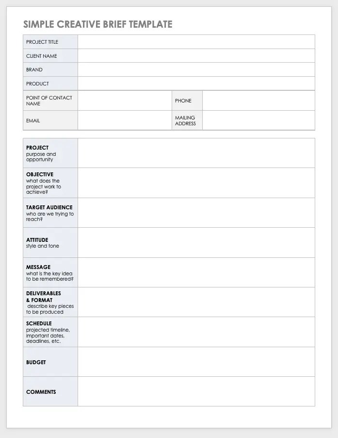
Here is an example of a simple design brief template that you can use to craft your very own design brief:

Simple-creative-brief-template
Download Simple Design Brief Template
Excel | Word

This versatile design brief template is perfect for a wide range of design projects, be it graphic design, web design, or product design. With its user-friendly format, it simplifies the process of gathering information and ensures that all essential information is brought together in one convenient location. 

Should I customize a design brief template?

When it comes to design projects, using a design brief template is a fantastic way for designers to collaborate and gather all the necessary information in one convenient place.

However, customizing the template to fit the unique requirements of different projects can bring even more benefits. By adding your personal touch and adapting the template creatively, you can effectively address specific challenges and goals, ultimately boosting the outcome and client satisfaction.

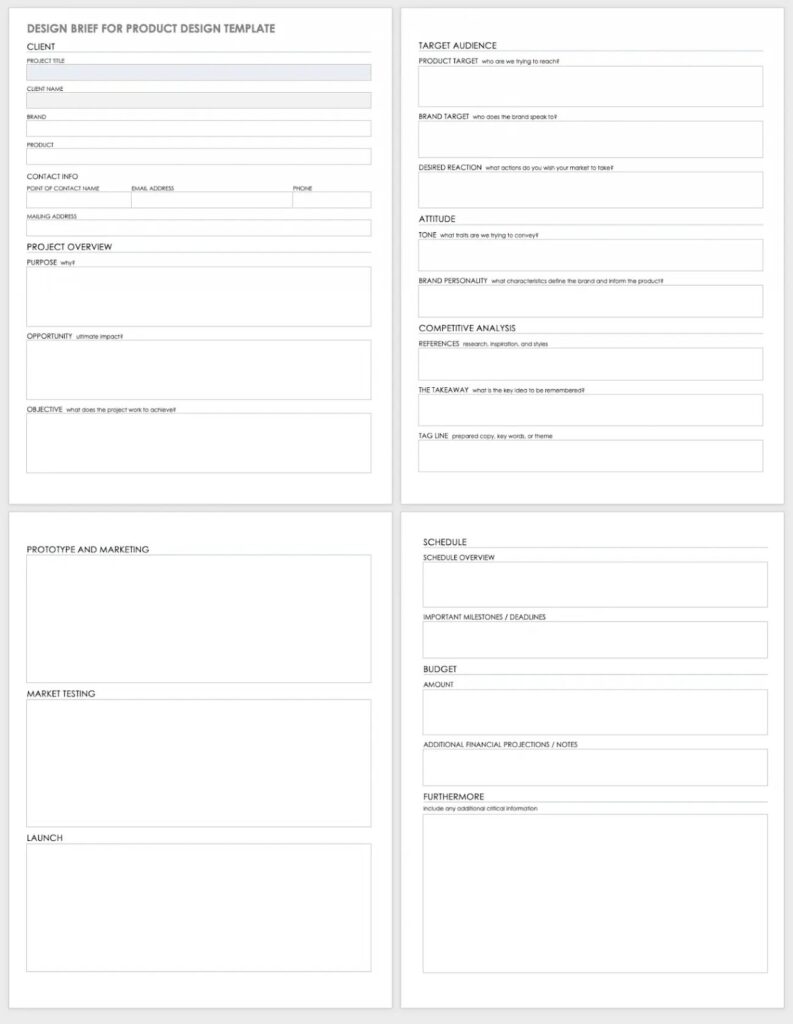
Let’s take a look at an example: a design brief template specifically designed for a product design project. 

Download Design Brief for Product Design
Word | Google Docs

This template is tailor-made for product design, focusing on how the product can provide meaningful and relevant experiences for its users. 

Why is a good design brief so important? 

A good design brief is incredibly important for several reasons, this includes:

  • Clear communication: A brief improves design communication and ensures that everyone understands the project’s requirements and goals. This minimises the potential for miscommunication and costly revisions.
  • Aligning expectations: A design brief helps align the expectations of the client and the designer and outlines the scope of the project, deliverables, and timelines. This ensures that everyone is on the same page from the get-go.
  • Efficient workflow: A good design brief gives designers a clear roadmap to follow, allowing them to focus their efforts on meeting the client’s specific needs. This helps to streamline the entire design process and improve efficiency. 
  • Client satisfaction: Ultimately, a good design brief leads to client satisfaction as designers are more likely to deliver designs that meet or exceed expectations. 

In summary, a well-crafted design brief acts as a cornerstone for successful design projects. It facilitates clear communication, aligns expectations, promotes efficiency, and paves the path to client satisfaction. 

What are the key components of a design brief?

A good design brief will typically include the following key components:

  • Project overview: The nature of the design work required, the context in which it will be used, and any specific challenges or constraints.
  • Objectives and goals: What you hope to achieve through the design.
  • Target audience: The target audience or user group for the design, including details about their demographics, preferences, and needs. 
  • Competition and market analysis: Key competitors in the market landscape. 
  • Brand guidelines: This should include the brand logo, color palette, and any other specific visual elements that need to be incorporated into the design.
  • Deliverables and timeline: The deliverables expected from the designer and the timeline for the project. 

How to write a design brief in 5 easy steps

Creating a well-written design brief requires careful planning and attention to detail. Here are five essential steps in writing an effective design brief: 

Step 1: Gather project information

Before you start writing the design brief, gather as much information as possible about the project, including objectives, goals, and constraints. 

Conduct interviews with stakeholders, review existing materials, and analyze the market and competition. The more information you have, the better you can define the project’s requirements.

Step 2: Define your target audience

To create a design that resonates with your user, it’s crucial to gain a deep understanding of your target audience. Conduct in-depth research to uncover valuable insights about their demographics, preferences, and needs. 

By truly understanding your audience, you can tailor the design to effectively communicate with them, capturing their attention and engaging them in a meaningful way.

Suggested reading: How to Find Your Target Audience

Step 3: Outline project scope and deliverables

Clearly define the scope of the project and specify what is included and what is not. Establishing clear boundaries will help prevent scope creep and ensure that the project stays focused and meets client expectations. 

According to a study by the Project Management Institute, nearly 50% of projects experience scope creep, and only 57% finish within budget while only 51% are finished on schedule. A well-crafted design brief can help your design team avoid these common pitfalls. 

Step 4: Establish objectives and constraints

Set clear project objectives and goals. Define measurable outcomes and identify any constraints or limitations, such as budget, timeline, or technical requirements.

TIP:  When defining the timeline and budget, it’s important to ensure they are realistic and mutually agreed upon. This will help to prevent any future conflicts and ensure that the project runs smoothly. 

Step 5: Structure and format the design brief

Finally, organize the design brief in a clear and concise format. Use headings, bullet points, and visuals to make it easily readable. Include relevant brand guidelines and examples to support the information.

Tips for creating the perfect design brief 

  • Keep your brief short and concise: Designing something already takes a significant amount of time, so no one should have to spend hours trying to understand a poorly formatted design brief. Make sure that your design brief is well-structured, visually appealing, and easy to read.
  • Make it interactive: Creating an interactive design brief can enhance the overall experience for both designers and clients. Use media like graphs, images, and interactive features to provide a visual representation of ideas and capture the attention of the reader.
  • Collaborate with stakeholders: Involve all relevant stakeholders in the design brief creation process. This could include the client, marketing team, and product managers. Encourage open communication and gather valuable insights from different perspectives.
  • Include brand guidelines: If applicable, provide brand guidelines, including the brand logo, color palette, and any other specific visual elements that need to be incorporated into the design. This will help the designer better understand the visual direction and ensure consistency with your brand’s identity.
  • Review and revise: Go through the design brief and give it a thorough review to make sure it’s clear, complete, and accurate. Check that you’ve included all the key information and that it matches the project requirements. Make any necessary edits or changes to improve the design brief before it is finalized. 
  • Ask for feedback: Share the design brief with the client or stakeholders and ask for their feedback. Take their input into account and see if they have any suggestions or if they need any clarifications. Once everyone is happy, get their final approval before moving on to the design phase.

Final thoughts 

A well-written design brief is a powerful tool that sets the foundation for a successful design project. It ensures clear communication, aligns expectations, improves efficiency, and ultimately, leads to higher client satisfaction. 

By following the steps outlined in this article, you can create an effective design brief that will guide the entire design process. So, invest time and effort into creating a detailed design brief, and watch as it becomes an invaluable tool in your design process.

Impact mapping is a relatively new technique that has gained popularity recently as more businesses look for ways to improve their product planning process. 

It provides a visual representation of various stages of a product strategy and measures the impact of any changes on the business. This helps to align development teams on goals with the desired impact on their stakeholders.

What is impact mapping? 

Impact mapping is a collaborative planning tool that improves alignment between development teams and stakeholders. It helps teams uncover the areas that will have the biggest impact and help them achieve a particular goal or objective.

The impact mapping method was first developed by Gojko Adzic, a well-known agile author and strategist who wrote a book of the same name in 2012. The concept is based on outcome-driven planning, user interaction design, and traditional mind mapping.

What are the benefits? 

Impact mapping offers several benefits, including: 

  • Better alignment between leadership and development teams
  • More clarity around the product strategy, outcomes, and goals
  • Less chance of project scope creep
  • Easier to identify and avoid potential bottlenecks 
  • Better understanding of how deliverables connect to user needs
  • Improved communication and collaboration between teams 

When is impact mapping used? 

  • To create a roadmap for product development 
  • To set project or personal goals 
  • To create a product vision 
  • To define the project scope
  • To reframe a problem 

How to get started with impact mapping? 

Gojko defined impact mapping as a 4-level process and introduced the idea of answering one specific question with every stage of product development:

  • WHY
  • WHO
  • HOW
  • WHAT

1. Why are we doing this? 

The first step of impact mapping is to define the goal or objective you’re hoping to achieve in the next phase of your product’s development. 

The goal should be SMART (Specific, Measurable, Attainable, Relevant and Time-based.)

Example: Your goal is to increase user conversion by 30% by the end of the year. 

2. Who will help us? 

You then need to determine who will help you achieve this goal — Gojko refers to these people as “actors.” Ask yourself: 

  • Who can produce the desired effect?
  • Who can prevent it?
  • Who are the consumers or users of our product?
  • Who will be impacted by it?

Example: The actors who will help you achieve your goal may include the marketing department, existing users, new users, or customer support. 

3. How will they help us? 

Now you should consider how these actors will help you achieve your goal or objective. You should consider the following: 

  • How should your actors’ behaviours change?
  • How can they help you to achieve the goal?
  • How can they prevent you from succeeding?

Example: You actors could make an impact by creating a personalised user experience, optimising layouts on critical pages, or improving user assistance. 

4. What will we do? 

Finally, you should consider: 

  • What can you do, as a team, to encourage this desired behaviour? 

Example: Introduce a live chat feature, maximise personalisation investments, or run workshops with your customer support team to align on company values, mission, and culture.

In this stage, you should write down as many actions as possible that will help you achieve the outcomes identified in stage 3. You then need to prioritise these actions based on how much value they will deliver to your company. 

Tap into the power of impact mapping!  

Impact mapping is a powerful tool that helps teams simplify complex product planning and improve their overall product strategy. You can use the impact mapping technique to prioritise new features based on your company’s goals and boost team collaboration. 

Designing anything, whether it’s a new product, a building, or a brand logo, requires a systematic approach to create something that is functional and visually appealing. That’s where the design process comes in.   

In this guide, we’ll explore what the design process is, why it’s important, the stages involved, how you can adapt it to your needs, and provide some useful tips for using it effectively.

What is the design process? 

The design process is a step-by-step method that designers use to solve problems or create a new product or service. It provides a structured roadmap for designers to follow, ensuring that their work is organized and well thought out. 

While there are variations in the design process depending on the specific industry or project, the core principles remain the same.

Why is the design process important? 

The design process is important for a variety of reasons. Let’s look at the key reasons why this disciplined approach is so valuable in design projects:

  1. Clarity and organization: One of the biggest advantages of the design process is that it brings clarity and helps designers establish a clear understanding of the problem they are trying to solve. Following the design process methodology enables designers to navigate the challenges they face and remain focused on their goals. 
  2. Efficiency and consistency: By following a defined framework, designers can work more efficiently, saving valuable time and resources. The process streamlines their workflow, minimizes errors, and encourages consistency across various design projects. This also makes it easier to replicate successful results in the future.
  3. User-centric approach: The design process supports a user-centric approach by encouraging designers to gain a deeper understanding of their target audience. This enables design teams to create innovative products that meet users’ needs and expectations. 
  4. Collaboration: Following a structured framework makes it easier for designers and other professionals to collaborate and bring their ideas to life. The design process provides a common framework for effective communication and helps to align team members around a shared vision.

What are the stages of the design process? 

While the design process may vary depending on the industry or project, it typically consists of the following stages:

Stage 1: Define

The first step is for the designers to define the problem they are trying to solve by conducting thorough market research and analyzing relevant data. The goal is to gain a clear understanding of the project’s objectives and the needs of the target audience.

The design team should try and answer key questions, including: 

  • What problem do they want to solve?
  • Who is facing the defined problem? 
  • Will the product help the target audience  overcome the defined problem? 
  • What are the requirements for the project?
  • What goals do they hope to achieve? 
  • Are there any limitations e.g. budget or time constraints? 

Suggested reading: If you learn more about conducting research in the design process, check out Effective UX Research: Preparing for Research

Stage 2: Ideate

During the ideation stage, designers brainstorm and generate a wide range of ideas and concepts. They explore different possibilities, challenge assumptions, and think outside of the box. This stage encourages creative thinking, challenges assumptions, and aims to generate a diverse pool of potential solutions. 

Taking this approach increases the likelihood of design teams discovering unique and innovative solutions.

Stage 3: Prototype

Creating a prototype or mockup is the most visual part of the design process. Prototypes can take various forms depending on the project, such as sketches, wireframes, or interactive mock-ups. These prototypes are used to visualize and test the design concepts.

Stage 4: Test

In the testing stage, designers gather feedback on the prototypes from users or stakeholders. The user should be asked relevant questions such as: 

  • Did the product solve their problem?
  • What was their first impression of the product? 
  • Did they face any challenges when using the product? 
  • What could be done to improve their experience? 

This feedback helps identify strengths, weaknesses, and areas for improvement. Prototype testing and refinement ensure that the final design meets the needs and expectations of the intended user.

Stage 5: Implement

After finalizing the design based on user feedback, the implementation stage begins. This involves translating the design into a tangible product, service, or experience. The design team will often collaborate with other professionals, such as developers or manufacturers, to bring the design to life.

Stage 6: Measure 

The final stage of the design process is to measure how effective the final design is once it’s released. This stage involves gathering data, analyzing metrics, and measuring design performance against the project’s objectives.

Measurement can take various forms depending on the nature of the design. For example, designers may track user engagement or conversion rates when assessing the performance of a new digital product.

The purpose of the measurement stage is to determine whether the design is meeting its intended goals and to identify areas for improvement. 

Suggested reading: If you want to find out more about assessing product success, check out How to Measure Product Launch Success: 12 KPIs You Should Be Tracking

How can I adapt the design process to my needs? 

The design process is flexible and can be tailored to suit your specific needs and requirements. You should modify the design cycle and spend more or less time on various stages depending on your circumstances. 

Here are a few tips to help you customize the design process to suit your project:

  • Understand your project requirements: Gain an in-depth understanding of the specific goals, constraints, and target audience of your project. This will help you tailor the design process to suit your specific needs and objectives. 
  • Modify the stages: You do not need to follow these design stages rigidly. You may need to adjust the order or focus on certain stages to ensure the best outcome. For instance, if you have a tight timeline, you may choose to prioritize prototyping and testing over extensive ideation.
  • Collaborative adaptation: Involve your entire design team in adapting the design process. Ask for their input and expertise to customize the process to fit the project’s needs.
  • Reflect and adapt: After completing a project, take the time to reflect on the design process and its outcomes. This will allow you to adapt the design process to optimize your design outcomes in the future.

Tips to use the design process effectively

  • Remember that the design process is not linear. Using the framework effectively often involves moving back and forth between the various steps. You may need to return to previous steps to evaluate earlier decisions or gather additional information.
  • Embrace a user-centric approach. Put the needs and desires of your target audience at the centre of the design process. Adopting a user-centric approach can significantly boost revenue as 86% of consumers are willing to pay more for a better customer experience. 
  • Test early and often: Incorporate user testing throughout the design process. Testing your design concepts and prototypes with real users will help you gather valuable insights and identify issues early on in the design cycle.
  • Take regular breaks: Various studies have highlighted the importance of taking regular breaks when working on complex problems. Design can be a mentally demanding process and taking some time to recharge will help you gain new perspectives and approach your design challenges with renewed creativity and focus.

Suggested reading: If you want to find out more about the role of user experience (UX) in design, check out All You Need to Know About Effective UX Research Part 2: Conducting the Research

Final thoughts 

The design process is a valuable tool for any designer, providing a structured approach to problem-solving and creation. To use the design process effectively, remember to adapt the framework to your specific needs, prioritize user testing, and encourage regular breaks to maintain creativity and focus.

By following the stages of the design process, designers can boost efficiency by streamlining workflow and minimizing errors. Its user-centric approach also ensures that designs meet the needs and expectations of users, leading to innovative and user-friendly products. 

So, dive into the design process, unleash your creativity, and watch your ideas come to life!

Most product design projects start with desk research — also called secondary research. This type of market research involves collecting data from existing resources, making it the opposite of primary research where you go out and study things first-hand.   

But what is desk research? When is it needed, and how do you do it?  

This blog will answer these questions and explore how desk research will lead you towards user testing and continuous research throughout the product development process. 

Why is conducting research important? 

Before you decide to launch or design a product, you should get answers to several questions such as:

  • What is the current market situation? 
  • Does the market need this product? 
  • Who are your potential customers? What are their needs and pain points? 
  • What problems can you solve that competitors cannot? 
  • What do customers like/dislike about your product? 

Product research helps you make well-informed product development decisions, identify potential issues, and gain insight into your customer’s needs and desires. This will enable you to build a well-structured strategy and develop products that your customers will love. 

The consequences of poor market research 

In 1985, Coca-Cola updated its classic coca-cola drink with a new formula. The company had performed 190,000 blind taste tests on consumers and discovered that they preferred the sweeter flavour of its rival Pepsi — so the ‘New Coke’ was launched. 

The problem was that Coca-Cola had underestimated loyal drinkers’ emotional attachments to the brand. Its market research testers failed to ask subjects how they would feel if the new formula replaced the old one. 

The new formula caused outrage among loyal customers and executives were forced to bring back Coca-Cola’s original flavour just 79 days after their initial announcement. This was a costly mistake that lost the company millions in revenue. 

What does desk research involve?

As mentioned, desk research is a research method that involves using existing data. This technique allows you to gather ideas and research your market and users “from your desk.” 

You can collect this type of secondary research from published materials in reports, articles, or similar documents that are easily accessible on the web or in public libraries.

Why is it essential? 

  • Secondary data sources are easy to find 
  • This research method is cheaper than primary research 
  • This research method takes much less time than primary research 

How to do desk research in 5 steps 

Step 1: Define your research objective 

The first step is to describe what you intend to accomplish with your research project. You can identify this by answering key questions that are relevant to your market and customers. 

For example, if you are a French baker and want to create bread with alternative flour, your questions should break down every question within that process, such as: 

  • What alternative flours are available in France? 
  • Which of these flours are affordable? 
  • Among the remaining choices, which flours are easy to use? 
  • Among the remaining choices, which flours taste good? 
  • What alternative flours are currently used by bakers in France? 
  • Who are you selling this new bread to?

Step 2: Build a research plan 

You then need to decide how you will complete this research and answer the questions you have set. As part of your research plan, you’ll need to decide which platforms you will use for your research.

Some popular resources include: 

  • Government, non-government agencies, and trade body statistics 
  • Company reports and research 
  • Competitor research 
  • Public library collections 
  • Textbooks and research journals 
  • Media stories in newspapers 
  • Online journals and research sites 
  • ChatGPT

3 tips for conducting desk research: 

  1. Check the credibility of resources 
  2. Check the date on publications and use up-to-date information
  3. Avoid duplicating desk research by checking what has been done already

Step 3: Use the right tools and resources 

There are many resources available for desk research and you must choose the right tools for your project. 

Here are some reliable sources that we recommend using for secondary research:

  • JSTOR: This is a great resource to find research papers. Any article published before 1924 in the United States is available for free on JSTOR and the digital library also offers scholarships for independent researchers. 
  • Google Scholar: This is the most popular and easy-to-use search engine that can present scholarly pieces of writing on any topic you require. Google Scholar is free to use, and you can search for any type of publishing format. 
  • ChatGPT: This is a large language model (LLM), a machine-learning system that autonomously learns from data. 

There are also lots of great tools that you can use for competitive analyses, including:

  • Crunchbase: This is a live company database which updates constantly. This tool helps you identify upcoming marketing tendencies. 
  • Capterra: This is an intermediary between buyers and technology vendors within the software industry. Here, you can find the most comprehensive lists of products per industry, reviews, ratings, and infographics, and easily compare competitors. 
  • Serpstat: This is one of the top-rated SEO tools that will help you outline competitor analysis simply by entering your domain.

Step 4: Conduct user testing 

Desk research is a fast and affordable research method but it should be combined with qualitative user research to get the best results. Once you’ve completed your desk research, you can begin talking with real users and testing your products. 

User testing is a crucial part of the product design process and it is much more than simply having a functional product. It’s about maximising everyone’s return on investment and elevating the design to ensure the end product will achieve the desired goals and objectives. 

There are two types of usability testing: 

  • Quantitative testing: This focuses on the usability of a design and assesses users’ performance on a given task, such as completion rates or task times. Quantitative data is usually sourced from questionnaires, surveys, or A/B Testing
  • Qualitative testing: This focuses on the user’s emotions and identifies which design features are easy or hard to use. Qualitative data is usually sourced from interviews and user observations. 

Why user testing is important

Let’s look at an example of why user testing should be an essential part of product development…

In 1990, the well-known beer brewing company Coors decided to tap into the booming bottled-water market by introducing Rocky Mountain Sparkling Water. 

Coors kept its easily recognisable logo at the front and centre of the label. This confused customers, leaving many worried that the new beverage may contain alcohol. 

If Coors had carried out user testing, they would have discovered that the Coors name did not help sell the new product. In fact, it confused and even frightened customers. 

Step 5: Prepare a post-research report 

Documentation is essential to all areas of research, and you should start documenting right from the beginning of the process. Create a detailed research report of all desk research and user research you find. 

You can then share your research findings in the form of a presentation for your team and stakeholders.  

Final thoughts 

Desk research is an easy and cost-effective form of market research that should be the starting point of every product design project. Your desk research will guide your project, leading to effective user testing and ensuring continuous research throughout the design process. 

We hope this article has provided you with useful information about desk research and how to implement it in your next product development project. 

Introduction

As a UX/UI designer, you are well aware that devising creative design concepts and producing high-quality designs require a great deal of time and effort. Fortunately, with the most recent progressions in artificial intelligence (AI) and natural language processing (NLP), you can now streamline the design workflow with ChatGPT. 

In this article, we will look into how ChatGPT can help optimize your design process and give advice on how to begin.

The Benefits of ChatGPT for Designers

ChatGPT is a technology that combines Artificial Intelligence and Natural Language Processing to create answers that imitate human responses. There are many advantages of using this tool, including the ability to come up with new design concepts, build prototypes, and evaluate existing designs. Utilizing ChatGPT can save time, boost creativity, and produce more successful designs.

Examples of ChatGPT in Action

ChatGPT can be used in design sprints and with specific design tools, such as User Personas, Customer Journey Maps (CJMs), Empathy Mapping, and Jobs-to-be-Done (JTBD) frameworks.

Design Sprints:

During the empathy phase of a design sprint, ChatGPT can generate a list of questions to ask potential users to better understand their needs and pain points. During the ideation phase, ChatGPT can generate ideas for possible solutions to the problem.

User Personas:

ChatGPT can generate user personas based on various factors such as demographic data, behavior patterns, and pain points. These personas help designers better understand their users and design products that meet their needs.

Customer Journey Maps (CJMs):

ChatGPT can generate CJMs based on data about the user’s behavior and interactions with the product or service. Designers can use the generated CJMs to identify pain points in the user journey and improve the overall user experience.

Empathy Mapping:

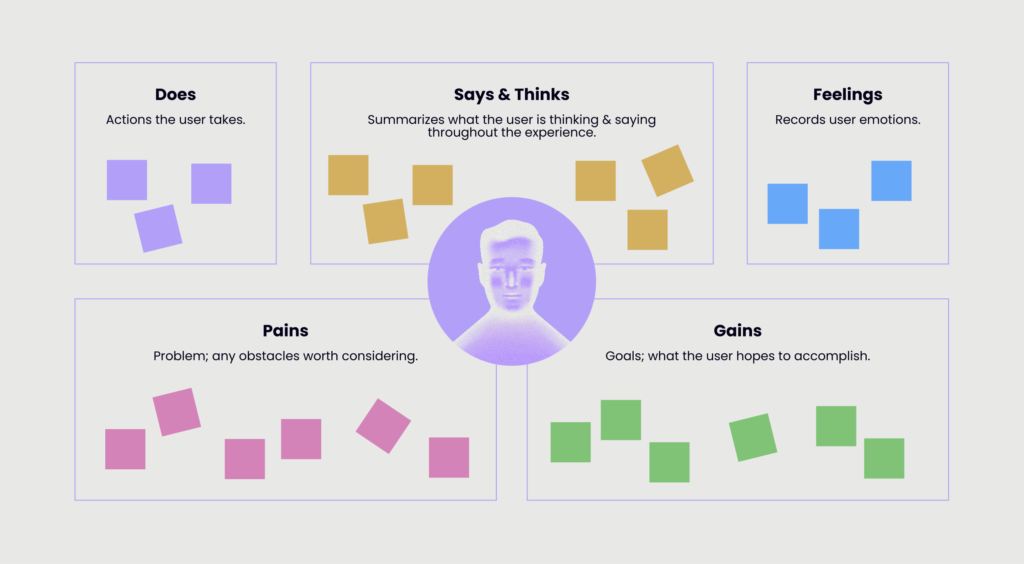
ChatGPT can generate prompts for empathy mapping exercises, such as “What does the user see?” or “What does the user hear?” These prompts help designers to gather information about their users and better understand their needs.

Jobs-to-be-Done (JTBD):

ChatGPT can generate prompts for JTBD exercises, such as “What problem does the user need to solve?” or “What is the user trying to achieve?” These prompts help designers to understand the context in which users are using the product or service, and design solutions that meet their needs.

Tips for Using ChatGPT Effectively

Tips for Using ChatGPT Effectively

To make the most of ChatGPT, designers must pick the right initiating questions, refine the results, and avoid typical errors. Some tips for getting the most out of ChatGPT are to select the suitable setting for your initiating queries, modify the length of the output, and check the accuracy of the generated text.

Conclusion

ChatGPT represents a creative solution for designers to optimize their workflow and come up with more effective designs. This technology can be used to save time, create innovative concepts, and evaluate their designs. 

This article has provided readers with useful information on how ChatGPT can be of assistance to UX/UI designers, and we urge designers to experiment with this technology in their design processes.

Designing a financial app that meets users’ needs and preferences is crucial to achieving financial goals. But with so many apps out there, how can you make yours stand out? One useful principle that designers can use is called Jakob’s Law, which is based on the familiarity principle.

Jakob’s Law, also known as the “mere-exposure” effect, suggests that people prefer things they are familiar with. In social psychology, it is known as the “familiarity principle.” According to Jakob’s Law, users’ expectations about a product shift to another if it seems familiar. This means that designers can make their financial app more user-friendly by using design patterns that users are already familiar with.

So, how can banks and financial professionals apply Jakob’s Law to financial app design? Here are a few tips:

  1. Use pre-existing design patterns: Users are already familiar with common design patterns that are used in other apps. By using these patterns in your financial app, you can make it easier for users to learn and use your app. For example, users expect the login button to be in the top right corner of the screen, so don’t put it in a different location.
  2. Identify users’ “desire paths”: Users have certain tasks they want to accomplish in your financial app, and they expect to find them in a certain location. Identify these “desire paths” by using session recording tools to see how users interact with your app. Then, place the most important features where users expect to find them.
  3. Strike a balance between familiarity and uniqueness: While using pre-existing design patterns can make your financial app easier to use, it can also make it seem boring and unoriginal. To make your app stand out, add unique design elements that align with your product and brand. But don’t go overboard – the app should still feel familiar to users.
  4. Use the “Five Whys” technique: If you’re struggling to identify new concepts to apply to your financial app design, try using the “Five Whys” technique. Start by asking “why” five times to understand a problem, and then use that information to arrive at a solution.

By following these tips, banks and financial professionals can create financial apps that are both user-friendly and unique. Remember to keep the user in mind and use design patterns that are familiar to them, but also be creative and add unique design elements that align with your brand.

Jakob’s Law is a powerful tool for designing financial apps that can revolutionize the industry. By applying this principle, banks and financial professionals can create apps that not only meet users’ needs but also stand out from the competition. By boosting the user experience and increasing user engagement, these apps can also boost the bottom line. So, don’t overlook Jakob’s Law when designing your financial app – it could be the key to your success.

Windmill Digital offers high-quality product design services. Our experts are highly skilled in their field and are experienced in creating exceptional products for our broad range of clients.

For more information, contact us here.  

A product vision statement is a valuable tool that tells the outside world where your product is heading and what you hope to achieve. Creating a product vision statement should be the first step in launching any new product and its importance should not be overlooked!

This blog will tell you everything you need to know about a product vision, with tips on how to write a compelling vision statement for your next project.

What is a product vision?

A product vision, also known as a product vision statement, is the core essence of your product. It outlines the long-term goal of your product and your reasons for creating it.

Product vision examples
  • Google: “To provide access to the world’s information in one click.”
  • LinkedIn: “To create economic opportunity for every member of the global workforce.”
  • Apple: “A revolutionary phone, an iPod, and an internet communicator together in one product. Apple reinvents the phone”.

Suggested reading: Product Vision Examples That Define Great Products

Product mission vs vision

Many people confuse mission with vision, but there are some key differences between the two. Crayond explains how the product vision is the ‘what’ and the product mission is the ‘why’.

A product vision statement focuses on the reasons behind creating the product while the product mission statement focuses on actions and bringing all tasks together.

Why is a product vision statement important? 

Aligns your product development team 

Your product vision statement reminds all team members and stakeholders about the shared goal they’re trying to achieve with the product. This helps to bring your team together and reminds them of why they’re doing what they’re doing.

Improves chances of success 

Did you know that almost 95% of new products launched every year are likely to fail? Or that  50% of product development teams fail to have a consistent or well-prepared process?

A clear product vision statement will help you create an effective product strategy. This will improve your chances of launching a new product to the market successfully and gaining revenue. 

Creates a better product roadmap

Another benefit of a product vision statement is that it will help you create a better product roadmap. You can use the information in your product vision to create a strategic guide and action plan for your product development team to follow. 

Improves team productivity 

Your product vision statement will give your team a clearly defined vision and goal. This will improve workplace productivity and help you achieve your business objectives faster. 

Enables faster decision-making

A product vision statement gives your team a clear direction and helps them make faster and better decisions throughout the product development journey. 

When is a product vision needed?

A product vision statement should be created whenever you start developing a new product. It can also be a useful tool to align your team when you are making updates or tweaks to existing products.

Who creates the product vision statement? 

Writing a product vision statement is a complex task and requires careful planning and teamwork. Invite team members and relevant stakeholders to get involved and organise a creative brainstorming session to discuss ideas.

You should aim to answer key questions such as:

  • Who is your target user?
  • Who are your competitors?
  • What are your product USPs?
  • What challenges does your product help users overcome?
  • What is the product development timeframe and budget?
planing

TIP: One effective method is to ask each team member to write down their goal for the product. You can then compare and discuss everyone’s answers and come up with a product vision by the end of the session.

What is a product vision template? 

A product vision template is designed to help you create an effective vision statement for your product. The book Crossing the Chasm by Geoffrey Moore provides the following product vision template for business: 

For (target customer) who (statement of need or opportunity), the (product name) is a (product category) that (key benefit, reason to buy).

Unlike (primary competitive alternative), our product (statement of primary differentiation).

What are the desirable qualities of a product vision?

  • Achievable: A product vision can be ambitious, but make sure that it is also realistic.
  • Customer-focused: A good product vision should be customer-focused and provide value to your target audience. 
  • Concise: A product vision statement should be short and concise. Most product vision statements are only one or two sentences. 
  • Accessible: Your team should be able to access your product vision statement easily. 
  • Inspirational: Your product vision should inspire, excite and motivate your team. Make sure that your end goal is clear and easy for your team to visualize.

5 tips for creating a product vision 

  1. Align your vision with your mission: Your product vision statement should be aligned with your company mission and values.
  2. Create an agile product vision: Your team should have the flexibility to adjust the plan to achieve the product vision at any time needed.
  3. Organise an empathy mapping session: Empathy mapping is a technique that many companies use to create product vision statements. It involves improving your team’s understanding of your customers and aligning them around a common ideal/goal.
  4. Use a product vision template: Using a template, like the one mentioned above, will make the process much easier and faster. You can also use a product vision board tool to help you set clear goals and objectives for your product.
  5. Run a product vision workshop: Invite your team to a product vision workshop with the goal of agreeing on a clear product vision statement.
image

Suggested reading: How to Run a Product Vision Workshop

Summary 

A product vision statement is an essential tool that will help your team stay on track and achieve your desired business objectives. When used correctly, a product vision will align your product development team, improve productivity, and increase sales revenue.

When embarking on a journey, especially one to an unfamiliar location, you do not leave anything to chance. You’ll need a plan for how to get there, and a map, whether traditional or digital, like Waze or Google Maps, will make the journey more pleasant. 

Similarly, having a graphic outline of how your potential customer experiences your product or service is critical to creating a memorable experience for them, which translates to better lead generation and increased customer retention, among other things.

Source: Delighted.com

Getting a customer to buy a product may appear to be a simple task. You make your product available, and your target customer sees it and purchases it. However, according to the most recent Baymard Institute data, the average cart abandonment rate across industries is 69.89 percent. In other words, seven out of ten shoppers abandon their shopping carts without making a purchase.

So, for your products to be successful, you must first understand the path your prospective customers take to reach your products, as well as what they need and value the most.

The Function of Customer Journey Maps in Design Thinking

In Design Thinking, getting to know your customers’ personas and understanding how they interact with your brand gives you a pretty good idea of how they will behave in the future. An excellent way to do this is through customer journey mapping.

A journey map is a detailed visualization that depicts the experience of a user-based persona as they use a specific product. It depicts the steps your customers take when interacting with your product or service.

A customer journey map specifies three elements:

  • The points at which prospective and existing customers interact with your brand. 
  • What the customer seeks at each point.
  • The path they take from one point to the other, as they move towards buying your products. A map can be illustrated for an online experience, retail experience, or a combination of these.

Why should a company carry out customer journey mapping?

Making a customer journey map confers a lot of advantages that include:

Understanding your customers more—The better you understand the customer’s expectations, the more you can tailor their experience to fit their needs.

Make better measurable decisions—By following each milestone on the journey map, you can easily measure the progress of optimizing your product’s purchase process against the customer experience desired by your customers.

Identify and improve business processes—The mapping process brings together sales, marketing, and customer support to define what customers need to know before they buy, what they need after they buy, and how these interactions can be enhanced.

Identify growth opportunities—You can use the journey map to identify new growth opportunities for your company.

Run a tight customer-centric ship—During the mapping process, auditing your content can reveal areas where you are losing customers and how you can shore up and strengthen those areas.

Steering content priorities—It’s easy for teams to become distracted by a new and exciting idea. A journey map that expresses the needs of the target audience helps to ensure that the team stays true to what your audience wants and needs.

When should it be done?

Customer journey mapping can be do when your start-up wants to:

  • Assess the gaps in your current service offering.
  • Increase the personalization of customer interactions for each customer profile or segment.
  • Create a more effective marketing strategy for your new products and services.
  • Recognize how each customer persona’s service experience differs.
  • Develop a new experience while keeping the important moments in mind.
  • Compare your competitors’ journeys to yours and create better differentiators.

Download our free customer journey map template


Customer journey map

If you’ve downloaded Windmill Digital’s free Customer Journey Map template, you can make and customize it to meet the needs of your brand or product.

But, before you begin creating your customer journey map, let us explain how to fill it successfully. We’ll go over what each component represents and what to expect from each question.


The 7 Key Components of the Journey Map

  1. Name/ Persona

A user persona is a fictitious character representing a distinct customer segment of your start-up. When creating this persona, be sure to consider characteristics like background, demographic, lifestyle, character, information sources available to them, as well as shopping preferences. The information to build user personas can be gathered through user interviews, empathy maps, surveys, etc.

  1. The Phases (Step 1-7)

A customer journey map includes significant milestones in the customer journey. You’ll begin by drafting the path your business intends for a customer to take to reach a goal. Using the typical buying process stages, you’ll list each stage horizontally. 

  1. Doing

This section of the customer journey map details the action a customer takes at each stage of the buying process. List out every action your customers take all through their interaction with your company. Whether clicking on a CTA link in your email or searching on Google.

Take note if customers take too many actions to get to their goals. Finding a solution to this by cutting down the number of steps a customer needs to take can feel risky, but it will pay off in higher conversion rates.

  1. Thinking and Feelings

Emotion drives everything your customer does. And their emotions change depending on where they are in their journey.

If your process is lengthy or complicated, they may experience a variety of emotions at each stage. Including these emotions on the journey map can help you mitigate negative journey emotions so they don’t become synonymous with your brand.

  1. Pain point voting dot

Where there is a negative emotion, there’s a pain point that caused it. Adding pain points to your customer journey map can help you identify which stage your customer is experiencing negative emotions and deduce the reason why.

For example, one of your customers could love your product but abandon their cart upon discovering unexpectedly high or hidden delivery charges.

  1. Improvement pain point

Improvement pain points are where you and your team plan on how to potentially mitigate these pain points. 

This segment aims to improve your purchasing process so that your customers have few or no issues with it and have positive emotions when they patronize your business.

For example, one way to alleviate the pain points associated with delivery charges could be to provide a FAQ page where customers can learn more about the charges.

  1. Touchpoints

A touchpoint in a customer journey map is a point at which your customer can form an opinion about your company. Touchpoints can be found anywhere your company has direct contact with potential or existing customers. Customer touchpoints can include a pop-up ad, interactions with your employees, notifications and error messages, and even a Google review.

Conclusion

Customer journey mapping is not a one-time event. The customer journey is subject to change, and your brand must be prepared to adapt. However, the template provided here should give you a good start in better understanding your customers’ journey as they interact with your company, brand, products, partners, and people.

Remember to map out the various journeys taken by the persona representing your various customer segments. This can be time-consuming, but worthwhile because boosting customer retention percentages by just 5% can maximize profits by 25% to 95%.

User interviews are one of the most important aspects of UX research. When designing anything in UX, considering the user’s needs and perspectives and how the product affects them is critical to success. Similarly, before releasing a product to the market, start-ups must incorporate user interviews into every stage of the development process. If you’re a designer, a UX researcher, or work in any other area of UX, user interviews are an essential tool in your toolbox.

In this post, we’ll discuss how to interview users about their interactions with your product. We’ll break down what a user interview is, its advantages, and when to conduct one. We also have a free user interview template and some pointers on how to get the best use out of it. But first, what exactly is a user interview?

What is a User Interview?

Because of its effectiveness, the user interview is one of the most-used methods of user research in UX. It is a research method that provides deep insight into users’ needs, pain points, and desires, thus developing user empathy.

It can be conducted in a variety of settings, including traditional face-to-face interviews at a company’s headquarters, in a neutral location, or even at the user’s home. In situations where time or movement is limited, user interviews can also be conducted via video or voice call. 

For some projects with ample time and resources, the designers or researchers may be flown overseas if the target users live in a different country.

User interviews provide insight into how your target audience discusses a problem in a more intimate setting. Listen for their main problems, needs, wishes, and joys regarding a process, service, or solution as they speak. Aside from what they say, the way they express themselves when discussing such topics reveals a lot.

Be open-minded and interested in what your participants have to say when conducting interviews. If you are only conducting user interviews to confirm previously held assumptions, or to verify previously collected data, user interviews are not the right UX research methodology for you.

Why should we conduct user interviews?

User interviews let you interact with users one-on-one. Beyond theories and assumptions, you can get to know the people for whom you’re designing, learn their language, and how to communicate with them.

It allows you to collect real-time data from users about their experiences and the usability of your product or service.

It assists in defining the pain points and potential opportunities for your product to provide value to the user.

Insights from user interviews aid in the development of future products. Knowing the target user’s pain points and designing around them can help to reduce development and testing costs.

User interviews guide you in redefining your business model to be more efficient on how your product interacts with the user.

It aids the identification of new target audiences. Famously, Febreeze was selling poorly until Proctor & Gamble, aided by a new round of user interviews, switched the product’s marketing approach. The switch, which linked Febreeze to pleasant smells and good cleaning habits, worked, and sales took off.

When should it be used?

User interviews can be useful at various stages of the product development process.

Ideation. This stage is when you have a need that you want to create a solution for—but aren’t sure what form it will take. In interviewing people who have similar pain points, you gain a better understanding of your potential users’ wants and needs. The information gathered during the interview will help in creating a solution.

Contextual interview.  In contextual interviews, before being interviewed, the participant is observed using the product. This is usually done in the early stages of the product’s development, to assess the user’s experience live. 

Post-product development. When the product has been considered finished, before it’s launched into the market, testing is recommended. 

At any point you need clarification from the participant. User interviews can also be conducted if you have questions or problems that require additional insight from the participant. This is especially important if you want to interact with your respondents. It can offer insight, particularly for existing solutions.

How to use the User Interviews template?

User Interview Questions:Tell me about yourself and your relation to product [project/ website or application]What are the most important tasks you or other people need to perform in using [project/ website or application]?How would you describe your past and current experience with [project/website or application]?What devices do you typically use when visiting [project/ website or application]?
User Interview questions 2What is your main goal when visiting the [project/ website or application]?How often do you use or see yourself using [project/ website or application]?QuestionQuestionQuestion

Use the provide user interviews template in conjunction with this guide for best results.  

But we’re going ahead and breaking down what to expect from each question to make it easier for you.

Q1. Tell me about yourself and your relation to the product [project, website, or application].

This question serves two functions. On the one hand, it collects information from the user. On the other hand, it also serves as an icebreaker. It relaxes the user and makes them feel at ease.  

Q2. How would you describe your past and current experiences with [project, website, or application]?

This open-ended question seeks to elicit any previous negative or positive experiences they may have had with the product. Encourage them to provide answers that are clear, specific, and accurate.

Watch what their expression says in addition to what they say with their words. Are they bitter, frustrated, happy, anxious, nervous, or even neutral? Their demeanor may convey far more than their words.

Q3. What devices do you typically use when viewing the [project, website, or application]?

This question is to review how easy it is for users to access your product. Does it require extra effort, time, or resources to access your product? Be careful not to ask leading questions as it can cause the user to answer falsely and tell you what you want to hear.

Q4. What’s your main goal when visiting the [project, website, or application]?

What is the reason for their use of your product? What problem or need are you looking to solve? What benefit do they receive from using your product?

Don’t be hesitant to request interviewees to expand on their responses.

Q5. How often do you use or see yourself using [project, website, or application]?

How frequently does the participant utilize the products? If necessary, you may ask follow-up questions. For example, for the user who does not frequently use the product, find out why. And how they believe it could be improved upon.

As well as a series of questions to guide you toward a deeper understanding of users’ genuine feelings in relation to your product, our template includes and also a few blank entries. Fill these spaces with some more specific questions of your own around your user interview goal.

These questions should help you understand what your users’ goals are, what their needs are, and how they think and feel. Avoid asking yes or no questions: On the contrary, open questions will provide you more insights and will be proven more valuable in helping you understand how the user really feels.

Conclusion

Preparation, as with most things in life, is essential! To get valuable insights from your participants, you must set a goal for your interviews, recruit the right participants, and prepare your template questions.

When conducting the interview, it is critical to establish rapport with your participants, explain the purpose of the interview, and ensure that the interviewees are at ease throughout. Interviews, when done correctly, are valuable sources of information from the target user.

We’ve tried to make it as easy as possible for your team to benefit from the user interview template. But nothing beats the guidance that an experienced design team can offer, so get in touch today to find out how Windmill can help your business clarify its user interviews, business model, and other key strategic pillars.

Every designer understands that research is a critical component in a successful product design. Expert interviews are an integral element of research. Talking to experts at the early stages of a project’s life cycle is a more efficient and concentrated method of data collection than, say, participatory observation or systematic quantitative surveys.

It is an excellent source of ‘inside’ information for startups, their products, and their target markets. Gathering information from experts with extensive experience in your field of interest gives your products a competitive advantage that is critical to their success.

What are Expert Interviews in Design Thinking?

In Design Thinking, the first step in the design process is Empathize, which is the gathering of information to understand your user.

This data-gathering is crucial to problem-solving and a human-centered design process that enables designers to discard assumptions and gain real insight into users and their needs.

Interviewing subject matter experts (SMEs) is one of the most credible ways to gain valuable perspective in data collection. An expert interview is usually a one-on-one conversation with someone who has extensive experience and knowledge in a specific field or subject matter.

Expert interviews typically involve consulting specialists to find out more about the area(s) of concern and conduct observations to aid in engaging and empathizing with your users.

Why should a company conduct Expert Interviews?

Your company needs to carry out expert interviews for several important reasons. They are:

  • Expert interviews give designers an authoritative source of data, bringing real-world perspectives and technical advice that are hard to find elsewhere.
  • It may be useful to speak with some experts in the field to better understand the problems you are facing, especially if they are complex, differentiated, and unique-to-your-field problems.
  • Expert interviews can help to shorten time-consuming data collection processes, especially if the experts are seen as rich sources of practical insider knowledge and are interviewed as representatives of a larger circle of users.
  • They recognize and dispel false assumptions and assist in forming ideas.
  • By giving you information gathered through years of experience, the knowledge makes you a mini-expert in that field.
  • Expert interviews are also useful in situations where gaining access to a particular social field may be difficult or impossible. For instance, with sensitive topics.
  • It gives timely and unproblematic access to objective data.

When should Expert Interviews be conducted?

Expert Interviews should be used when working on complex issues that require context knowledge. The expert interview should take place at the beginning of your research process, or at the end, to sum up, and corroborate research findings.

Expert Interviews Template

How to use the template

You’ve already downloaded the template. But before you start, let’s bring clarity on the use of the template.

The expert interview template is a Design Thinking tool modeled to help you better understand the right problems to solve during your interview session with the stakeholder(s). It marks the beginning of your product and user empathy journey. But how do we put the template to use?

Getting ready to use the template and conduct an Expert Interview

The template is a Design Thinking tool that can be used by up to four stakeholders. This is because multiple expert interviews provide a more accurate form of diverse data. Before getting to the questions, make sure you and your interview subjects are prepared.

  1. Provide the experts with context around the why and what of the interview session and how long they can expect it to last.
  2. Be focused—listen carefully, check you’ve understood their meaning, ask follow-up questions, and take notes. Ideally, the session will be recorded, but ask for permission first.

The template includes five questions that will get to the heart of the task.

1. What is your product?

This question seeks to uncover what products the product is and what it offers. Stakeholders should shed light on product portfolio services, such as definitions and classifications. You can also try to determine which products are the most and least popular.

2. What problem is your product trying to solve?

With this question, you’re attempting to elicit the basic, underlying characteristics that shape the product/service from the stakeholder.

What was the issue they were trying to solve by attempting to launch the product? What problem are they attempting to solve with their product? What were the success metrics for measuring how their products addressed the problem?

3. What are the main challenges each customer segment faces? What are the core values our product provides to aid them?

This question focuses on your product/target service’s customer segments. The goal is to identify market segments. Is the value you’re providing in line with the criteria that customers look for in products like yours? Who are the target market’s most common customers? (Age, gender, characteristics, and so on.) What method do you use to keep track of your customers.

What are the key customer pain points for each segment? Which do they prioritize (based on the solution they could provide through their product)? Which of the customer’s pain points are addressed by the products? How much does a typical customer spend on your product?

4. Who is using the product currently? Who would we like to use the product?

The stakeholder is addressing market size and market growth trends. Find out which segment of society is using the product. Are they part of the target group? If not, why are they attracted to the product? Is the target group for the product using the product? Who are the primary and secondary target groups who should be using the product? How do we expand our target market? What are the underlying drivers and inhibitors of growth for the target market?

5. Who are your direct/indirect competitors?

This question should address major competitors. Who else is providing the same value to our target customers that we are? Where else can your target market find the value that your products provide? Where do they get their products? Are they your direct or indirect rivals? How much of an impact do they have on our market share? 

Conclusion

It’s critical to prepare ahead of time when conducting expert interviews, which is why we’ve created a template to make things easier. However, even if you have prepared questions, don’t pass up the opportunity to ask follow-up questions if they provide more clarity and new insight. That being said, keep a close eye on the time.

Remember to pay close attention so you don’t miss anything important.

Learn what an expert interview is and how it differs from a user interview. If possible, arrange for a follow-up if you have additional questions for the expert.

After the interview, sit down and compile your feedback. Consider what stood out for you. What did you discover that you were previously unaware of? How can you apply the findings to the problem(s) at hand? Do you need to conduct additional tests and research? These questions will allow you to take the next step in your design process.

We’ve tried to make it as easy as possible for your team to benefit from the expert interview template. But nothing beats the guidance that an experienced design team can offer, so get in touch today to find out how Windmill can help your business clarify its data-gathering, expert interviews, and other key strategic pillars.

Before beginning a design project, there are a few important questions you should consider. Some of these questions will be directed at you, the designer, but the vast majority will be directed at your client.

You can satisfy your clients’ desires and create opportunities for them in return by asking the right questions and understanding their desires, needs, and goals.

So, in this article, we’ll look at 12 questions a designer should ask before kicking off a project. We hope this article can be a point of reference that you can return to help you navigate the project process.

Why are these questions important?

Asking questions comes with a lot of benefits for the project and the designer. These include:

Direction

It’s bad enough to start a project blindly, but it’s even worse to discover mid-project or at the end that you went in the wrong direction.

All the answers you get will help you know where you’re going and give you an idea of what the outcome should be.

Return to these questions and answers whenever you feel the project is veering off course. This enables you to see where you’re going wrong, reconsider your strategy, and get back on track.

Clarity

Asking the right questions is important. When you ask the wrong questions, you will get answers—but those answers will do nothing for you in terms of clarity.

The goal of asking these questions is to find out the objective and variables of the work you’re doing. Each question you should ask should clarify the project more. The more questions you ask, the closer you get to the project. Nir Eyal says in his best-selling book, ‘Hooked’, that “only an accurate understanding of our user’s underlying needs can inform the product requirements.”

Confidence

You give your clients confidence that you understand their needs by asking and listening to them. It improves their understanding of the design process. Those who are torn between options or have no clear idea of what they want can benefit from answering these questions because it gives them a more solid definition of what they want. This increases their trust in your abilities and allows them to come to terms with you, especially in the area of your rates.

Being aware of what your client requires gives you confidence. This increases the likelihood that you will be able to produce an output that will satisfy your customer. And a satisfied customer often means a glowing review and referrals.

Questions a designer should ask their client

1. What inspired you to create this project?

It’s critical to understand why your client wants to do the project, whether it’s to design a new product from scratch or to redesign an existing one. This question allows you to learn about the project’s motivation and purpose.

Inquire about the company’s core values as well as the meaning behind the company name and logo. Some of these may provide hints as to what is at the heart of what they want the design to reflect.

2. What do you hope to accomplish with this project?

This is a very important question. You’re not only asking for the expectations they hold about the project. You are trying to learn what they’re expecting from your team and their hopes for the project. Aim to go above and beyond this expectation.

If they are rebranding, find out what they disliked in the previous project. When you determine what the issues are, you stand a better chance of a satisfactory solution.

3. Where will the design be used?

Make sure to discover which medium will be hosting the design. Is it for a mobile app, a website, both, or a web app? Is it digital-only or is print included too?

Is it going to be an iOS-only or an Android-only app? These answers will help you in choosing layout and font types for your design.

4. Who is your target audience?

Asking your client to define their target user personas is vital to delivering the human-centered design ethos at the heart of Design Thinking.

There are many theoretical approaches to defining a persona. You can construct a persona based on:

  • Goals—a goal-based persona foregrounds what they want to achieve, tasking you with working out how to deliver what they want to achieve.
  • Tangible fictitious qualities—a design team can use data to create a realistic, well-rounded persona. Going beyond a generic character to one that feels real, a design team can better picture how they might feel frustration or satisfaction during their user journey.

But as with anything that depends on assumptions to a degree, developing personas comes with pitfalls. Demographics can be an important part of creating personas, but you risk introducing bias into your work. Equally, you need to be sensitive to cultural concerns or taboos of the people you’re targeting. If it’s not sending the right message to those it should appeal to, you must change it. Always bear the desires, needs, and wants of your target group in mind. You’re not designing for yourself but for an audience.

5. Who do you consider your competition?

Whether direct or indirect customers, every business, service, or product has competitors. Learn the competitors of the product you’re building and how your design helps the products stay ahead of them.

6. What kind of style do you want?

What kind of aesthetic is your client looking for? What design elements and styles do they want to see in their design? This can be a difficult area to navigate, especially when it comes to reconciling what the designer believes will work with what the customer desires.

If you suspect that something in the customer’s system isn’t working properly, try to explain why. Working with a client with whom you disagree on design requires tact and firmness.

7. What’s the budget for this project?

Make your rates known to the client as soon as you can. Don’t be tempted to lower your rates, be honest about what you charge for your services.

If they think your prices don’t align with their budget, the design they want is more expensive than the budget allocated, try breaking down the charges. Seeing where the costs are coming from can help them decide what they want to change to lower the price.

8. How can you be reached?

Communication with the client and stakeholders is vital when working in design. Find out from them what mode of communication is easier, whether email, messaging services like Slack, or video calls.

Also, find out how frequently you need to be communicating. Some clients will require little to no interaction till the end of the project, others will be more hands-on following the progress more closely. milestones.

9. What’s the time allocated for the project?

Agree with the client on a time frame that will benefit both of you. The time should be an adequate timeline to get the product finished within the given time frame. Add more time than you’ll need as a contingency in the case of emergencies.

Questions a designer should ask themselves

Now, as a designer, you have responsibilities to yourself when embarking on a project. Ask yourself these questions to ensure you can do yourself justice as well as the client.

10. Do I understand the scope of this project?

You must be confident that you fully understand how to translate all the answers the client gives into a solid project that will give your client results. If it still feels like there are areas where you need more clarity, talk to the client, a more experienced designer, or anyone who can provide a broader perspective. Wading into a project you don’t fully understand is going to make the design journey harder than it needs to be.

11. What are the risks in this project?

Every project comes with a measure of risk. Risks are circumstances, scenarios, activities, or variables that occur during the execution of a project. It can affect the progress, targets, results, resources, timeline, and budget of a project.

Defining these risks before they occur allows you to prepare a plan for avoiding them or mitigating those that cannot be controlled, such as your client causing delays or your designers falling sick a few weeks before the website’s launch. You must have strategies in place to stop risks negatively impacting your work.

12. Have I done a similar project before?

Experience with similar projects can be a big help. Whether the experience is good or bad counts towards helping your design be a success.

Good experiences tell you what worked in this previous project. But don’t assume that the same will work for your client. If the client’s proposed design aligns with your previous work, then your job has been made a bit easier. Borrow good features from similar projects to boost the design. Jakob’s law tells us that the familiar is often a good thing in design.

Bad experiences with previous designs also help because it lets you know what does not work. This makes it easier to eliminate the option instead of making the same mistakes all over again. Make sure you’re communicating with the client before implementing them.

Conclusion

Situations will vary according to the different brands and what they want. By no means are they meant to be a rigid constraint but rather a fluid guideline. They can be a baseline or a starting point for further questions as the case may be.

Having a team of experienced designers is a huge plus, you have a variety of questions from those who have successfully done the design process from start to finish. This and more why our team of expert designers at Windmill Digital is perfect for all of your design needs.

Contact us here for more information.

Wealthtech apps help us manage our wealth better—and our experience as users only gets better when they’re easy to use (and pretty to look at!). The success of Wealthtech apps (partly) depends on their UX. Part of creating a lasting UX is ensuring its simplicity and that the app is user-friendly. When a Wealthtech app has exceptional design elements and easy navigation, it engages customers and encourages them to promote it. This can lead to a higher ROI as well. Superior UX also means a consistent app design.

In this blog, we will be highlighting our top picks for Wealthtech apps with the most outstanding UX.

WealthFront

WealthFront aims to democratize customer access to high-quality financial advice. The WealthFront app has a simple UX that allows users to make their first portfolio and access advice on how to get the most out of their returns. The portfolio has a simple interface and lets users know, for example, their estimated targets saved. It appears like this:

Source: Wealthfront

Users have a choice to begin with a portfolio built for interests such as Social Responsibility, then customize it according to their preferences. The app offers 100s of funds in different categories. Some of these include, but are not limited to, clean energy, technology, and crypto. It also warns users if it detects their choices are not lining up with their preferred risk level. 

The company’s “Socially Responsible” portfolio offers customers a faster UX as they can enjoy a diversified portfolio in a matter of seconds. Users can also get in touch with financial experts who have evaluated dozens of funds to merge social responsibility with future performance. The UX also contains elements of personalization that allows customers to add extra funds to support the causes most dear to them.

The Social Responsible profile looks like this:

Source: Wealthfront

WealthFront’s retirement planning scheme on the other hand, allows users to track their progress by showing them their investments, with the software automatically managing their trades and investments in a time efficient manner.

Vitaliy Bobrykov, a designer here at Windmill, states:

I like WealthFront as it has a unique and cozy style. Its main focus is on investing for long-term purposes (like retirement). I like how they designed onboarding and guidance, how they are educating users, and how they make complicated things about investing look simple for users.”

Revolut

Revolut helps customers efficiently track their daily spending and long-term planning for savings and investments.

The app offers users a convenient UX as it helps them calculate limits based on their spending predictions. Users get notifications when they’re reaching their spending limit. They can even get a full picture of their spending as the app offers them a breakdown by merchants, categories, countries, etc.

Source: Revolut

Revolut also offers users a diverse UX by allowing them to invest in Bitcoin, Ethereum and other tokens in more than 30 currencies. With a simple tap, they can trade from as little as $1.

Source: Revolut

Vitaliy Bobrykov states:

Revolut is a big product with a bunch of features, but the app is clean and clear with simple structure and navigation, and it doesn’t look overwhelming.

Robinhood

The company’s main mission is to “democratize finance for all”. They make products that allow users to start investing at their own convenience. They can start by adding $1 towards companies that they value.

Source: Robinhood

Stash

The company was created to provide “everyday Americans” with the opportunity to create wealth and invest. Their personal portfolio is not only diverse but is created according to the user’s risk level. The UX is clean and simple and the design comprises the perfect mix of black, white, and blue.

Source: Stash

Users can also create a “Smart Portfolio.” With the use of robo-advisors, users can have a seamless UX as they’ll help them make investments in line with their goals. 

Source: Stash

The retirement portfolio also offers a convenient UX, allowing users to even search for companies and ETFs easily.

Source: Stash

Betterment

The company aims to help people expand their everyday investments. The app offers an immersive UX consisting of eye-catching colors and images. Users can easily add the amount they wish to invest and why, and any other investing goals. The general investing account appears to be like this:

Source: Betterment

Users can easily track their goal’s performance in their account. The UX is made easier with the use of graphs.

Source: Betterment

The retirement planning section of the app allows users to calculate how much they want to save against their spending needs, link to external accounts to gain a clearer perspective of their financials, etc. The UX is simple and allows users to track their progress by easily inserting their target amount and date.

Source: Betterment

Betterment’s all-in-one dashboard is the epitome of great UX. Not only does it allow users to view their total net worth, but they can also add shared accounts that let them keep track of shared finances. These are just a few of its many features!

Source: Betterment

Topaz

Topaz is a wealth management platform that delivers a slick experience for its HNWI (high-net-worth individual) users and their advisors alike. 

It’s clear that the app is designed with user experience front and center. Its UI is simple and familiar, but also sophisticated and personal. In fact, personalization is embedded in every aspect: it learns what news each of its users finds interesting, what investments they might want to make, and even allows goal-tracking that pulls together a wide range of asset types. 

Source: Topaz

Conclusion

Wealthtech apps are useful to anyone who wants to manage and save their money. Thanks to modern technology, innovations such as robo-advisors have only made this faster and simpler. Great UX is one of the main ingredients of Wealthtech apps. Without it, they would not attract a wide user base or stand tall against their competitors. Whether it’s offering simple navigation systems, easy-to-read fonts, or attractive colors, exceptional UX encompasses it all.

Windmill Digital offers exceptional digital product design and strategy services. Our team is highly experienced and will make you stand out against your competitors. For more, please contact us.

They say don’t judge a book by its cover, but what if you judge it by its color instead? Pretty colors are a sight for sore eyes, and this is true in the world of financial app design too. Colors are innately linked to our psychology as humans. Color psychology is related to the study of colors as a factor in determining human behaviour. This notion was explored mainly by Swiss psychologist Carl Jung who regarded color as the “mother tongue of the subconscious.”  

Color has a significant emotional and cognitive effect on users and is one of the essential components of fintech app design. Customer user experience can broadly be understood if the concepts of color psychology are applied. Research has found that customers make subconscious decisions about products in 90 seconds; 62-90 percent of that is because of color.  

Color: How it’s linked to emotions

Research has shown color to impact our mood, sleep, and overall wellbeing. Every color symbolizes different things, and it can be beneficial for designers to know the connotation attached to each when designing fintech apps.

Purple, for instance, represents royalty and luxury, whereas black can represent sophistication, formality, or security. Given that many color combinations can be made for fintech apps, it can be challenging to determine the most appropriate one. Your color palette can evaluate the quality of UX.

Warm colors stimulate feelings of contentment, positivity, and energy. The colors red, orange, and yellow can also signify hazards. Cool colors on the other hand, including green, blue, and purple, are typically gentle and relaxing but can also symbolize sorrow. If a company wants their products to symbolize well-being, beauty or safety, green, blue, or purple would be suitable options.

Color and culture

Colors symbolize different things in many cultures, and it’s a good idea for designers to familiarise themselves with these other implications when designing products. This is especially true for companies that operate in different countries and being sensitive to how color fits into a certain culture can help you meet users’ needs better.  

In Western culture, the color black symbolizes death and grief, whereas, in Far Eastern cultures, it can represent good health and success. In the Middle East, black can symbolize mystery and mourning, whereas, in Indian cultures, it can represent evil or negativity. UX designers need to empathize with these cultural implications when creating color palettes for fintech apps.  

Generally speaking, blue is the safest color choice globally. In Europe and North America for instance, it represents power and trust. This is mainly why American banks choose blue as the primary shade of their company logos. However, in places like the Middle East or South America, it can signify sorrow and melancholy (getting “the blues”). 

Color coding for Fintech products

In the world of fintech, green and red hold immense importance. They represent buy and sell, profit and loss, etc. When choosing colors for fintech apps, think about visibility and clarity. White backgrounds with bold colors, for instance, can help stimulate users—contrast is key. Reflect on which colors showcase your clients’ values and brand image or how they can help them stand out in the market. 

In finance, it’s key for a brand to represent trust, safety, and esteem. While you may want your product to demonstrate status and wealth, it’s important to focus on factors like loyalty alongside.  

Blue is one of the most popular choices for fintech brands as a primary color. Not only does it represent trust and loyalty, but it works well with the main colors of fintech (green and red) as well.  

A study by Hurlbert and Ling found that participants from both genders react quicker to blue color contrasts. Other colors UX designers can include in their color palette include purple, which represents wealth and harmony, or black, linked to sophistication and style. Black is also an extremely versatile shade and is popularly used with white. 

We spoke to Windmill Senior Designer, Vitaliy Bobrykov, to talk us through his approach to color in one his financial app designs.

When we work on a big client project, color choice should be dictated by brand strategy (which demands specific research) and design system, but in a conceptual project like this, it goes more from my personal aesthetic preferences and experience. The color blue can be considered “traditional” for financial apps based on the psychology of color perception (Revolut, Public.com, Coinbase, etc). And as for me, the blue color is easy to work with, [it’s easy] to find nice-looking pallets and complementary colors. Besides that, I wanted to experiment with a dark theme, that is not only popular but a “must have” for today’s apps.

Conclusion

Color psychology is an interesting field that can be applied to financial app design and knowing its basics can help you meet customer needs better. Colors exist in our everyday lives, but they have a subconscious control on us that can affect our decision-making when buying products. Understanding and empathizing with which colors appeal to your customers is a huge part of meeting their needs. Chances are, they won’t use your products if the first impressions of it, i.e., its colors, don’t appeal to them.

To harness the power of psychology in your financial apps, shoot us a message.

Design Sprints are a win-win for start-ups, producing a scaled-down testable product or feature and providing a start-up with valuable, actionable testing data. Imagine building a finished product only to then find out that your target audience didn’t engage with it. You find that not only have you stretched your budget too far, but you can’t afford to make the necessary amendments to the product either.

Working with a Design Sprint agency will help you avoid getting into these sticky situations! It’ll allow you to build your prototype, test it, then launch it into the market without wasting big sums of money.  

Design Sprints comprise five phases: Empathize, Define, Ideate, Prototype, and Test.  But first, let’s touch on who the people and roles critical to the success of the Design Sprint.

Design Sprints: The main players

Facilitator 

The person most central to the success of a Design Sprint, the facilitator is responsible for fostering collaboration among participants, staying on track, and encouraging creativity. A facilitator should aim to be a good listener and have an open mind when it comes to new ideas. Instead of overpowering the group, they focus on guiding them to make strategic and efficient decisions. They encourage everyone in the team to participate and create an open and thriving work environment. 

Wisely, many companies choose to hire a facilitator instead of choosing an in-house one to lead a Design Sprint. This is because being a facilitator requires experience and a particular set of skills. Facilitators are not only responsible for ensuring all the pre-sprint work is done on time, but also have duties after the Sprint has been done. They need to make sure to team keeps up with the 5-day sprint process efficiently and doesn’t fall behind.  

Designer 

The presence of a designer in a Design Sprint makes sure that a designer’s perspective is considered. In the early stages of a Design Sprint, a designer will bring an understanding of aesthetics and usability to the process, while their skills are crucial to the prototyping stages as well. The success of a sprint will hinge on their input. 

Engineer 

An engineer will help the team articulate the reality of the type of product they’re seeking to develop. Most prototypes need a certain level of engineering talent to bring into being, and an engineer is best placed to do that.  

Marketer 

Having a marketing executive on a Design Sprint team means they’ll be passing on all their marketing knowledge onto you. This can be of help when creating sales strategies later on. A marketer will also provide you with the right words to describe the products with. After all, they’re the first thing potential customers will interact with, so they’ve got to be engaging. A marketeer is the best person to help you do that.  

Product chief 

A product chief can be the owner, CEO, or Vice President of product. However, product chiefs in Design Sprint teams can also be heads of customer service or lead engineers: there is no black and white rule to it. Simply put, the product chief will be the person who has the most tangible exposure to the product issue you’re solving. Their opinion can make or break the success of the Sprint.  

The Five Phases 

The Design Sprint process is divided into five phases: Empathize, Define, Ideate, Prototype, and Test

The Design Sprint process is divided into five phases.

Empathize  

Empathy is the ability to put yourself in another person’s shoes and really understand what they’re feeling or experiencing. It might sound intangible and maybe even not so important, but empathy is the fundamental stage of a Design Sprint. You will not build a successful product without it. 

In the Empathize stage, you build understanding of your customers’ needs and challenges and where you can make improvements. The facilitator may conduct empathy-building activities, such as Proto Personas, Empathy Map, and Journey Map.  

In this phase, the team comes together to understand the business problem from various angles and contribute their knowledge and ideas in 10-15 minute sessions and discuss different aspects of the business problem. The Sprint Master displays all the ideas on a whiteboard, which the rest of the team can use as a reference throughout the Sprint.  

Define 

Building on the learnings from the Empathize phase, in the Define phase the team works to define outcomes and solutions the problem at hand. The team will organize unstructured information into well-defined maps. Useful templates in this phase include the Business Model Canvas and the Value Proposition Canvas.  

Ideate 

During this phase of the Design Sprint process, the ideas that need to be prototyped are generated. Sketching is a common activity, where participants draw out their visions in a rough format. It’s important for team members to have enough time to create well-articulated sketches that can speak for themselves without requiring much explanation. At the end of the day, your team should be able to create a step-by-step storyboard for your final prototype. 

The key is to have an open mind to addressing the problem and not be afraid to embrace ideas that are out of the box. Helpful activities in this phase include Lightning Talks and Affinity Mapping.  

Prototype  

The prototype stage is where designers shine: they use their skills to whip up a testable prototype in a few hours. The preceding stages all inform the design of the prototype. Identify the testing schedule, review the prototype and complete the interview script for the last phase. 

Test 

During this phase, the team guides users through the prototype product to generate useful data. Focus on how the product meets the users’ goals here, instead of leading them. Asking the right questions is also important and so is being a good listener. Ask your users what they really expect from your product and how you can capture their needs. You can structure and organize user responses via Excel.  

In most of the product teams, the UX designer or the researcher usually interacts with the users. In a Design Sprint, each team member gets a chance to be part of the validation session. This is key to capturing some of the learnings, putting different concepts to test using real-time user feedback. 

Conclusion  

Design Sprints are valuable to start-ups and have proven benefits. To get the most out of a Design Sprint, work with a company that understands the value of each contributor and sprint phase. Windmill Digital offers exceptional Design Sprint services. Our experts are have conducted more than 300 successful Design Sprints. For more information, contact us here. 

You’re a Series-A start-up, you’ve just got funding, and you’re ready to take your business to the next level. Not sure what your next step should be? We’ve got you covered.

Design Sprints can be the fast-track solution you’ve always been looking for.

Design Sprints are a focused, ten-day process focused on solving critical business questions via design, prototyping, and testing ideas with potential customers. They have many proven advantages. For instance, they can help you prioritize tasks according to their level of urgency and importance, while also providing structure to problem-solving. They allow you to use your resources in a cost-effective way and gain valuable user feedback beforehand.

So, if you’re itching to know about how a Design Sprint can benefit Series-A start-ups, you’ve come to the right place.

Why a Series-A start-up should use a Design Sprint 

It can save you money 

While all businesses face some level of financial pressure, a Design Sprint is particularly valuable for Series-A start-ups, helping them to maximize the cash injection for their first funding round, which can be crucial to the survival of the company. Design Sprints are a proven solution to reliably get mission-critical decisions right.  

By short-cutting an expensive MVP design and build phase, a Design Sprint takes an iterative approach to problem-solving that allows products and ideas to be quickly tested and validated. With actionable data, you can then move into the development phase with confidence, maximizing investment returns in your product. 

Design Sprints encourage fast action, bringing team members of different specialties and knowledge together to explore solutions in a tight schedule. This saves a company months of design, engineering, and development costs. 

It can save you time

There are two big, time-saving advantages to a Design Sprint. Firstly, they minimize the in-workshop time of a CEO/founder, being built to respect the busy work schedules of key decision-makers. Windmill’s Design Sprint process only needs decision-maker involvement on the first two days. 

Secondly, a Design Sprint process is quick—just a couple of working weeks—providing actionable data, fast. Without a consistent revenue stream in place, getting to market and making money quickly can be vital to a start-up.  

When a Series-A start-up should use a Design Sprint  

You want to launch a new feature or functionality of the product  

Design Sprints can help test new product features before it gets launched in the market. It gives start-ups an insight into how customers perceive the product, and the business the opportunity to make any amendments based on the customer feedback they receive.  

At the beginning of the product  

Instead of launching an MVP into the market to understand if an idea is any good, design sprints can help you get clear information from a realistic prototype. With a Design Sprint, start-ups can fast-forward into the future to see their finished product and customer reactions. This also keeps them from making expensive commitments. 

Design Sprints are the best way to create efficient, yet quick solutions to any product issues. They’re a great way to kickstart the development of, for example, your app, web project, hardware, or sales projects. 

Validate business models or solve a business problem 

A Design Sprint can solve strategic problems via Design Thinking tools, such as the Business Model Canvas, amongst others. The Business Model Canvas, in addition to Lean Canvas, Value Proposition Canvas, and Mission Model Canvas, guide an executive team toward thinking clearly in terms of strategic orientation. They help a team really get to grips with their customer interactions, value proposition, infrastructure needs, and finances, among other critical aspects of their business. By mapping out the structure of a business in a clear way, teams can pinpoint weaknesses, set a new direction, or rationalize operations. 

The Design Sprint process explained

A Windmill Design Sprint, all-in, takes ten days, but to reduce stakeholder participation time, our process has four days of workshops, instead of the traditional five. The founder or CEO of a Series-A start-up is a busy person people—we get it! Before a workshop begins, Windmill conducts preliminary research. Then begins the five-step process: Empathize, Define, Ideate, Prototype, and Test. 

Day 1 

The first day is about defining the challenge, building empathy, and mapping how customers will interact with your product.

To define the strategy to find the right solution, the team will create personas that include the characteristics of their ideal target audience, taking into consideration customer needs and motivations.

Empathy is a critical element of a Design Sprint, according to Windmill’s Principal Designer, Taras Bakusevych:

“Building empathy is a great starting point for your workshop. It will help you understand our customers, what are they trying to achieve, what drives them and what challenges they facing in the process.”

Commonly, a workshop will produce a design principles list that contains certain adjectives you want users to describe your company’s products with. One of the main goals of the first day is to map how customers will interact with your products.

Day 2

The second day is dedicated to Ideation. Often, the workshop participants will engage in a sketching activity to brainstorm solutions to the problem. A great way to do this could be to ask every team member to identify UI (user interaction) solutions. Other ideation activities could include Lightning Talks, How Might We, Affinity Mapping, SWOT Analysis, Value Proposition Canvas. It’s always a good idea to have a diverse mix of ideas and perspectives on the table. Here at Windmill, we sketch ideas and user journeys by using storyboards.  

Day 3

Day 3 is for prototyping. On this day, the team takes learnings from the first two days to build a prototype. It lets the teams test their ideas, whilst also saving money, time, and other resources. The prototype can help predict the success or failure of potential solutions. It’s important to keep the prototype as accurate as possible to get the most authentic user feedback.  

Day 4

The last day is dedicated to validating the prototype in question. The validation stages need the technology team to go over the solutions to figure out their dynamics, and the time it takes to develop them. The stakeholder’s validation is also an essential part of the validation process, as their review is critical for the design sprint to succeed.

Days 5-10

With the workshops concluded, the Windmill team compiles a report packed with insight for sharing with investors and making decisions. This report will highlight the biggest opportunities available to you. It will prioritise the features that will have the most impact with the least amount of effort, time, and resources.

Design Sprints and Series-A start-ups—a match made in heaven

Design Sprints have various advantages for Series-A start-ups. If the process is fully understood and implemented using the best resources, it can help give you a clear idea of what customers think of your product, and how you can improve it if need be. Series-A start-up CEOs/founders want to make the most out of their money, and this includes investing it wisely rather than cost-cutting. With Design Sprints, not only will you save money, but you’ll meet your overall business goals too when your products are aligned with customer needs.  

Windmill Digital is experienced in conducting Design Sprints. Our team is highly skilled and trained in their field and can help you solve any product issue efficiently. To book a Design Sprint and accelerate your start-ups growth, contact us. 

Design Sprints are one of Windmill’s core competencies. We use Design Sprints to help customers battle-test their ideas, examine their product-market fit, and identify market opportunities, and much more. We’ve run hundreds of them successfully over the years.

So why would we write a blog about why Design Sprints fail?

Partly because it’s a catchy title. But also because to do something right, you need to know what can go wrong.

So here are some of the biggest pitfalls a design team can run into—and how to avoid them.

Is a Design Sprint the right solution to my problem?

The biggest reason for the failure of a Design Sprint is using one to solve a solution that it isn’t suited for.

Design Sprint is a quick and dirty process that tests out ideas fast. Some projects are simply beyond the scope of a Design Sprint—or conversely, too narrow.

A Design Sprint is best at solving a tightly defined problem. That’s why defining the scope of a project is always the first step.

This graphic visualizes how a broad problem will result in a solution that scores low for concreteness; while a narrow problem results in a highly concrete solution.

Additionally, a Design Sprint isn’t needed when a product is already well defined, or if the problem is too small, like the development of a component.

Losing track of the Design Sprint process

One interesting aspect of the Design Sprint process is that, while it’s a creative process, it’s also highly structured, with defined roles and steps and relies on thorough admin/organization skills. It’s only by strict adherence to the process that creativity can flourish.

According to Moenika Chowdhury, a UX Researcher and Facilitator at Windmill

Common failures from team members can be the lack of note taking during meetings, not updating tickets, and failure to inform the team about changes they are doing. This can lead to inefficient work with tasks being done more than once, and overall confusion.

Sometimes a company may decide to tackle a problem by self-running a Design Sprint, and in doing so overlooks the importance of a skilled facilitator. Bad idea. A skilled facilitator is crucial to the success of a Design Sprint, using their talents to stimulate energy among the team, push the process forward, mediate conflicts, create a safe environment, and keep people on track.

Not enough stakeholders

A successful Design Sprint needs a variety of stakeholders in the room. A sprinkling of founders, engineers, marketers, designers—even board members—will add greatly to the sprint. According to Google Ventures, the ideal design sprint team should consist of about four to eight people.

It takes multiple teams to deliver a product to market, so getting those viewpoints makes sense. For instance, engineers might voice concerns about their ability to create specific features within their current architecture, while the marketing team may require more time to successfully promote the new feature.

Vitaliy Bobrykov, a UX Designer here at Windmill, has seen the criticality of a mix of stakeholders:

The team should have participants from different departments, like developers, product owners, business analysts, customer support, etc, in this case, we can have a versatile view of the problem. There must be a decision-maker in case the team gets stuck with a choice.

Communicationbreakdown

Effective communication among the design team is essential to the success of a sprint. Without it, the process can get bogged down. Some common communication mistakes include lack of note-taking during meetings, not updating tickets, and not informing the team about any changes in their design sprint processes in due time.

Effective communication between the client and business is needed to manage expectations, and without it, frustrations can arise.

A design sprint process that is not communication-oriented is bound to fail. It’s important to present design artefacts such as prototypes, user interviews, scenarios etc. to the audience using the correct medium of communication.

Takeaways

There’s an easy solution to all these problems: work with a company that has teams of experienced designers and facilitators and a proven track record of delivering successful Design Sprints.

Get in touch to harness the power of a Design Sprint and fix your biggest product problem.

Imagine this: You’ve just started your job as a junior UX designer and, like everyone else, you’re looking to climb up the ladder. Meeting your boss’s expectations is not only a must, but it will ensure your success in the job role. But how to achieve this? 

This blog will mention essential factors one must consider to pave their way into leadership roles as a designer. These include working to requirements effectively, encompassing a rounded set of skills, and efficient time management skills.

Working to requirements

The #1 skill a junior designer needs to prove is working to requirements. This means having an in-depth understanding of client needs and then successfully translating those requirements into design.

At the middle designer level, responsibilities shift. Middle designers are responsible for clearly defining and framing requirements.

Meanwhile, senior designers are responsible for major discoveries. When it comes to having a global workflow, they understand the need for more facilitators and coordinators throughout multiple teams. Not only are they more involved in understanding client requirements and seamlessly turning them into design, but they tend to contribute less to the actual design interface and instead focus more on research. The main goal of a senior designer is to discover more options and have maximum engagement with stakeholders. They also start to work with budget clients.

Rounded skill set

For a junior designer, proficiency in a broad range of UX design skills is desirable. Competency in and knowledge of Design Thinking tools; research knowledge; and visual design flair form the foundation of a successful UX designer. UX designers should also have a grounding in: 

  • Prototyping
  • Wireframing
  • Visual design software
  • Research and usability testing
  • Information architecture
  • Application development

As a UX designer takes on more responsibility, skills don’t become less important, but instead, focus shifts. Activities like user research or stakeholder engagement and discovery will begin to occupy more attention than the user interface (UI) itself.

There will come a time to decide whether to follow an expert track or managerial track. The expert track will see you lead in a particular aspect of design that you’re strong in; while the managerial track involves, like it sounds, managing a team.

Time management

UX design leaders tend to have busy agendas packed with client meetings and internal and other team meetings, among other commitments. Having their agenda booked for them can become challenging to manage, making it difficult to take time out for their design work. It’s common for design leaders to reach the end of the day and feel like they still need to do eight hours of their own design work.

This is where their time management skills come into play.

UX design leaders know how to allocate their time in the right places and don’t hesitate in saying no. They prioritize their tasks according to urgent and important assignments, but naturally, they first cater to the urgent ones first.

Concluding thoughts

While there may be no definite path to design leadership, the role entails certain engagements and prioritizing not every designer might be ready for or keen to do. For junior designers looking to enter the world of design leadership, it’s vital to understand what the role may ask of them and how much they will be able to offer it personally.

Find out how Windmill Digital’s digital product design services can accelerate your product strategy, contact us here!

A workflow diagram (also known as a workflow) provides a graphical overview of a process. Using standardized symbols and shapes, the workflow shows, step-by-step, how a process is completed from start to finish. Designing a workflow involves first conducting a thorough workflow analysis, which can expose weaknesses.

A workflow analysis can help you define, standardize, and identify critical areas of your product. Workflow diagrams go by other names, including UML Activity Diagram, Flowchart, Taskflow, Process Map, and Process Chart.

In short, workflows are for:

  • Showing how users travel through the system while performing a specific task.
  • Describing a path that might not always be linear, but the one that branches.
Workflow diagram depicting branching pathways from start to end

Why use a workflow diagram?

Workflow is an integral part of UX design and is critical to a product’s ultimate success. We’re not talking about on-screen visual elements, but rather the path a user takes across various features towards their desired result. The user experience is strongly impacted not just by what’s on the screen at any given time, but also by how the current screen relates to past screens and future states. Product usability is much enhanced when you consider the totality of the user experience.

But there’s also a more business-oriented argument for improving workflow usability: Users can often overcome isolated usability problems, but a broken workflow is much harder for them to fix. Among the typical consequences of bad workflow design are:

  • Undiscovered errors that occur when users don’t relate what happened on screen A with a (much-later) screen B;
  • Abandonment, where users simply give up on something they don’t understand;
  • Frustration, which arises when an awkward process takes much more time than it should. (Individual design elements can also delay users, but a poor workflow takes considerably longer to complete.)

Therefore workflow diagrams are useful when:

  • You need to communicate complicated ideas to people who may not have been party to their creation.
  • You need to understand which screens are required and how a user might experience them. Workflow diagrams take a holistic view on the flow. This is different when you single out some pieces of the flow. 
  • Usually we design only the happy path. Branching in the flow can highlight additional considerations in the design. Workflow helps to visualize what’s going on and thereby help to understand a process, and perhaps also find less-obvious features within the process.

Creating effective Workflow Diagrams

Effective diagramming of a workflow can facilitate a clear understanding of the boundaries of a product process. This allows the reader to see where and when the process flow can leave the process that is being documented.

Such diagrams can convey complex information or help elicit nuanced details when designing interfaces.

Diagramming these process flows can be an effective tool that a designer uses to shed light into the nuances of the flow that may not have been so evident.

Use common symbols and shapes

Workflows use specific shapes and symbols to represent steps and actions throughout the process. These symbols were approved by The International Organization for Standardization (ISO 5807) in 1985. Common symbols and shapes include:

Eleven symbols used in workflow diagrams, including 'terminal', 'process', 'decision', 'input/output' and 'predefined process'.

Utilize numbering to direct your narrative

Generally, flowcharts read from top to bottom and left to right. But if your diagram is not sequentially drawn, numbering helps in the accurate consumption of information.

Keep everything on one page

It is good practice to make sure that the workflow fits on a single page while keeping the text readable. When a diagram becomes too large to fit on a page, depending on the number of steps, you can also have your workflow left to right, then down to a subsequent line where it continues. It will look something like this:

Image shows how to keep flow linear across multiple lines.

Place return lines under the workflow diagram

Since we naturally read text from the top of the page down, it is logical that return lines should be placed under the workflow rather than above. If two return lines are needed, they shouldn’t overlap.

Workflows vs User Flows

Both workflows and user flows are deliverables that are generally useful within the interaction design phase. They are used to map out the structure, hierarchy, and relationships across content and features, so that people can fluidly navigate through the design to accomplish their desired goals.

But compared to user flows, workflows are appropriate when the task in question will be performed similarly by all users and who will also share a common entry point. For example, in an alarm clock mobile app, a task such as “set alarm time” is likely to be performed in the same way by all users.

A few “don’ts” in creating workflow diagrams

When creating a workflow diagram, there are some practices best avoided.

❌ Don’t make them look like user flows.

❌ Don’t depict the user persona as flow is similar to all users.

❌ Don’t put wireframes into the flow.

❌ Don’t put any pages into the flow at all. The workflow is more conceptual deliverable.

Image shows an incorrect workflow diagram that includes pages such as 'error message'

❌ Don’t loop the flow. Each flow has to have a start and an end.

❌ Don’t merge several flows together. The workflow is focused on completing one task.

Images shows two incorrectly merged workflows.

Workflow Diagrams are one of the many tools Windmill uses as part of our digital product strategy services. With our help, you can accelerate your start-up’s growth strategy with confidence. Together we can rationalize objectives and create exciting web and mobile app concepts.

Every company needs to stand out. Not necessarily in a showy, attention-grabbing way, a company must occupy a niche. There’s always a similar product or service available, making it important to know thy neighbor. What can your company offer that competitors don’t? What features make your product or service distinct from the rest? And more importantly, what can you learn from your competitors? Enter competitive analysis. 

Ginni Rometty, the ex-CEO of IBM, states, “You’ve got to keep reinventing. You’ll have new competitors. You’ll have new customers all around you.”

A competitive analysis aims to assess competitors’ strengths and weaknesses and identify gaps in the market. This blog will serve as a guide to conducting a competitive analysis. 

So without further ado, let’s dive right in.

Types of competitors 

There are four main types of competitors you’ll encounter. They are:

Direct competitors: A direct competitor competes for the same users with the same problem and offers the same solution. The target audience and price points are also similar. A timeless example of two companies in direct competition is Coca-Cola and Pepsi, whose flagship products target the same audience (mass market) with the same problem (thirsty) and with the same solution (a sweet, cold drink at a low price point).

Indirect competitors: Indirect competitors compete for the same users with the same problem but offer different solutions. These are companies that make products that are slightly different but have the same target audience regardless. They also satisfy similar customer needs. An example of indirect competitors is Domino’s and McDonald’s. While they both sell different products (pizzas and hamburgers), they target the same audience: hungry customers looking for a quick and affordable meal.

Partner competitors: Business partners who partner in one aspect of their business but compete in other business areas can be called partner competitors. An example of partner competitors can be Alexander Wang and Adidas. The two companies collaborated and created clothing items and footwear. However, they are still competitors in the grand scheme of things as both are apparel and footwear brands.

Rival companies might team up because it’s strategically advantageous (such as to fight a larger competitor) or because their clients demand a solution that forces an integration of their services.

Alternatives: Alternatives don’t compete for either the same users, problem, or solution. They offer customers choices when they make buying decisions. They offer them utility and thus create competition between two companies. If a product serves a similar purpose as your product, it can be considered its alternative.

An example of alternate products is Nikon, the camera company, and Wacom Intuos, which makes creative pen tablets. If the price of Nikon products increase (due to a rise in e.g., input costs), the demand for alternatives, such as the tablets made by Wacom Intuos, may increase as a result.

Image shows the five competitor categories: direct, indirect, perceived, partner, and alternatives.

Now we turn our attention to the methods and techniques involved in conducting a competitive analysis.

Why should a company do a competitive analysis workshop?

A competitive analysis provides direction on a large number of product-related concerns. These include:

  • It provides an understanding of how your current and prospective customers perceive the competition.
  • It provides you with a constructive assessment of your competitor’s strengths and weaknesses.
  • It helps you discover what your competitors are up to and what kind of threat they pose to your company’s success.
  • Understanding your competitors’ landscape not only informs your design decisions but also your overall product strategy.
  • It reveals valuable opportunities for creating a superior product and distinguishing yourself from the competition.
  • It aids in identifying industry trends and making more informed marketing decisions.
  • It works in conjunction with a value proposition canvas to solidify a distinct value proposition.
  • It aids the pricing of products and services.
  • Discover new ways to reach customers, as well as new customer segments.

When should a company do a competitive analysis

Competitive analysis should be carried out:

At the beginning of a project

One of the first research steps in the UX design process is to conduct a competitive analysis. Before beginning work on a new project, conduct a UX competitive analysis. 

Frequentative process

Because competitors can appear at any time and may increase (or improve) their offerings, the competitive analysis should be iterative and ongoing for the duration of the project.

Competitive analysis: a step-by-step process

If you have already downloaded the competitive analysis above, it’s time to learn how to make your product stand out among other market players.

Define objectives and prepare data gathering

Start by looking into your company. What areas and segments of the market do you cover?  What sectors? What are your target keywords? 

Then search for companies that are similar to yours. A good competitive analysis will likely return a list of global, national, and local competitors who are your direct or indirect competitors. 

Any business marketing a product similar to, or an alternative for your product in the same geographic area is a direct competitor. Companies offering distinct or substitute products to your product or service are considered indirect competitors.

Secondly, before you conduct your research you need to have a well-organized place to store your gathered data. Whether digital records or paper.

Identify Competitors

Before you can assess and analyze your competitors, you have to know who they are. If you’re starting from scratch, Google is your friend. Search for…

  1. Terms that describe your business in a simple way, with an optional geographic modifier;
  2. Your SEO keywords (these might differ from your previous search if your marketing team has decided to avoid the most competitive keywords); and
  3. List-type articles that provide an overview of your industry.

For once, you can also pay attention to the top advert results. The ads will be from companies targeting the same areas as you.

Your second stop will be company reference websites such as Crunchbase and Owler, which allow varying levels of free access. Their information will be more reliable for larger companies, so pick a prominent competitor from your initial research and look through that company’s competitor list. From there, you can explore competitors in a branching fashion.

More fully featured sales and marketing solutions such as D&B Hoovers and Cognism may have higher data quality, but cost more. They’ll help you gather data about things like product suites, geographic locations, financial data, mergers and acquisitions activity, etc.

A free trial of one of these services can be a good option if you’ll only be working on your competitive research for a limited period. Sign up, gorge on the data you need, and cancel.

Collect information

Now it’s time to collect competitor data.

General company data

Target the quick wins first. Use the aforementioned company reference websites (Crunchbase, Zoominfo, Owler) to populate high-level competitor information such as financial data, owned geographies, products, M&A activity, and, if you’re lucky, marketing and strategy information.

For small or private companies, data quality will likely be poor compared to public companies, which are duty bound to provide company data so investors can make informed decisions. Finding information on such companies can be more of a manual process. The “About Us” section of a website is a good place to start, try also a Google News search for the company in question.

Search tip: Dun & Bradstreet has arguably the best company data, some of which is available for free. To access a limited version of Dun & Bradstreet’s paid-for data for free, we can leverage Google. Search for “[Company name] site:hoovers.com”. You may have to click around a bit to find the “ultimate parent” company of the organization you’re researching, which is likely the most useful one to find.

Internet performance and technology

You may want to include an analysis of a competitor’s website and internet presence. Tools exist to help with this and include SimilarWeb, Alexa Rankings, Buzzsumo, and Spyfu. These tools will help determine how competitors’ websites are performing and make it easier to track their growth.

You can also identify the web technologies that a particular site uses, should that be an important part of your sales strategy. These include SimilarTech, Builtwith, and What Runs.

Product Information

Obtaining product information is a bit more of a manual process. Use competitor websites to find out about their product offerings. Additional sources of product-related information includes data from websites such as G2Crowd, GetApp, and TrustRadius, which contain product reviews, providing customer insight. For companies active in the digital space, Google Play and Apple’s App Store are useful sources of information.

Collate your data

A visual board can be a helpful tool to evaluate competitors better. For marketing purposes, a visual board can be used for brainstorming, sprint planning, putting together customer and user journey maps, etc. Tools like InVision and Pinterest are popular for visual boards. 

Here at Windmill, we use Miro. It’s an online whiteboard that allows for efficient team collaboration. The tool is also viable for documenting business meetings, managing workflows, etc. 

Another way of categorizing competitors’ can be by using mind maps. XMind is an excellent tool for creating mind maps. Place your competitors (direct, indirect, partner) accordingly.

Image shows three things to avoid in a competitor analysis: focusing on famous competitors, copying other companies, and wasting time and effort.

Using a Comparison Matrix

A comparison matrix is a tool used to analyze industry trends and helps compare different companies in the market. Not only does it aid in understanding their differences, but their strengths and weaknesses can be evaluated too. This data is beneficial for unveiling competitive advantage and potential growth opportunities. It will help leverage what makes your brand unique. 

A comparison matrix can be created in many different ways. Here at Windmill, we use the Feature Comparison Matrix. This kind of comparison matrix includes several rows of features and columns of competitors, which helps compare the variety of products belonging to each competitor. The data for a Feature Comparison Matrix can be gathered via a competitive website analysis. 

Experts also recommend using heat maps for data analysis. These maps help identify which parts of a business website are getting the most views by using a color spectrum. It helps to understand the behavior of visitors on a website.

What are the different comparison categories?

It’s essential for you to understand which comparison categories to include in your comparison matrix. Without the proper categories, a comparison matrix will fail to live up to its intended purpose. 

When creating a comparison matrix, you must include:

Basic information: This section includes key attributes for identification. These include product names, short descriptions, supported platforms, website addresses, app links, etc. It also allows the user to save login and password information, giving them quick access to a competitor’s product. 

Consider linking to a screenshot board as well. It will help you analyze each product feature’s visual aspects and specifications, thereby improving the quality of your competitive analysis. 

Feature list: This section comprises all the features competitors’ products offer. Not only will it help determine the functionality of their products, but their quality too. Consider using color-coded scores as they can make it easier to assess quality levels.

Approximate sitemap: This category is all about defining and describing the organizational system. It includes the various product sections and patterns. Make sure the list provides a general overview of the structure, though it doesn’t necessarily need to be precise. 

Heuristic evaluation: A heuristic evaluation will allow one to analyze the usability of a competitors’ products against a set of Heuristic Principles. Use the whole set of heuristics or pick a few of them, depending on the time available for research. However, it’s essential to evaluate the same heuristic for all competitors. 

Feedback: Track the overall rating of competitors and then read their feedback to identify common threads. Reviews are valuable sources of information about a product, such as what people like or dislike, which features they would want the product to incorporate, etc.

Overall experience: State the strengths and weaknesses of your competitors here. 

Business-specific: This section includes comparing the Pricing and Revenue Models of competitors to their overall performance. Such information can help you set the price of products. For example, consider comparing a company’s time on the market with its growth patterns. Knowing a company’s founding year can also help put its growth performance in perspective. 

Comparing the target audience is also beneficial, as it helps to understand how the product appeals to current customers and whether there is a need to discover new ones.

Conclusion

To get the most out of one’s marketing efforts, a competitive analysis is essential. Luckily, there are so many different tools available today that one can use when conducting a competitive analysis. Whether it’s to assess competitors’ company profiles or to track their growth rates, these tools prove to be handy. Moreover, as there is an abundance of data to analyze, from identifying competitors to evaluating the various aspects of their companies, a comparison matrix can be helpful. 

We’ve tried to make it as easy as possible for your team to benefit from the Competitive Analysis template. But nothing beats the guidance that an experienced design team can offer, so get in touch today to find out how Windmill can help your business clarify its value proposition, business model, and other key strategic pillars.

You might hear designers talk a lot about empathy—specifically, empathy with the customer. That doesn’t mean they’re desperately concerned about the customer’s personal worries and feelings, for instance why their child is struggling in school or why they like a particular soccer team so much. That type of empathy is called compassionate or emotional empathy.

The type of empathy a designer expresses in their work is a third type: cognitive empathy. Cognitive empathy is defined by Daniel Goleman, renowned psychologist and author of the 1995 book Emotional Intelligence, as:

Simply knowing how the other person feels and what they might be thinking. Sometimes called perspective-taking.

For a start-up, or a team launching a new product within a company, the stakes are high. Getting a picture of your customer that’s useful for business purposes is vital, and requires structured thinking. To achieve that, designers often use a tool called an Empathy Map.

An empathy map is a collaboration tool for visualizing ideas that teams can use to understand their customers better. It allows a team to evaluate the problem that its product solves for the user and can be used whenever a design team needs to immerse themselves in the user’s environment. Use-cases include:

  • When a team is developing a persona for its client;
  • When a team needs to understand its clients better for in-depth interviews.
  • When describing a user persona in a user story.

An empathy map can be used in conjunction with a customer journey map, which maps out the customer’s journey through the product.

Empathy Map that shows five sections; Does, Says and Thinks, Feelings, Pains, and Gains.

To maximize the value of an empathy map, there are several factors you need to consider. Keep in mind that your empathy map needs to be concise, yet informative. Below we elaborate on this further.

Empathy Map: a step-by-step guide

To create an empathy map, you will need a user persona, research data, and your team.

Step 1: Define Goals.

Take the user persona you created for your empathy map and place it in the center. Next, set your main goals. Consider the end result you wish to see, or any relevant questions that interest you most.

Step 2: Set up the empathy map

Fill in the map step-by-step according to the quadrants.

  • Does.
    This section describes the actions taken by the user while using the product. To complete this section, think about: How do they use it? How do they solve the problem? How do they search for information on it?
  • Says & Thinks.
    This quadrant summarizes what the user says and thinks throughout their experience. What do they care about? What are their likes and dislikes? What challenges do they face? If you’ve done interviews, you can record direct quotes here too. They could be something like, “I like this product because it helps me spend less time searching for the right option.”
  • Feelings.
    This section is for noting down the user’s feelings. These can be gathered directly by asking (but there is always a risk of disingenuous answers) or by inferring body language. For instance, a sigh can indicate an expression of tedium; or circling the screen with a mouse can indicate frustration. If you are working on a live product, you might be able to find reviews online where users volunteer their feelings.

Next, fill in the user’s problems and goals.

  • Pains (problems) include difficulties the user has, such as being afraid to make a mistake, high prices, etc.
  • Gains (goals) include what users are striving for and hoping to achieve. For example, success at work, establishing a schedule, travel, etc.

Step 3: Find duplicates and define uncertainties

Once all the quadrants are filled, review similar entries and group or place them next to each other. If you are unsure of your decision or some answers coincide in several quadrants, place them in the quadrant for which they are most suited.

Step 4: Discuss and consolidate

With all quadrants filled, break for ten-minutes then discuss with your team if there are any changes to make. Share your thoughts among the group and discuss how the knowledge gained today will affect the project. Lastly, evaluate progress towards the goals laid out in Step 1.

Conclusion

A ready-to-use Empathy Map is a starting point for analyzing users’ needs, product aesthetics, or solving product challenges. Our step-by-step guide will give you a better understanding of your customers’ needs.

It is important that the map is accessible and that the information behind it is not outdated by periodically revisiting and refreshing the empathy map. This will make it into an effective tool that helps you better understand your customers’ needs.

We’ve tried to make it as easy as possible for your team to benefit from the user interview template. But nothing beats the guidance thatan experienced design teamcan offer, soget in touchtoday to find out how Windmill can help your business clarify its user interviews, business model, and other key strategic pillars.

Figma Tutorial: How to Transfer a Project from Sketch to Figma

Many designers continue to work in programs familiar to them, such as Sketch, even if new programs, such as Figma, have surpassed them in terms of functionality and capability. Figma has become the market leader, thanks to its deep functionality. Its benefits include:

  • Compatibility with any operating system, not restricted to MacOS (like with Sketch).
  • Easier teamwork: all team members can work on the same file at the same time.
  • Autosaving enabled. Update history is stored on the cloud.
  • The transfer of the project to the development team does not need additional programs; everyone can work in one file.
  • Many functions automate the design process, accelerating the team’s productivity.
  • Anyone who has a link can comment on the design—editorial, leadership, marketing.

However, Figma’s sophistication presents a learning curve that must be overcome.

Learning to transfer a project from Sketch to Figma can be a good way to begin to learn the program for new users. This Figma tutorial will focus on the transfer process of layouts and how to simplify this process.

Figma and Sketch are similar—but aren’t compatible. This means you cannot open a Sketch project in Figma. Since they are different graphic editors, many objects are distorted, affecting their design. Here is an example of how objects are distorted in the transfer:

Image depicts distortion in elements transferred from Sketch to Figma
The top image shows the original elements in Sketch; the bottom shows distortions after opening them Figma

How to import from Sketch to Figma and save the design

Below is a step-by step guide for preparing to transfer your file from Sketch to Figma without distortions and losses. It will walk you through two main tasks: creating the library and transferring the project.

1. Create the library with components and styles in Figma.

1.1 Create a new file in Figma. This won’t be a working file, but a file for the library. In it, we will collect objects that are often repeated in the project and then customize their appearance. In this way, we will create object templates that can be changed and not configured every time from the beginning. Figma allows you to make them very flexible, so don’t skip this step.

1.2 Redraw all frequently repeated components to this file (Buttons, Accordions, Cards, etc.).

1.3 Make them flexible (customize constraints). This helps to create a responsive design and many similar components in the project (for example, a dialog with different widths for different purposes).
View how on YouTube.

Image compares a flexible component with customized constraints and an inflexible component in Figma
The first component needs its width changing. The second shows an inflexible element without configured constraints; elements are displaced by the increased width. The third shows a flexible element with customized constraints.

1.4 Add clear naming for objects (for example Button, Checkbox, etc.). These may be the same names as Sketch objects. This allows easy to find the component in the project when we link the library to the working file.

1.5 Create parent components so that child components in your design inherit the parent’s settings. To do this, select the object and click on the create components button at the top.

illustration

1.6 Add the different states of components and combine them into variants. This will help you quickly switch between the states of the component (for example, change the Primary label to the Error label without setting the color and size).
View how on YouTube.

Image shows color variations for various types of button

Figma also lets you create styles for colors and effects. For example, you need to change the shade of red for all red components in a project. If we make changes to the style of red, then they will be applied to all objects to which you have linked this color.

2. Project transfer

With library components set up we can now begin to import the project from Sketch to Figma.

2.1 Create a working file in Figma

2.2 Link the created library to the working file. After that, all changes in the library will be duplicated in the working file and it is no longer necessary to open the library file to add a component to the design. To search for a component, enter its naming in the search box of the Assets tab.
View how on YouTube.

2.3 Redraw layouts using components from the library.
Based on the created library, it is easier to collect new pages. We already have Lego bricks (Components), from which we need to assemble figures (Layouts).

  • Copy the required screen in Sketch, and drag it into an open working project.
  • Redraw the objects of the screen using components, fonts, colors from the library.
  • Objects that are rarely found draw anew.

Tip: To speed up your work, you can import the entire project from Sketch to Figma and use distorted layouts as the basis for the layout design in Figma. But be sure to check them against the original screen.

How to do this: Drag the Sketch file into the Figma Draft. Add exactly the whole project file, because a separate layout is added as a screen, and we need an editable base. When creating a layout, copy the required layout from the transferred project into the working file and work with it.

Simplifying the transfer from Sketch to Figma

Tidy up pages. Name layouts and components correctly, arrange layouts in a logical sequence, rename each page according to content, and more. Design all pages in the same way so as not to get confused and not to confuse the team members who will be working on the project. This is especially true if the team hasn’t worked with Figma before.

Import Sketch layouts as a design base. If you have never worked in Figma, then this is a great way to master a new tool. Taking into account the fact that you do not need to be distracted by creating a design. You just copy what you worked on in Sketch and add components from the library.

Create structure from the start. If you don’t have a file structure in Sketch, it’s best to start creating it in Figma right from the start. Thus, it will be easier for you and other team members to work.

Use styles in Figma. For example, text fonts are very flexible—you can add different colors and alignments for the same font style. Now you do not need to create separate H1 styles with center alignment and H1 with left alignment.

Also, styles can be applied not only to color and fonts but also to effects.

Check font parameters. If the font in Figma is visually different from the font in the Sketch, check if the font in the Sketch is broken. If there is a star next to the font name, then this font was broken and does not match the library in Sketch. Click the Detach button to see its real parameters.

If you do not see the font parameters in Sketch, most likely the font used in the design is not installed on your computer. Download the font (for example from the Google Fonts Library, install it on your computer, and restart the Sketch to see the font options.

Image depicts the font editor in Figma, with arrows highlighting size and an asterisk that denotes a broken font.

Summary

Hopefully you found this Figma tutorial on importing your Sketch project to Figma useful. Follow Windmill on LinkedIn for more practical design advice. Figma is a key tool that Windmill uses as part of its digital product design and development services. Find out how Windmill can bring your product ideas to life.

Bio: Ilona Yeletska is a UX Designer at Windmill. Since joining Windmill’s design team, she has worked on the design for the Windmill website and is currently working on a fintech product.

A problem well stated is a problem half solved.

– Charles Kettering

Meeting the UI expectations of modern users requires design teams to spend considerable time and effort carrying out thorough UX (user experience) research. Such research helps ensure that every design element is planned and developed in a way that best fits the needs of all the users. UX research is crucial to deliver an intuitive and gratifying user experience while also fostering longer and stronger relationships. 

In Part 1 – Preparing for UX Research and Part 2 – Conducting UX Research of this three-part series, we talked about the pressing need for UX research, how organizations can prepare for UX research with training, what steps they need to follow to conduct the research, and how they can deal with any challenges that come their way. 

In Part 3, we will be talking about the importance of analysis and reports to improve the outcomes and return on investment of the research effort. 

The need for analysis

Many design teams that carry out UX research consider the activity to be complete once user inputs have been received, but in reality, the research process is far from over. Earlier phases were focused on the right questions, but this phase is all about digesting the answers!

After answers to the research questions have been received, it is time to review the qualitative insights. They will build a strong picture of the required design elements to be incorporated into the product. The analysis helps design teams clearly understand the qualitative aspects of user needs (their first thoughts, feelings, and expectations) instead of quantitative aspects (the number of users who liked or disliked a particular feature). 

The analysis also allows teams to revisit their own notes, as well as those of observers to ensure the 1-to-1 UX research is comprehensive and provides specific insights. Specificity is important and this is consciously brought in at every stage. For example, by avoiding references to terms like ‘a few’, ‘some’, or ‘most’ users and talking about actual numbers. At this point, researchers try to identify things that may have been missed during the live sessions and to identify themes that let the report tell a story, instead of just a linear list of issues.

Structuring the responses and conducting analysis

One of the best and easiest ways of structuring the responses to conduct the analysis is by using Excel, although teams can also resort to using professional tools to carry out the analysis process – especially as research activities expand. These tools can easily capture verbatim responses and automatically carry out analysis afterward too, for example, tag by issue/theme.

Question/User User 1 User 2 User 3
Question 1        
Question 2        
Question 3        
       
  • By writing test scripts and responses in Excel, research teams can (more) easily compare users’ answers across a single question.
  • Teams can identify common themes that users mention at any point. These typically include look and feel, navigation, views on desktop vs. mobile, etc. It can also help unearth insights into how they feel about crucial steps in the workflow, such as creating an account, accessing help, and more. 
  • Any response that stands out can easily be color-coded or highlighted for easy reference.
  • When common themes aren’t immediately apparent, researchers can rely on powers of memory and concentration, repeated readings of the user responses, and thinking outside the box. 
  • Interesting user views and verbatim comments can also be put into tools like Trello, Mural, on the wall, etc. Repeatedly looking at them can help in grouping those into fundamental underlying themes.
Things to keep in mind

Although analysis is a critical step in the UX research process and helps make report writing a lot easier, it is important to guard against overuse. 

  • Try not to include every user comment in the statistics; if a considerable number of people have expressed a similar opinion, make a note of them and use it as a guide. 
  • But make it a habit of inserting lots of user comments into reports. This will give a better feel for those who weren’t part of the research sessions. This also helps the research rely more directly on what users said, rather than individual interpretations. 
  • Also, try not to give in to the pressure of providing clear yes or no answers; if the user response is “yes, but only just” or “no, but only just”, make a note of that. 

UX research is an essential part of Windmill’s Digital Product Strategy Services. Validate your product vision early in the design process.

The need for reporting

The time spent with users is extremely valuable. Therefore, how they feel about the product, what features they like or don’t like, or what improvements they expect must be documented properly. This brings us to the need for robust reporting. Reports help in: 

  • Getting a birds-eye view of all issues identified so they can be transformed into an issues log or working document that details fixes and priorities;
  • Revisiting the reasoning behind a design decision. If there’s a later challenge it’s possible to refer to the exact finding and not just someone’s interpretation of it;
  • Providing an excellent and fairly user-friendly way for many new team members to understand what’s going on in a project and what fix is being attempted; 
  • Reviewing other reports and improving their own techniques and knowledge sharing.
Benefits of reporting 

Reporting plays a huge role in assimilating the views of all users who’ve been a part of the UX research project. 

  • Bringing all customer responses into a single document not only helps list out milestones that make the UX research process more professional; it also provides a great opportunity to show milestones to demonstrate progress. 
  • User-friendly reports are also easy to share, and such write-ups help persuade any skeptics who think UX research doesn’t deliver value. 
  • Moreover, reports are also a great way of demonstrating that the effort put into the research has actually led to actionable discoveries – both short term and long term. 
  • In addition, user research helps teams decide which issues need immediate fixes and which can be saved for later. 
  • Design teams can constantly refer to reports, even as further studies are conducted, to see how the problem and their understanding of it have evolved. 
  • Research reports can also be used as a guideline for future research projects; over time, teams can build up a UX research library where the accumulated knowledge is constantly shared and distilled.
Choosing the right report style

To get the maximum impact from the analysis and reporting process, it is important for teams to choose the right report style. For instance, it may be better to choose a formal style to list identified issues, rate severity, and proposed recommendations – especially when more than one researcher is working on the same project. This helps to keep styles consistent. In other instances, it may be possible to pick an informal style of reporting such as storytelling with more variation in presentation and discussion. No matter the style chosen, it’s crucial to ensure that all the identified issues are graded for severity.

While planning for content, make sure to include: 

  • Project background/context
  • Research objectives
  • General methodology
  • General session structure (script separately or in appendix)
  • Key for grading issue severity
  • Statistics on the participants recruited
  • Executive summary
  • Summary of issues (becomes issue log)
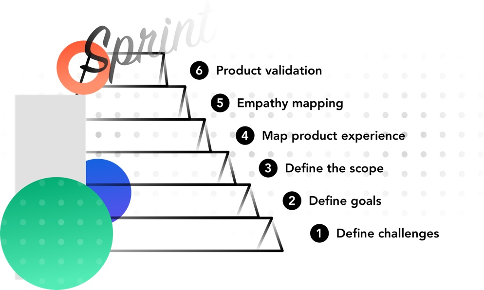
  • Findings sections structured sequentially or by theme
  • Next steps
  • Appendix
At Windmill

At Windmill, user researchers spend a lot of time perfecting their individual methods of reporting. It is important to update them after every session, and send them to the client if they have any additional comments. Recordings of the session also aids in the interviewer being 100% engaged, since they will not be scrambling to write down a specific quote or comment from the prospective user. It is great to go back and watch the session while reporting to observe body language, which can say a lot about what a person is experiencing. 

UX research is an indispensable part of the product development process. When done correctly, it can greatly help designers and product developers understand the specific issues of modern customers. This allows them to design product elements in a way that helps their users overcome the challenges in the best possible manner.

Let’s give the last word to Julie Zhou, Designer and Author. She says, “To find ideas, find problems. To find problems, talk to people.” It’s time to talk. 

Everyone is an Information Architect, whether they know it or not. If you’ve ever restructured folders on your hard-drive to make files easier to find, you’ve practiced information architecture. At its core, Information Architecture is helping people find what they’re looking for. But when a project requires a large amount of data to be categorized and structured, which is often the case for data-driven product design companies such as Windmill, expertise in Information Architecture is required.

Information Architecture is a process that allows data to be represented in a structured manner, setting the stage for a streamlined design process.

The main goals of Information Architecture 

Users should not have to spend time and effort understanding the content presented to them in a product. It is Information Architecture, the art and science of organizing and structuring data, that enables design teams to make the product effortless to use for their end users.

Information Architecture takes a user-centric approach and helps design teams build visual elements, functionality, interaction, and navigation accordingly. The main goals of Information Architecture include: 

  • Organization of design elements into easily understandable formats;
  • Prioritization of information based on its criticality or importance;
  • Building navigation elements that are explicit and frictionless.
The Information Architecture process

Information Architecture can help designers overcome product usability and navigation challenges while saving a tremendous amount of time. But for it to work efficiently, organizations need to follow a clear, structured plan, based on four steps.

  1. Research: Begin by taking content inventory and cataloging all the essential elements. Collect all your content assets and sort them by type; remove duplicates if any and create spreadsheets with all the items – including hyperlinks, author names, and tags. Then, evaluate the content elements and information assets and perform a rigorous content audit. Remove any outdated and unnecessary content and ensure consistency and quality of the remaining content.
  2. Definition: Build the object-oriented user experience you want to deliver. Define your objectives, core content, metadata, and actions. Reorder the elements if required and add the corresponding CTAs. It may be useful to turn to techniques, like card sorting, to determine how people understand and categorize information. Use the results to design your information architecture, workflows, menu structure, and navigation paths.
  3. Structure: Create taxonomy driven by the visual hierarchical structure of your content. Depending on how you want to present the information to the users, define your system and choose a corresponding organization model:
    • Choose a sequential structure if you want users to follow certain steps in a specific order.
    • Choose a hierarchical structure if you want to organize various pieces of information into categories.
    • Choose a matrix structure if you want to give the users more freedom to choose their own path.
  4. Navigation: Create a labeling system to mirror the thinking and language of your users. Review the list of labels for consistency of usage, punctuation, and writing style. Consider choosing a single syntactic approach and then maintain uniformity. Decide how you want users to navigate through your content and finalize the directions and flows accordingly:
    • Choose forward navigation for moving between screens at consecutive levels of hierarchy, steps in a flow, or across an app.
    • Choose lateral navigation for moving between screens at the same level of the hierarchy.
    • Choose reverse navigation for moving backward through screens either chronologically (within one app or across different apps) or hierarchically.
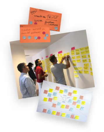
Eight Principles for Success

Using Information Architecture as the blueprint of your product design can help you to build the right wireframes and sitemaps that will ensure user satisfaction. To set the foundation of an effective user experience, here are eight Information Architecture principles to keep in mind:

  1. Look at the content of your product as a living thing with its own lifecycle, behaviors, and characteristics. This will help you visualize the relationships your content has with other data.
  2. Curb the temptation of delivering too many options to users. Keep it short and simple and make it easy for users to find the information they need. It’s a bit of a myth that users want choice. What they really want is to progress in their task.
  3. Don’t overload users with unnecessary information; provide summaries wherever possible to help them understand the information they can expect to find by digging deeper.
  4. Avoid long descriptions. Instead, it’s better to explain the elements in a category by showing examples of the content. Offer precise subcategories that double as shortcuts for users to understand the content at a glance.
  5. Instead of flooding the home screen with vast quantities of information, make sure to provide important content at each page – so users can know where they are and what they can do while there.
  6. Since users have different ways of looking at information, make sure your design accommodates that. Incorporate several different classification schemes to allow users to browse content.
  7. Have different menus for different types of information when possible and avoid mixing different categories in your navigation scheme. This will help improve product usability.
  8. Have a process in place to add new elements as your product grows – without causing downtime or impacting user experience.

Robust Information Architecture underpins an efficient user experience. Strengthening the foundation of your product through a detailed understanding of the Information Architecture process and embracing these eight principles could help you deliver a powerful user experience.

At Windmill, designers implement the structural design process by beginning each project by making flowcharts and mind-maps. Once the main elements needed in the product are hashed out, they perform card sorting to define what employees would need in their onboarding process. This helps to define the structure of the project to create the visual hierarchical structure needed. Our designers’ favorite tool for mind-mapping is X-Mind. Use it in your next project!

Read more about User Experience in Effective UX Research Part 1 – Preparing For Research.

A satisfied user is the best business strategy of all

– Michael LeBoeuf, American Businessman

Given how critical it has become to meet user requirements to the T, effective UX research is an indispensable part of the product design process. Effective research not only helps in better understanding user needs and preferences, it also helps designers design product elements and features in a way that drives maximum usage and loyalty.

In Part 1 – Preparing For Research of this series, we discussed the pressing need for UX research, and how organizations can prepare for UX research by training their team with a series of steps. In this part we will be discussing how companies can conduct the research, how they deal with surprises, and tips to tackle difficult users.

Conduct the research

Once you have prepared yourself for user experience research and understand the elements of effective research, it’s time to conduct the research on real users to get the real
picture of their needs and wants.

Here are some steps to follow to make it happen:

  1. Begin with an introduction:
    Introducing yourself to users and educating them about the purpose of the research is an important first step. You should have a fixed introduction that you repeat each time, to come across as more professional but also to ensure you don’t forget anything. This will allow you to concentrate on the user
    instead.
  2. Capture user background information:
    Given that you have already taken the time to cherry-pick users who are genuine and represent the required variety of basic user characteristics of your audience, you should already be aware of basic user information. You will need to question further to capture more background information: ask questions relevant to the product to uncover their relationship to the product. Make sure the questions you ask have quick and simple answers and avoid asking many questions which could lead the user to talk at length at this stage.
  3. Discuss the scenario:
    As you move towards conducting usability research, you’ll have to invent a plausible scenario for the user to move through the screens. Unless your prototype is complete and interactive enough to offer users the actual set of content and options, you’ll be forcing your user to select the options you’ve chosen for them. So, make it as realistic as possible. If you are conducting research on a live site, feel free to ask the user to create their own scenario based on their typical or recent use of the site.
  4. Ask the right questions:
    Based on what your product is about and what insights you want to unearth from your users, asking the right questions is crucial. Have a list that captures the true essence of what your users really expect from your product. Since it is easy to introduce bias at this stage, make sure to not interrupt them at all until they reach a key goal, otherwise, you might influence what they’re looking for. Once you’re done asking questions, summarize the discussion you’ve had with them; if possible, give users a rating scale to get a good idea of what they think of your product and what they would like you to improve.
  5. Repeat for other scenarios:
    Once you’re done with one scenario, make sure to repeat the process for other scenarios. Always check how realistic the scenario is for the user: gain an idea of what the user would actually do and keep referring to what you would do in real life. Where there are differences between what the user would really want and what you’ve chosen, it may be useful to ask the user what they think this screen should look like if they were performing their own task, and not the one you’ve invented.
Always be ready for surprises

It is common for researchers to assume that they’ve written an amazing test script with mostly open questions that will deliver answers to their test objectives. Although most researchers are prepared for the “known unknowns”, the problem arises when researchers encounter an “unknown unknown” – especially while conducting early research.

As a principle, if a user says anything that you feel you don’t understand, always ask them to clarify their stance. If they’re not sure what you mean, refer to your notes and repeat as closely as possible what the user actually said – not your interpretation. Based on what the user says, you may need to ask further open questions.

How you come across to your users always makes a difference in the answers you receive from them. Since power imbalances do exist, you need to drive efforts towards minimizing the chances of these imbalances becoming a barrier. Make sure to consider your physical appearance as well as how you speak and act. Be aware that users of different ages, genders, races, and accents need to be interacted with differently.

Have a plan to deal with difficult users

Just as there are some amazing users who perfectly fit the profile and are able to clearly express their thoughts, there will be some who make the research process long and painful. Here are some tips on how to deal with users who are:

  • Too talkative:
    Adopt a serious business-like attitude to say things like, moving on before we run out of time, we still have a lot to get through, we’ll try and get through this step quickly, or we won’t have time to cover it all, etc.
  • Disengaged:
    Try to understand if the user is just there for the incentive, or whether they specifically feel disengaged with your product. Try asking a different set of questions or move to another scenario.
  • Excessively negative:
    If the user hates the experience, it is surely a cause for worry. But rather than getting disheartened or trying to influence the user to say something positive, be enthusiastically cheerful about their feedback. Empower them by saying something like “the more problems you can find for us, the more chance we have to fix it”.
  • Excessively positive:
    If your users seem to love your product experience, it’s a reason for celebration. But make sure they have an open mind to different aspects of your product experience. If required, propose alternative design options and shift them back into a thoughtful mode. Always remember, no product is perfect.

When it comes to user research, driving efforts in planning research activities and then conducting the research is extremely important to understand user needs and goals. How you present yourself to your users, what questions you ask, and how you ask them all have a great impact on the answers you receive, the features you design, and the user experience you will eventually offer.

At Windmill, all designers are actively involved in the user research process. Since many products that we design are for big companies with many moving parts, we make sure to research a wide range of users from the beginning and always test in house first. Before we go to the client we need to practice our user testing on the team to hash out any mistakes or wrong assumptions.

This includes generative to usability testing. Of course, conducting the research is not the end objective. Intensive analysis of the data captured in the user research follows. That’s the stage that reveals the insights that will define the scope of the product design, and what you’ll find in the next blog post.

It’s long been an industry norm that enterprise products do not have to pay quite as much attention to user experience design as consumer products since their primary focus is the functionality of their offering, not the ease of use or aesthetic. These tools are usually used by enterprise employees on corporate networks with help desks at their disposal. However, when the world switched to working from home there became an urgency to create intuitive workflows and engaging experiences due to the lack of help from fellow colleagues or IT.

With consumer apps, when the user experience design is confusing – for instance being unable to find the navigation bar or the color of the text is not easy on the eyes – they are likely to lose interest and exit the website or application. 40% of users exit a website if the design is not appealing. However, if the design, navigation, and text are user-centric, they are more likely to explore the website and dig deeper to understand the offerings. It is apparent that this is equally true for driving up the usage of enterprise apps too.

User experience design is crucial in both inward-facing enterprise tools and external-facing enterprise apps and sites. The key question is, how does one capture the essence of where users find delight in their experience?

User experience design is not about just creating attractive designs. Designers need to fully understand the product in question, its users, goals, and blend it with beautiful visuals. Analytics play a huge part in creating powerful experiences since it removes the guesswork from the process and gives designers clarity on what a user needs.

There are two primary ways to collect data – qualitative and quantitative. Quantitative data is measurable and is based on certain specified metrics. Analytics tools and customer surveys are used to collect this data. On the other hand, qualitative data enables designers to find out what part of the product offers maximum value to the user. This data can be collected through user interviews, feedback, and surveys. Designers must use a combination of both to get a holistic picture while creating the user experience.

Role Of Data Analytics In Designing User Experiences

1. Improve design and content

Let’s take the example of RS Components, a leading distributor of electrical, electronic, and mechanical components. They used to receive millions of visitors on their eCommerce site, but users found poor site search and product information on their website frustrating, ultimately resulting in a reduction in site visitors and negatively impacting sales.

Based on the customer feedback, online surveys, and discussions in forums, RS Components identified the key issues that impacted the experience and revamped it on their website. The change enabled them to exceed their financial target by 42% and resulted in massive growth in conversion.

How RS Components used data analytics to improve user experience

With data analytics, designers can gauge what part of the website or app interests the users the most. They can leverage data analytics to understand user behavior and personalize the experience. Analytics will help designers build an intuitive design that appeals to everyone.

2. Focus on the right problems

A designer might face multiple issues, especially when a new version of the product is about to be launched. What problems are more important? Designers can leverage analytical tools to prioritize customer feedback and determine the most common or major issues that affect the user’s experience. These insights can help them create feature lists mapped back to releases and schedules with greater assurance of product acceptance on release.

3. Create a seamless experience

A user expects a consistent experience across all touchpoints in their journey with the product. Today those touchpoints could range from desktop apps to web browsers, mobile apps, and increasingly wearable devices. Designers can collect the data received from these touchpoints to understand their habits and challenges.

For example, it could reveal that many users who try to access their enterprise product through their phones are unable to login. Based on this insight the designer can simplify the mobile login process. The objective is to make the experience hassle-free and so simple that even a child can do it without guidance.

4. Personalize the experience

Users want a personalized experience due to the amount of choice that is offered to them in their daily life. With the help of data segmentation, designers can hyper-personalize the experience. For example, a user belonging to the technology industry should see different banners and messaging on the website than someone who belongs to the manufacturing industry.

5. Gauge what interests the users

Designers need to be continuously enriching their product or app to deliver increasing value to the users. Giving the user an experience that grows with them is one way to build a robust long-term relationship.

Conclusion

Data analytics play a major role in designing powerful user experiences as it helps designers make informed design decisions that align with the user’s goals.

At Windmill designers are constantly using data to design. From the initial discovery phase involving surveys, interviews, and usability testing to capture qualitative and quantitative data, to the continuous updating of applications based on user feedback. User experience is ever-changing and never complete. This mindset allows Windmill designers to deliver delightful experiences in every medium and market.

Note: This is the 2nd article in a two-part series where we discuss why accessibility matters when designing websites, web, and mobile applications. 

As we learned in the previous article, Accessibility 101: Design Principles A Designer Must Know, The World Health Organization estimates that 15% of the world’s population lives with some form of disability, and 71% of people with any form of disability will leave a website immediately if it is not accessible. 

Technology offers unprecedented opportunities for inclusion regardless of ability. It is important that this thinking is embedded from the outset of application and interface design. 

How To Create Accessible Apps

Here are 4 core elements to be mindful of when creating a website that everyone can use:

  1. Content and structure
    • Describe links in detail instead of using generic words like “click here”. This will help users understand the purpose of each link without having to physically see it.
    • Use a combination of colors, graphics, and text to describe information and emphasize key points.
    • To simplify navigation, ensure that all the repeated components within a web page appear in the same relative location and order, and try not to limit navigation flows. Create multiple ways for users to locate what they are seeking. Similarly, using consistent icons will help users with cognitive challenges understand their users better.
    • Create descriptive page headings and titles to allow users to understand the relationships between content and pages.
  2. Visual design
    • Line spacing should be at least 1.5 times the font size, and the letter spacing should be at least 0.12 times the font size. This will help users with low vision read text easily.
    • Word-spacing should be 0.16 times the font size and the font size should not be less than 10 points.
    • Maintain a contrast ratio between the text and background. Clashing colors will hinder the readability.
  3. Device-independent design
    • Be mindful of the device you are designing for; website accessibility will be different from mobile phone accessibility
    • Content that appears or disappears on using a keyboard or mouse pointer may limit the accessibility for some users constrained by the devices they want to use. Design the interaction in such a way that the user can perceive the content and dismiss it without disrupting their experience.
    • Ensure that all tasks can be conducted by users even by using conventional user interface components. Sometimes users may not be able to perform certain activities such as shaking or gesturing their device. 
    • Ensure that the touch targets are 9 mm high by 9 mm wide and the inactive spaces around controls do not overlap with touch targets. This makes it easier for users with limited motor movements to use the device without any hassles. 
  4. Keyboard-only options
    • Ensure that keyboard shortcuts are not the same as browser or screen reader shortcuts. A keyboard shortcut could be just a word or a character or a symbol and it should be active when the user interface component for which it has been assigned is in focus.
    • Present content in the correct reading sequence. For example, if the document is a multi-column document, the content must flow from the top to the bottom of the column and then to the top of the next column. This makes it easier for people using assistive technology to read the pages.
    • Include a skip-to-main content link before the header so that users can directly access the primary content on the page quickly.

Accessibility @ Windmill – There are a few core tools that Windmill designers use to create inclusive digital interfaces. 

Before beginning a project they review the Web Content Accessibility Guide 2.1 (https://www.w3.org/TR/WCAG21/) to make sure the project is in line with the current guidelines. When designing for the web, built-in plugins are the most efficient way to test usability. Below are the designers at Windmill’s go-to applications for digital accessibility.

In addition to following best practices, designers must include users with various accessibility issues in their user research to understand the challenges they might face. This process will help designers to create more inclusive and accessible applications for all. 

Want your users to fall in love with your designs? Fall in love with your users.

– Dana Chisnell, thought leader in civic design

Achieving delightful user experiences in today’s ever-changing climate is a challenge. Designers must implement design elements in a way that best delivers the user’s core values, which are sometimes not obvious. The modern user is complex and needs to be understood from all angles to know how they will interact with the product. Enter user research.

The need for UX research 

Modern products are multifaceted, and sometimes put design and development teams under pressure to deliver high-quality products to users quickly and cheaply. This pressure, however, can lead to building products nobody wants or needs – particularly when teams skip the crucial step of research. 

The process can seem slow and perhaps unnecessary when you’re in the thick of it with looming deadlines, but remember that doing it properly is critical to the success or failure of your product. It also means you’re focusing on the most important part of your product first; the user, and adopting a completely user-centered design lifecycle from the start.

The 4 Elements of Great Research

  1. Set test objectives:
    Why are you conducting this research and what do you want to get out of it? Instead of focusing on broad objectives such as how users interact with the product, or what usability issues users are facing, focus on specific elements like who could benefit the most and why. When do users need our help and why? How do users make a decision and what information do they need?
  2. Write the test script:
    A test script is a set of instructions that drives users to provide answers aligned with the test objectives. There are many methods to creating them, such as writing a story or gamifying it with a list of small tasks for the user.
  3. Make the research happen:
    Remember who we are designing this product for; the users! So you must recruit suitable users that represent a good variety of basic characteristics to implement your research with. You should not only have one trait of the ideal user. After finding the perfect candidates, take time to sort out procedural and admin issues to ensure that they get the support they need to make this activity successful. There is always something new with technology or company regulations to complicate the process that you need to be aware of.
  4. Run tests and analyze results:
    Once everything is in place, it’s time to run the test interviews. Don’t lead the user but rather focus on understanding what users do, and how the product can fit with their goals. One session won’t be enough, so plan a few initially. Multiple testing sessions will help discover aspects they missed in previous testing and uncover opportunities for further improvement of test scripts. It is essential that after each test interview the researchers build a report of what they learned, and what can be improved for the real deal. This can be constantly revisited while designing the product as well, which is key. Remember, users are far more forgiving of imperfect details than an entirely wrong concept.

User Research Training @ Windmill

At Windmill we take user research seriously, hiring experts and disseminating knowledge throughout the wider design team. It features heavily in our weekly knowledge sharing sessions. In these 90 minute sessions one team member will build a few fun tasks to complete in groups of 2 or 3 focusing on one element of the research process. We implement a 5-minute self assessment after each training exercise, in which each team member can track their progress without the pressure of sharing it with anyone else. We find they can then be honest about where they are in their journey. The learning never stops!

Next

In Part 2 of this article series we will take a look at conducting user research with real users, based on work we have done at Windmill.

Note: This is a two-part series wherein we discuss why accessible websites and apps are essential and how to design one. 

As human society continues to grow, so does its diversity. There are lots of groups of people with special needs, and innovators are doing everything in their power to make them go through their day seamlessly. Not only is it wrong to create a product that certain groups of people can’t use due to their disability, but it also limits the monetization of that product. It is both unethical and bad for business.

The World Health Organization estimates that 15% of the world’s population lives with some form of disability. People can be born with disabilities, or develop them such as loss of eyesight, or have temporary ones, like a broken arm.

In terms of the share of the likely target audience for businesses, estimates are that as much as 20% of the traffic to business websites could be from users with some disability. That share could be higher for business categories like healthcare.

Did you know, 71% of people with any form of disability will leave a website immediately if it is not accessible?

So, apart from it being a moral imperative for companies to cater to all possible users and the law in most developed markets, ignoring this segment could prove extremely detrimental to business outcomes.

So, what can designers do to make the web content accessible for all users? The short answer is “Digital Accessibility”.

What is Digital Accessibility and how to start with the design process?

Digital Accessibility is a subset of user experience focused on making websites and apps that are inclusive and user-friendly to the widest range of people, including those with disabilities.

There are four major categories of accessibility to factor into design considerations.

  • icon

    Visual: Catering to users with visual challenges such as myopia, color blindness, glaucoma, and albinism.

  • icon

    Auditory: Catering to users with hearing issues such as presbycusis, acoustic trauma, auditory processing disorder, and otosclerosis.

  • icon

    Motor: Catering to users suffering from action-linked motor issues such as cerebral palsy, Parkinson’s, and muscular dystrophy.

  • icon

    Cognitive: Catering to users battling cognitive challenges like autism, Down’s syndrome, dyslexia, and global developmental delay.

Accessibility is governed by guidelines and legal requirements such as the Section 508 compliance (US), EN 301 549 (EU), The public sector bodies accessibility regulations (UK), and the WCAG 2.1 guidelines.

So, how is a designer to go about building accessible digital interfaces?

The designer must first develop empathy for likely users. They must possess or inculcate an inclusive mindset based on that empathy to design for a wide range of human diversity.

There are a variety of approaches designers follow to guide their specific work. One approach we particularly like is from Microsoft. Here are their three core principles of accessible design.

The Three Core Principles of Inclusive Design

1. Recognize exclusion

The definition of disability has changed over the years. In 1980, the WHO defined disability as a personal attribute wherein a person cannot carry out normal activities due to limited abilities, but recently the WHO refined that definition. Today they see disability as a more complex phenomenon that reflects the interactions between the person and the society in which they live. This is not about the person, but about the person in the context of the interactions they have to undertake.

Of course, it is natural for designers to bring their bias in while solving issues. However, designers must recognize that disability is not related to personal or health conditions but that disability happens when there is a mismatch in human interactions. These mismatches can be permanent, temporary, or just situational. By being conscious of their bias and by practicing empathy mindfully, designers can identify exclusions and find ways to solve the problem. An inclusive design will make the interface accessible to all kinds of people by addressing the interactions rather than focusing on the individual.

2. Learn from diversity

Humans learn and adapt to diversity quickly. By designing websites for people with different disabilities, designers might end up building something that could be more beneficial to people in general. Hence, designers should put the real interactions and tasks of people at the heart of their creations. This will give them new insights and enable them to build a better experience for all types of users.

3. Solve for one, extend to many

Disability can be permanent (someone having just one arm), temporary (someone who has fractured her one hand), or situational (when a new mother is working on a computer with one hand as she is carrying a newborn baby in the other hand). A truly accessible website must be easy to use for all these types of users.

To build an accessible website, designers must focus on that one big problem that is universal to all users and focus on solving that. By putting people and their constraints at the center, designers can build a more accessible website for all users. Adopting a robust and carefully considered set of design principles, like these three from Microsoft, can help set the context for how designers should build an inclusive mindset in order to create accessible websites.

At Windmill, our designers follow the Microsoft Accessibility Guidelines. To implement it we use website plugins to make sure that the color contrast under different conditions is sufficient while we are creating a design system and developing a product. The specific tools we use include UserWay (https://userway.org/), an Automated Website Accessibility Solution for ADA & WCAG Compliance, and Stark (https://www.getstark.co/), a suite of integrated accessibility compliance tools for software teams. In the next part of this series, we will look at some best practices and tips that Windmill designers use to design accessible digital interfaces.

The ability to simplify means to eliminate the unnecessary so that the necessary may speak. — Hans Hofmann (Painter)

The enterprise has integrated deeply with software and, more than ever, enterprise IT is responsible for driving organizational performance. Technological evolution and the coming of the ‘app economy’ have also made the enterprise more ‘appified’ but this has served to convert the enterprise IT landscape into a minefield of siloed applications, large product portfolios, and tangled inter-dependencies.

One result of the complexity of this ecosystem is that enterprise users are often forced to contend with inconsistent experiences and disjointed workflows that prevent them from being able to perform their tasks with ease.

The problem with complexity

Ageing systems and legacy technologies impede the ability of organizations to intelligently manage all the critical business processes and applications while remaining flexible to adapt to ever-changing business requirements. The pace of technological evolution has intensified rapidly over the past two decades and organizations now look towards software to drive evolutions, revolutions, and transformations in how they conduct business. In that light, sub-optimal and inconsistent user experiences, something of a mainstay of enterprise software, reduce adoption and impact organizational agility and performance.

The modern enterprise can no longer afford to bear the burden of unnecessarily complex enterprise application portfolios that deliver patchy user experiences.

The need for change

Software today undoubtedly operates as the central nervous system of all enterprises. However, enterprise software, until now, has been designed to satisfy the needs of the organization and not of the individual user. It has often appeared to be at odds with user-centered design. The good news is that enough evidence exists to show that enterprise software companies which use design methodologies and create holistic experiences for their users can drive better long-term adoption of the software and consequently achieve software-driven success.

Creating holistic experiences with large product portfolios – the roadmap

While there might seem to be a lot of conflicts inherent in large product portfolios, with this conflict comes the opportunity for intelligent renewal. Here is a road map that we have successfully employed to create robust, user-friendly, and secure experiences for enterprises, even with large product portfolios.

Evaluation for evolution

The first pillar of our enterprise-centered design practice is evaluation. Evaluation begins with going through the enterprise client’s existing product and application portfolio with a fine-tooth comb to identify how it can be rationalized, simplified, aligned, and then organized. This understanding can only be generated by thorough research that captures a detailed understanding of both business needs anduser needs.

Assessing end-to-end user journeys

Product portfolio renewal also demands coordination across a broad range of end-users and getting all the invested stakeholders to become engaged in this strategic initiative. We leverage the Design Sprint methodology to look at all the components of the entire technology ecosystem that impact the user needs and define the end-to-end user journey as it exists at the time. This involves understanding the user objective and the jobs to be done, every stage of the user journey, the various touchpoints, and the means employed by them to connect to the applications they use. This assessment throws valuable light on the overall UX and how it can be optimized.

A comprehensive ‘service map’ to build better connections

After looking at the entire product, technology, and user ecosystem, the next step is to design a comprehensive service map. The objective behind this is to build the right connections between the front end and the back end and look at the big picture to connect together the right dots and the right touchpoints.

Taking a look at the big picture helps us identify how the applications impact the users, their motivations behind using or not using them, and how they complete their tasks. With this information, we curate end-to-end, detailed solutions around the user workflows with a clear understanding of the main touchpoints, the channels that users use, the systems they connect to, and how they connect.

This allows us to design a consistent experience across the range of enterprise products and applications the users turn to in performing these tasks.

Focus on the ‘solution’ and not just one workflow

It can be impossible to deliver holistic experiences with large product portfolios unless we move away from a myopic development approach. While it might seem easier to just optimize one particular workflow or functionality, it is also often meaningless to provide one elevated experience and leave the others at a sub-optimal level.

For the millennial enterprise user, this would be like going to Airbnb and realizing that their experience while looking for accommodation in Italy was substantially different from the experience while looking for accommodation in Mexico on the same app. Will such an approach drive adoption? No, it won’t. In the enterprise context, will products that do not provide consistent and elevated experiences win the love of users? Unlikely! 

Add value, beyond the obvious

UX, contrary to popular belief, is not just about clean aesthetics and simple design. With a clear picture in mind, we focus on design that can elevate the user experience to another dimension by taking an application beyond being merely functional and makes it usable. It is in this dimension that the hidden gems lie, those extremely useful features that might not be immediately noticeable but add immense value to the product. 

How does this play out?

Let’s look at an example to show how this works in practice. We were called in to help a large shipping company refresh their billing application, but we soon saw the project take on a different dimension. As we studied the billing app, we realized that the app was a part of so many different user journeys. Customers used it, as did users (and other enterprise applications) in roles such as Finance, Order Fulfilment, and Account Management, among others. It would not make sense to change the user experience in billing and leave everything else untouched. This kicked off a new cycle of looking at the entire enterprise product portfolio to define a design-led realignment that would deliver a superior, and holistic user experience.

Focusing on the end-user needs and evaluating all the touchpoints is essential before you write even a single line of code simply because it is this evaluation that will determine the exact problem, the opportunities for alignment, and the gaps that, when filled, could deliver greater value. It is with this knowledge that you then determine the design systems, toolkits, and technology stacks that will address the entire user experience and help you deliver robust enterprise software solutions that users love, accept, and trust.

Design is about much more than visuals. Design is deeply embedded in product development, and the process itself is as important as the deliverable.

Here at Windmill, design is a journey we take with our clients, and we want to make sure we’re on a journey that’s enjoyable for everyone involved. We start by asking ourselves how we can best collaborate with our client’s product and development teams. Oftentimes, we are not the solo designers working on a project, which makes collaboration a key component to both our own success and the success of our clients.

Our goal at Windmill is to enable our clients to be as self-sufficient as possible. In order to accomplish this, we apply the three lenses of design thinking:


Business Viability

A common pitfall in design is getting lost in concepts and prototypes that never make it to market. As imaginative as designers can get, in order to be successful, an idea must be viable enough for a business to fully implement. This includes everything from managing expectations throughout the project lifecycle, to making sure everything remains within a client’s budget, to building a platform that truly solves the business challenges at hand.

We believe in establishing a shared vision toward success through open lines of communication with our clients from the onset of any engagement. By fostering a collaborative environment, we’re able to streamline the design process and deliver products that are customized to our clients’ needs.


Technical Feasibility

Designing and developing a product is one part of the challenge; successfully implementing a product is another. Successful design ultimately depends on the technical feasibility of the product, i.e. whether or not it actually works as intended and how well it integrates into a client’s existing technology stack.


Customer Desirability

In addition to all the operational benefits to a business, the product must ultimately delight end-users. Understanding our customers’ customers is just as important as understanding the business requirements of any given product. Our overall goal as designers is to build a product that delivers true value to the people who use it, hopefully making their lives easier in the process.


Sprinting Toward Success

The sweet spot between business viability, technical feasibility, and customer desirability is where true innovation happens. Many businesses focus on local problems, but in order to get to the root of any business challenge and provide a solution that fully addresses it, we try our best to present a holistic approach that takes into account each area of business that might be impacted.

We conduct a series of design workshops and sprints that enable us to identify the breadth of every challenge and develop a comprehensive solution. We invest our time in understanding our clients and their business models so we can deliver products and platforms that are perfectly customized to their needs.

This is our proven design thinking methodology, and we’re proud of all the amazing ideas it’s helped us bring to life, from concept to reality.

In a hyper-competitive software-driven world, you are only as good as your capacity to deliver products that delight your customers -fast. Software runs the world and enterprise products too have to join the “customer-driven” movement.

The days of clunky enterprise product experiences are gone forever as the user takes the driver’s seat  for enterprise products as well. Robust, feature-rich, intuitive, secure, and uber-usable are the terms that must come to mind when we say ‘well-designed’.

The pressure to design enterprise products that deliver a consumer-like product experience is rising. Enterprises must figure out how they can deliver such products at light speed without making any compromises. Along with is, the enterprise is now faced with a new challenge –how to define a complete product vision quickly?


Enter Design Sprints 

While building products for the enterprise, somehow, great design and agility have seemed like opposing goals due to the focus on time constraints. This does not have to be so.

Enterprise products and applications are usually mission-critical and have to be rolled out faster due to the business impact they can have. The consensus has often been to bake in functionality and performance and sacrifice design at the altar of time constraints. Such products inevitably need to be re-written and re-designed over time to drive up user adoption.

The needs and the complexities of the enterprise products demands a new approach to framing product vision.

Design Sprints, a concept popularized for Google to build consumer products, can be employed in the enterprise context, albeit with a few tweaks, to design highly functional products that drive adoption and help the users reach their end goals with ease while imposing a minimal cognitive load on them.

This is how we use Design Sprints to help our enterprise customers define a rich product vision that delivers value to their end-customers, while still staying ahead of the clock.

Measure twice, cut once – Enterprise products need a planning redesign.

 The Design Sprint process helps to discover what the product vision should be. It almost acts as a prototyping process that allows organizations to test their product idea with “real” users before any development begins. This is done keeping the criticality of enterprise use-cases and the complex enterprise environment in mind.

Our Design Sprint process helps organizations frame a product vision in two weeks by gathering user-focused insights, prototyping ideas, and validating them. At the end of the two weeks, you have a validated and fleshed out product vision that is ready to take the next steps towards development. This process involves a rigorous assessment of all the moving and static parts of enterprise product design, user needs, product objectives, etc. to provide a clear roadmap for product development to help organizations build products that end-users will actually use.

Design Sprint – How we do it

Our Design Sprint workshop starts with an intensive one-week effort aimed at solving this exact problem by building a shared understanding of the product vision with all the stakeholders by developing problem awareness, providing clarity, and removing all ambiguity. It is only upon gaining complete clarity on completion of this process that we proceed to the actual product design phase.

The Design Sprint workshop is the most critical stage of product development. Getting the Design Sprint right will result in a better-informed product vision and an actionable and measurable plan. Getting it wrong will lead to chaos and confusion later on that could stall product evolution.

Our Design Sprint workshop brings all the stakeholders under one roof to go through a series of well-defined, calculated, and tested steps during the first week. The workshop should include the technologists who will be developing or managing the products, leaders and business unit heads who feel their clients or employees need the product and anyone else who will be impacted by the product.

We create small groups of 7-9 people led by one design specialist to get the Design Sprint process moving. The objective behind creating small groups is to ensure greater participation, receive and share more ideas, and have everyone directly invested in the process of product creation.

We also conduct structured interviews with the stakeholders, pose the right questions, and direct them so that everyone invested can relate and understand the information presented.

 Stage 1: Define challenges to build problem understanding

In the enterprise context, new product development or product evolution happens to solve a pressing problem. Getting the relevant stakeholders under one roof helps to evolve a shared definition of the problem statement to identify the core purpose of the product. Why is the product necessary? Who will use it? How will they use it? What benefit will it bring to the table?

Our Design Sprint gets answers to these and other pertinent questions related to the product and the end-goal of the user within carefully designed sessions.  The first four days of the workshop are organized methodically to ensure that by the end of these we have a fully fleshed out product vision.  Each day has a clearly defined agenda and is conducted with the relevant set of people.

The initial two days are spent with the entire team to discover, map, emphasize, sketch and create the product. The Windmill team then takes one day to create a prototype which is then shared with the stakeholders and users on day 4 to test. The product summary is then drawn, and the ensuing days are spent creating a robust, well-designed working product vision and its relevant documentation. 

The knowledge pooling and interviews conducted in this round ensure that everyone is on the same page and helps to secure the elusive ‘buy-in’ that is essential to ensure successful collaboration.

It is almost like following the Yellow Brick Road to reach the Wizard of Oz, as everyone contributes their unique viewpoint to build a stronger overall product vision.

The Design Sprint delivers not only a workable vision of the product but also sets the ground for more predictable and efficient product design.

 Stage 2: Define goals for clarity and transparency

Since we can only manage what we can measure, it becomes important to set the parameters for measuring success. Well-defined goals provide greater clarity and transparency to the product vision process, help all stakeholders be on the same page, and highlight all the important milestones that need to be covered to tick off things as ‘done’.

 Stage 3: Define the scope to design a clear roadmap

Since a goal without a plan is just a wish, it becomes equally essential to define a clear project development roadmap. This involves considering all the goals and identifying the key priorities. During development, teams will then save time and create more viable product prototypes as they have clarity on which features, functionalities, and interfaces they need to develop first and which can be pushed later into the development cycle.

 Stage 4: Map product experience to match the customer experience

Enterprise products have to now be by the people, for the people so, it is essential to know your audience inside out to drive elevated customer experiences.

Hence the next stage of the Design Sprint process involves gaining a thorough understanding of the target audience, understanding their motivations behind using the products and evaluating the stages they go through to reach their end-goal.

 Stage 5: Empathy mapping to drive adoption

Empathy mapping is a critical step in our Design Sprint process. Empathy mapping helps the invested stakeholders take a deep dive into specific user journeys that are fundamental to the product functionality and essential to provide the desired product experience.

It accounts for all the feelings and associations that end-users experience while performing their tasks. It also takes into consideration the existing user journeys to design how they could ideally look. This approach helps in customizing optimized and elevated user journeys that delight and drive product adoption.

Stage 6: Product validation to save time and costs

Upon completion of these stages, the project moves to the product validation stage. At this stage, the product is tested with the “users” to gain clear validations and improvement ideas. Validating the product with the user helps in eliminating risk by building a solution that resonates with the users. Organizations end up saving months of development time and money that can then be directed to other ideas.


How does Design Sprint drive value?

Our Design Sprint process not only helps organizations build a robust product, but also educates them on how teams can solve problems by leveraging collaboration, mutual listening, and trust. Of course, delivering this impact is not easy. We have to undertake a lot of pre-research before undertaking a project to drive a productive workshop. This workshop needs complex facilitation skills, a clear understanding of the impediments in the enterprise landscape such as stakeholder availability and identifying the right projects to facilitate – whether it is new product development or a product improvement or modification.

Getting every stakeholder to contribute and participate in the process of creation of the product vision also enables a harmonious adoption of the solution. These people become product advocates and drive product adoption across the enterprise.

The process of defining a rich product vision also helps organizations get clarity on their product ecosystem. Often organizations have an idea or a vision of a product. But this idea might not necessarily address the complete picture and all the moving parts that go into making a robust product.

Such a Design Sprint process can help organizations get clarity on what the product vision should look like and the important areas that they need to focus on to quickly launch products that enterprise product users love.

Wealth management – much like just about everything else – looks a lot different today than it did just a few decades ago.

We’ve quickly entered a world somewhat unrecognizable from our analog past. As exciting as that may be sometimes, it also presents a number of challenges for financial service providers and nearly all businesses. With technology proliferating through every aspect of consumer life, it can be especially difficult for legacy businesses to adapt to evolving consumer demand.

As technology continues to become even more integrated into the daily lives of all consumers – and especially HNWI lifestyles – it’s vital for wealth management firms to figure out exactly how to attract, engage, and retain customers who are already so accustomed to continuous innovation.

The personal connection between a wealth advisor and a client was a hallmark of the trade in the past, but today, high net worth individuals (HNWI) expect a completely different experience. While that one-on-one relationship is still incredibly important to even the youngest, most tech-savvy clients, HNWIs also want fast and convenient self-service options via the digital devices they use the most.

Companies like Uber, Netflix, and Amazon continue to set a gold standard for customer-centric digital experiences that successfully delight over and over again. These are the kinds of digital experiences HNWIs now also expect from their wealth management providers, making it imperative for wealth management firms to adopt technology that enables them to provide elite, well-rounded service.

These digital apps and products aren’t meant to replace the personal advantage of a dedicated wealth management professional, but rather serve as a seamless digital extension of their expertise. Data-driven digital tools like robo-advisory and comprehensive digital investment tools enable wealth managers to offer even more personalized service, increase client engagement, and maximize their clients’ wealth.

It can be tricky, however, to design and deliver digital experiences that customers truly want. Designing and properly building these kinds of digital products is quite resource-intensive, and oftentimes, internal teams lack the expertise required to deliver products to market fast enough. This can pose significant competitive disadvantages for long-established wealth management firms looking to compete with the sleek digital offerings from nimble new digital banks or technology startups.

Partnering with a firm that specializes in design and digital product development can help wealth management firms ensure the best possible solution, reduce time to market, and ultimately deliver a much better experience to their customers. With the right partner and plan, wealth management firms can successfully transition into the digital era and offer customers value-added service that empowers them to manage their wealth anytime, from anywhere in the world.

Ready to transform wealth management for your clients? Visit our website to learn how Windmill Smart Solutions can help.